In this post we’ll go over the basics of fluid typography, as well as how to implement it in a modern WordPress theme.
If you’re someone who is familiar with fluid typography already, but just looking for the WordPress specific implementation feel free to skip to that section.
Introduction to Fluid Typography
The idea behind fluid typography is that the various type elements (particularly headings) will progressively scale down as the viewport shrinks.
This is a departure from responsive strategies of using media queries to adjust type size on mobile screens, as rather than having multiple defined breakpoints, the type size is constantly being calculated based off the screen width.
There are several ways to accomplish this, but the most straightforward (and widely supported) is using the css utility clamp().
Clamp takes three arguments, a minimum value, a maximum value, and a middle value that acts as the responsive value. In its simplest form, a fluid style for an H1 element could look like this:
h1 {
  font-size: clamp(24px, 4vw, 72px);
}
You can see the min and max are using absolute values, while the middle is based on the viewport width. If the viewport is tiny it will cutoff at the min 24px, and if it is huge the type will still cap out at 72px.
There is a problem with this though. Using pixels for type is not very accessibility friendly. Best practice is to define type sizes with rems so that the user can globally adjust the type up and down by adjusting the root font size.
A basic implementation would look like this:
h1 {
  font-size: clamp(1.5rem, 4vw, 4rem);
}
There is still one problem though! While the type is in its fluid state (not maxed out or at the minimum) it will only respond to viewport width and will not adjust with the browser base font size settings.
In order to have truly accessible fluid typography we have to add some amount of rem units to the middle value – so that the browser settings have an effect – like so:
h1 {
  font-size: clamp(1.5rem, calc(3.5vw + 1rem), 4rem);
}
You may be wondering: how do we know what to put for the middle vw and rem values though?
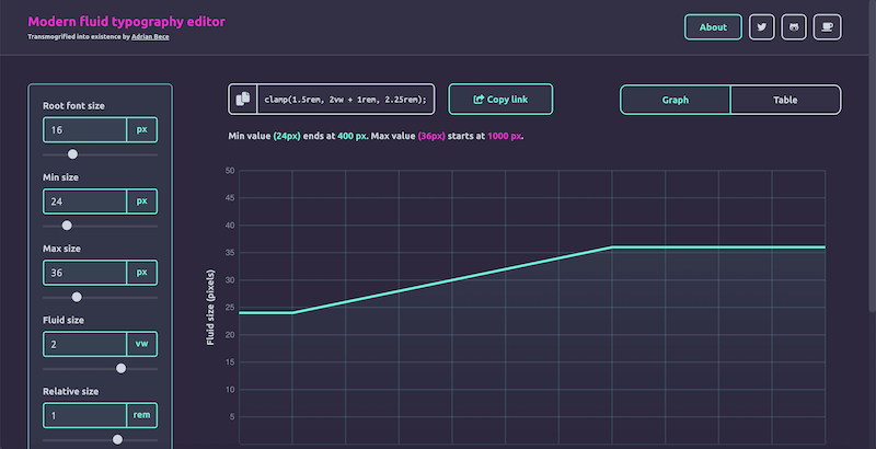
It can be hard to visualize how this will actually render in the browser. You can plug and play until it feels right, but there are a couple great tools to visualize fluid typography, so that you can hone this value in to exactly how you want it to behave:
WordPress Implementation
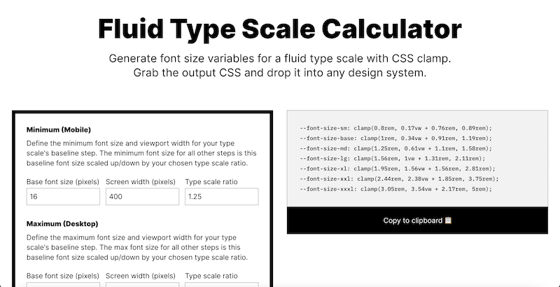
Until very recently, the best way to implement this in WordPress was simply to use these clamped values in the Theme.json file like so (the values come from the fluid type scale calculator linked above):
If you need a primer on Theme.json, feel free to check out this article.
{
	"version": 2,
	"settings": {
		"typography": {
			"fontSizes": [
				{
					"name": "Small",
					"slug": "xs",
					"size": "clamp(0.8rem, 0.17vw + 0.76rem, 0.89rem)"
				},
				{
					"name": "Base",
					"slug": "sm",
					"size": "clamp(1rem, 0.34vw + 0.91rem, 1.19rem)"
				},
				{
					"name": "Medium",
					"slug": "md",
					"size": "clamp(1.25rem, 0.61vw + 1.1rem, 1.58rem)"
				},
				{
					"name": "Large",
					"slug": "lg",
					"size": "clamp(1.56rem, 1vw + 1.31rem, 2.11rem)"
				},
				{
					"name": "xLarge",
					"slug": "xl",
					"size": "clamp(1.95rem, 1.56vw + 1.56rem, 2.81rem)"
				},
				{
					"name": "xxLarge",
					"slug": "xxl",
					"size": "clamp(2.44rem, 2.38vw + 1.85rem, 3.75rem)"
				},
				{
					"name": "xxxLarge",
					"slug": "xxxl",
					"size": "clamp(3.05rem, 3.54vw + 2.17rem, 5rem)"
				}
			]
		}
	},
	"styles": {
	}
}
With the newest version of WordPress and Gutenberg, however, we actually get some really great built in fluid typography support.
Essentially through the theme.json you can opt in to fluid typography, and then simply declare your desired min and max values for each font size option you want in the editor. Below is an example of declaring a typography scale that uses fluid type for all the sizes from medium upwards, and then just uses a fixed size for small and extra-small since we don’t need those to scale between viewports:
"settings": {
	"typography": {
		"fluid": true,
		"fontSizes": [
				{
					"fluid": false,
					"name": "XS",
					"size": "0.85rem",
					"slug": "xs"
				},
				{
					"fluid": false,
					"name": "SM",
					"size": "1rem",
					"slug": "sm"
				},
				{
					"fluid": {
						"min": "1.1rem",
						"max": "1.25rem"
					},
					"name": "MD",
					"size": "1.25rem",
					"slug": "md"
				},
				{
					"fluid": {
						"min": "1.25rem",
						"max": "1.5rem"
					},
					"name": "LG",
					"size": "1.5rem",
					"slug": "lg"
				},
				{
					"fluid": {
						"min": "1.5rem",
						"max": "2rem"
					},
					"name": "XL",
					"size": "2rem",
					"slug": "xl"
				},
				{
					"fluid": {
						"min": "2rem",
						"max": "2.25rem"
					},
					"name": "2XL",
					"size": "2.25rem",
					"slug": "2-xl"
				},
				{
					"fluid": {
						"min": "2.25rem",
						"max": "3rem"
					},
					"name": "3XL",
					"size": "3rem",
					"slug": "3-xl"
				},
				{
					"fluid": {
						"min": "2.75rem",
						"max": "3.75rem"
					},
					"name": "4XL",
					"size": "3.75rem",
					"slug": "4-xl"
				},
				{
					"fluid": {
						"min": "3rem",
						"max": "4.5rem"
					},
					"name": "5XL",
					"size": "4.5rem",
					"slug": "5-xl"
				},
				{
					"fluid": {
						"min": "3.75rem",
						"max": "6rem"
					},
					"name": "6XL",
					"size": "6rem",
					"slug": "6-xl"
				}
			]
	},
		"styles": {
	}
}
Gutenberg then under the hood generates a css variable using the clamp function like we do above, but uses a more nuanced formula than what we had above:
clamp({fluid.min}, {fluid.min} + ((1vw - 0.48rem) * 1.592), {fluid.max});Rich Tabor has an article that goes a little more in depth about this formula as well if you are interested.
This saves a lot of the work of figuring out exactly the right value for the middle argument of the clamp() function. If you really want fine grain control, you can still do this manually and use the old method of directly calling clamp() in the font size options, but I think for most using the new built in method is a great timesaver and will yield great results.
Wrap Up
If you are interested in learning more about features like this available when developing block themes, or more generally how to go about developing block themes for WordPress, consider signing up for my monthly newsletter, as I have a lot of planned content walking through this process!