WordPress 6.1 was released earlier this week and it features some much needed updates to Gutenberg and block themes that make them much friendlier to agency teams.
Client websites are always a balance between giving clients control, and minimizing extra options that could potentially break layouts and cause confusion. Below are a few highlights from the update that do just that, and are worth checking out if you are considering switching to a block theme based approach for your client websites:
Spacing Step Scale
Spacing in the Gutenberg editor has always been a bit of a pain. Custom margin and padding controls are fine for your own site, but it makes it easy for clients to do all kinds of wacky things.
In the past my solution has been to define “baseline” spacing in Theme.json and then use multiples of that manually with calc(--wp--custom--spacing--baseline * X) in my Theme.json and CSS so that the spacing can be adjusted using that global variable later on.
WordPress 6.1 has a much more elegant solution with stepped spacing. You can define a scale in the Theme.json and then editors will be presented with only choices from your scale rather than a custom input. This makes it feel like using Tailwind or Bootstrap utility spacing classes, which is fast and easy, but still controlled.
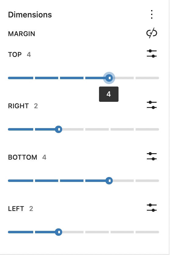
The code to accomplish this is quite simple. The following gives you a basic setup with a few options going from 0.5rems to 5rems of spacing. You can then use any of these spacing variables in your CSS or Theme.json style settings as well!
"settings":
  ...
  "spacing": {
    "spacingSizes": [
      {
        "size": "0.5rem",
        "slug": "05r",
        "name": "1"
      },
      {
        "size": "1rem",
        "slug": "1r",
        "name": "2"
      },
      {
        "size": "2rem",
        "slug": "2r",
        "name": "3"
      },
      {
        "size": "3rem",
        "slug": "3r",
        "name": "4"
      },
      {
        "size": "4rem",
        "slug": "4r",
        "name": "5"
      },
      {
        "size": "5rem",
        "slug": "5r",
        "name": "6"
      }
    ],
  }
...
}
Content Only Locking
This is possibly the biggest highlight for me.
Block patterns are a really nice way to give clients predefined layouts built in Gutenberg from an assortment of blocks. One of the drawbacks of this, however, is that it is easy for clients to break. They could insert extra blocks or delete blocks, but also if you have fine-tuned the settings or added custom classes to blocks within the pattern, users will likely be confused by all the settings panel options presented to them.
Enter content only editing. By enabling this, when a pattern is inserted the sidebar settings are basically cloaked from the editor. Instead, it just displays a list of the blocks contained by the pattern, which the editor can click between in order to edit the content, but not any of the advanced settings.
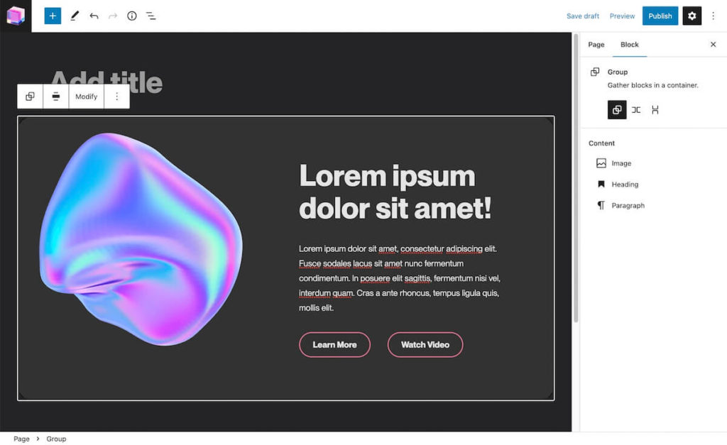
This makes block patterns behave almost like a custom block with an assortment of custom fields, except its all just native block editor!
Again this is super easy to accomplish. Just add the following to the top level group of your pattern:
<!-- wp:group {"templateLock":"contentOnly"} -->
One caveat to still be aware of: block patterns are not dynamic! This means once inserted into the editor if you later go change the template file in the theme, it will not cascade an affect all instances of that pattern on the site. For this, consider reusable blocks, or custom dynamic blocks with a php render template.
I also have noticed a bug that if an instance of your pattern already exists in a post before you switch it to content lock, when you add new ones they still don’t behave as thought content lock is applied. Creating a new page and inserting fixes the issue. Hopefully this will be resolved soon.
Enjoying the read?
Join 500+ developers and learn modern WordPress, JAMStack, and javascript frameworks with a monthly development newsletter geared towards agencies and freelancers.
Fluid Typography
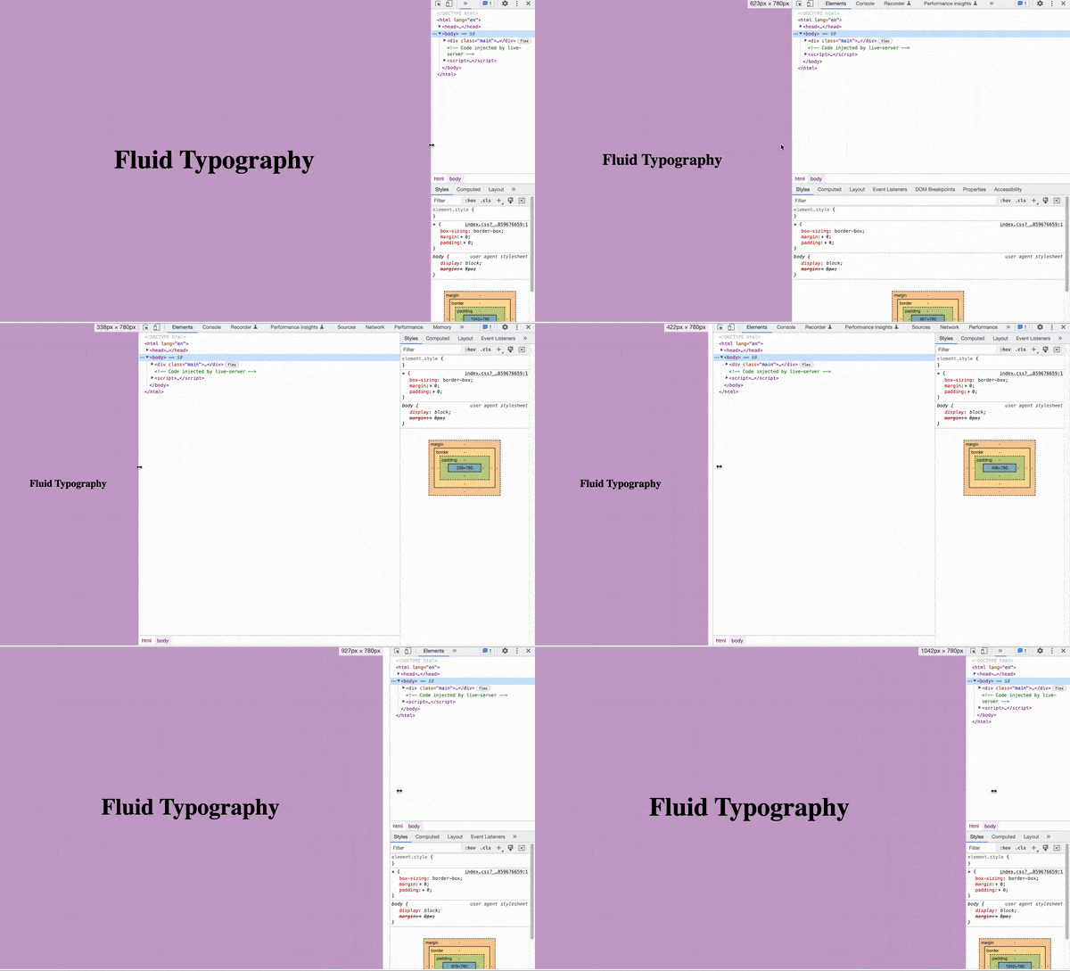
In the last couple versions of WordPress you have been able to achieve fluid typography with some CSS tricks like clamping, but now this is built right in! I’ve already written a post on fluid typography and how to implement it with this new feature, so check that out if you are interested in this feature.
New Templates
In this update we also get access to a whole lot more template and template part options within the full site editor!
Including the ability to create templates for specific individual posts, pages, or custom post types.
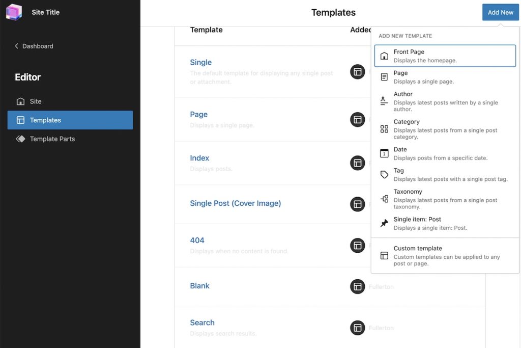
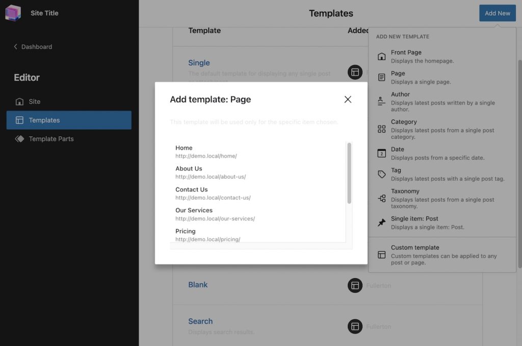
That said, I think this is one feature you should be careful with. This can quickly get out of hand especially if you are using the new ability to create templates on a per-individual-post basis. Remember that these are stored in the database unless you manually add the code to your theme as well, so this introduces further room for confusion.
I think full site editing still has a lot of room for growth here from an organizational standpoint, but the capability for these new templates is still a step in the right direction.
Wrap Up
These are just a few of the new features with 6.1
I selected these because I think they are the biggest game changers for agency and freelance developers to be able to confidently deliver block themes to clients.
If you want to read about all the changes you can check out this article from Kinsta, and I’d also encourage you to sign up for my newsletter (once monthly) as I’ll be continuing to cover updates and how you can make use of them in your own development in the coming weeks.

Leave a Reply