In this lesson we are pivoting away from static blocks to dynamic blocks instead.
Note: This post is part of the Block Creator series. These lessons build on each other, so it is recommended to complete them in order to get the most out of the course.
You can find links to all the Block Creator lessons on the main course page. You can also download this finished code from the course Github repo in case you get stuck at any point.
As a refresher: while static blocks store markup in the WordPress database, dynamic blocks only store attributes in the database and then use a PHP template on the server to render the final markup sent to the client.
Dynamic blocks are crucial for blocks that need to update on page load, for instance the query loop block that displays recent posts, but that’s not all they are useful for!
In the case of client projects, I almost always use dynamic blocks because they can be programmatically updated without using deprecations – just by changing the PHP template.
Our Block Outline
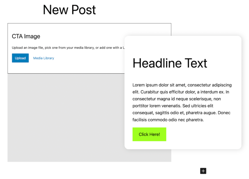
I’m really excited for this lesson because we are leaving our somewhat contrived imaginary “banner block” behind and building a real custom block with some useful functionality.
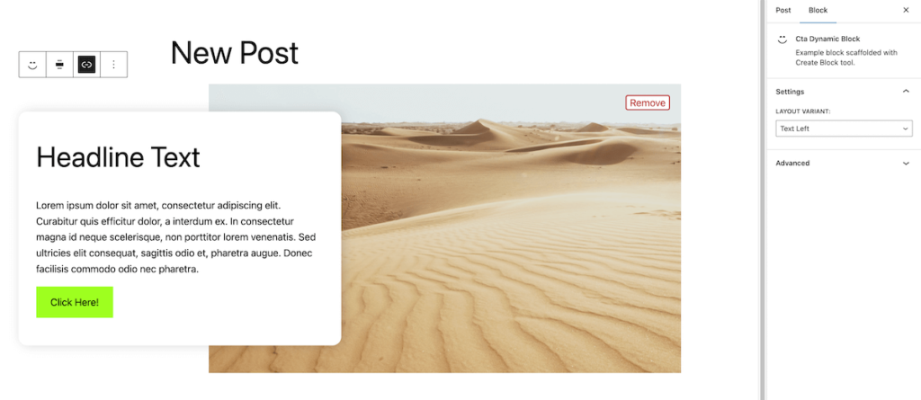
The block we’ll build is this Call to Action block:
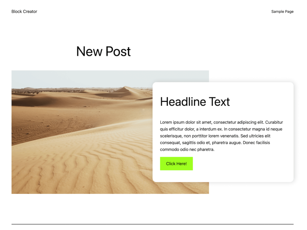
It will have an image picker that hooks into the media library, editable text, the ability to add a link, and finally a layout option to switch which side the text is on.
This will cover a lot of block building concepts and my hope is that after this lesson you’ll be able to start envisioning your own block projects and know how to approach them.
Spinning up our block with @wordpress/create-block
Let’s go ahead and spin up the start files for our project. Navigate to the plugins folder of your local development WordPress install and run the following command:
npx @wordpress/create-block --variant dynamic cta-dynamic-blockThis will go ahead and set up our block files just like we saw in lesson 01 for static blocks, but with a couple key differences:
- There is no save.js file – this is because we do not need to save markup in the database.
- There is a new render.php file – this is where we will make our template.
- In block.json we have a new “render” key that points to the render.php file.
Go ahead and take a look in the render.php file. It has the markup for the usual Gutenberg default starter block. Right away I like to add the following comment in my render.php file:
<?php
/**
* Dynamic Block Template.
*	@param   array $attributes - A clean associative array of block attributes.
* @param   array $block - All the block settings and attributes.
* @param   string $content - The block inner HTML (usually empty unless using inner blocks).
*/
These three variables are made available within the template by WordPress for us to use. This way they are easy to reference when we need them.
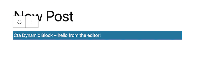
Go ahead and run the npm run start in your block and activate your new plugin in the WordPress admin. Create a fresh page and add it so that you can verify everything is set up correctly and working as expected. You should see basically the same default block from lesson 01.
Modeling our block data
The first step in building our new block is to model our data attributes. This block is going to have quite a few, but we’ll walk through them below:
NOTE: You may remember from an earlier lesson we talked about optimizing attributes with source/selector. This ONLY applies to static blocks. Since dynamic blocks do not store markup and only store an object with attribute values we don’t need to fuss with pulling attributes out of html.
	"supports": {
		"html": false,
		"align": ["wide"]
	},
	"attributes": {
		"image_id": {
			"type": "number"
		},
		"image_url": {
			"type": "string"
		},
		"heading": {
			"type": "string"
		},
		"body": {
			"type": "string"
		},
		"link": {
			"type": "object",
			"default": {
				"title": "Learn More"
			}
		}
	},
First off, we are adding wide alignment support, since this block will look best in a wide layout.
Then we are storing both the image ID and URL so that we have quick easy access to both. we’ll also store the heading and body text which will become RichText components.
Finally, for our button we are going to store an object attribute with the text, url, and target attribute. We are also giving it a default title value so that our button has some text when it is first inserted.
Normally, I try to keep attributes flat primitives like string and number when possible, but the link control component we will use from Gutenberg actually works best with an object.
The tradeoff with nested attributes
Sometimes using the object type attribute is tempting just for organization. For instance we could have nested “id” and “url” under an image attribute with the type of object like we did with the link. Just remember attributes work similar to react state, so when using objects you cannot do this:
link.url = "example.com" // BAD
setAttributes({link.url: "example.com"}) // Also BAD
If you use nested attributes you must use setAttribute and return a new object. Destructuring is the easiest way to accomplish this:
setAttributes({link: {...link, url: "example.com"}})Sometimes this is worth the tradeoff – the link attribute in question will work very nicely with the WordPress provided component – but often keeping attributes flat primitives will make your life easier down the road.
Building our block in the editor
Now that our attributes are ready to go, let’s start building our block in the edit.js file so that we can bring it to life in the editor.
Before we jump right in, I want to pause and address some decisions you will have to make when building more complex blocks.
Block Editor Zones
There are a lot of ways to add controls to blocks, and I want to highlight three “zones” below:
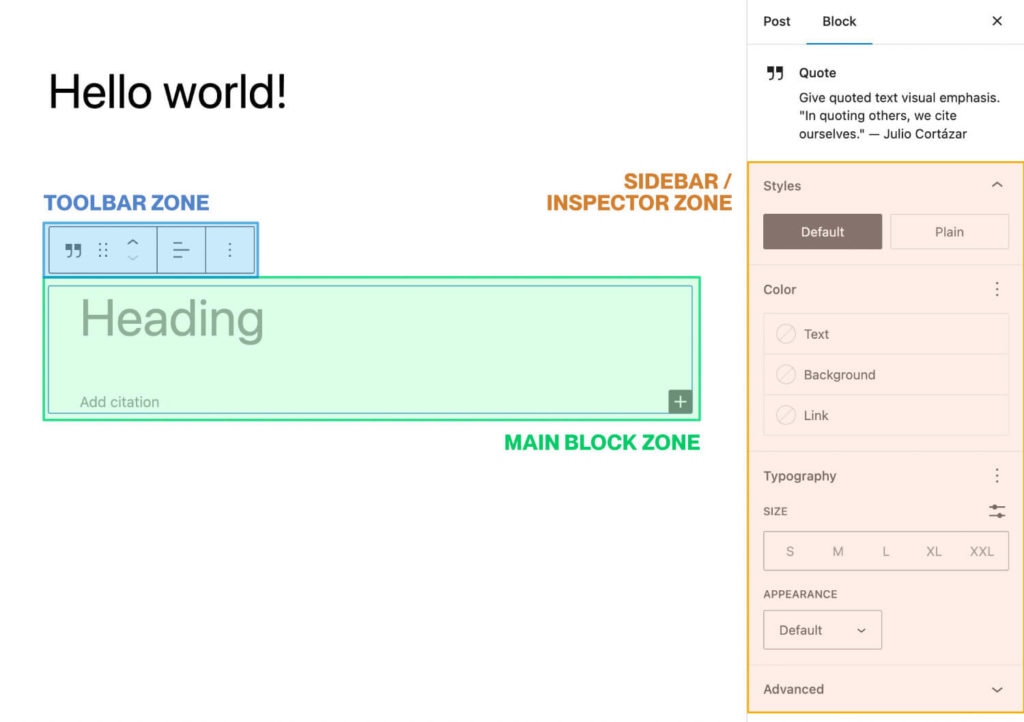
You can add controls to any of these zones, but there are some general best practices to follow:
Usually controls that affect attributes that contain actual content to be displayed should be in main block zone in an attempt to match the look of the front end of the site and make editing feel seamless. We’ve seen this with RichText in particular.
The toolbar and inspector zones are well suited to more abstract options. You have already seen how block supports we add will populate these zones, but you can add custom controls as well.
We’ll use the toolbar zone to control the url of our button (since this is not visible on the frontend). Later, we’ll use the inspector zone to add an option for controlling which side the image and text should be on.
Often whether to use toolbar vs. inspector just comes down to which works best presentationally with the control component you are using. For instance, if you want to use radio buttons for an option, that probably should go in the inspector since it needs more breathing room than the toolbar allows.
Building the block layout
Now that we’ve touched on block zones let’s start building the actual block. First, go ahead and empty out the current edit function, as well as the editor.scss and style.scss files.
Because I want to focus on the actual block building in this course, I’m going to have you copy finished styles into the style.scss file now. I’ve commented the file so you can see what everything is doing, but it is fairly straightforward css, so I don’t want to spend too much time on it.
Go ahead and copy the following into style.scss:
.wp-block-create-block-cta-dynamic-block {
display: flex;
width: 100%;
justify-content: center;
align-items: center;
// Style our image container
.cta-image-container {
width: 70%;
align-self: stretch;
position: relative;
// background as placeholder when no image present
background: #e5e5e5;
img {
position: absolute;
height: 100%;
width: 100%;
object-fit: cover;
top: 0;
left: 0;
}
}
// Style our text and button container
.cta-text-container {
box-sizing: border-box;
width: 50%;
margin-left: -20%;
margin-top: 50px;
margin-bottom: 50px;
z-index: 2;
background: white;
box-shadow: 4px 0px 20px rgb(0,0,0,0.15);
border-radius: 16px;
padding: 50px 32px;
h2 {
margin-top: 0;
}
}
.wp-element-button {
display: inline-block;
}
// Add styles for a text left variant based on classname
&.variant-text-left {
flex-direction: row-reverse;
.cta-image-container {
justify-content: flex-end;
}
.cta-text-container {
margin-left: 0%;
margin-right: -20%;
}
}
// Add responsive styles to stack on mobile for both layout variants
@media (max-width: 768px){
&.variant-text-left, &.variant-text-right {
flex-direction: column;
.cta-image-container {
width: 100%;
aspect-ratio: 1.25;
}
.cta-text-container {
width: 90%;
margin-left: 0;
margin-top: -50px;
}
}
}
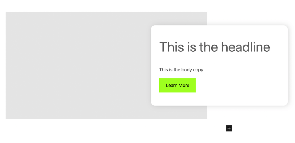
}Now that our styles are in place we can start building out the block and see it come to life in the editor. Let’s add the basic markup for the main block zone:
import {useBlockProps, RichText } from '@wordpress/block-editor';


export default function Edit({attributes, setAttributes}) {
	return (
		<div { ...useBlockProps() }>
			<div className='cta-image-container'>
				{/* Image will go here */}
			</div>
			<div className='cta-text-container'>
				<RichText
					tagName='h2'
					allowedFormats={[]}
					value={attributes.heading}
					onChange={(heading) => setAttributes({heading})}
					placeholder='This is the headline'
				/>
				<RichText
					tagName='p'
					allowedFormats={[]}
					value={attributes.body}
					onChange={(body) => setAttributes({body})}
					placeholder='This is the body copy'
				/>
				<RichText
						tagName='div'
						className='wp-element-button'
						allowedFormats={[]}
						value={attributes.link.title}
						onChange={(newTitle) => setAttributes({link: {...attributes.link, title: newTitle}})}
						placeholder='Button text'
					/>
			</div>
		</div>
	);
}
This should look pretty familiar. We are using useBlockProps on the outermost div, then we have a div where our image will go. Finally, we have a div with all of our text content where we are using RichText to control and hook into our attributes.
For our button, we are using RichText and outputting a div with the class of .wp-element-button. This is how WordPress renders the default button block, so this way our button inherits those styles. Also note how we are saving the title by de-structuring the “link” attribute. Anytime you use non-primitive attributes like arrays or objects you must always return a new object or array rather than directly update a property.
Go ahead and make sure your block compilation task is running and pull up your sample page and add our dynamic CTA block. (Don’t forget to activate the plugin if you haven’t already).
Awesome, our block is looking good! Next up, let’s add the image control.
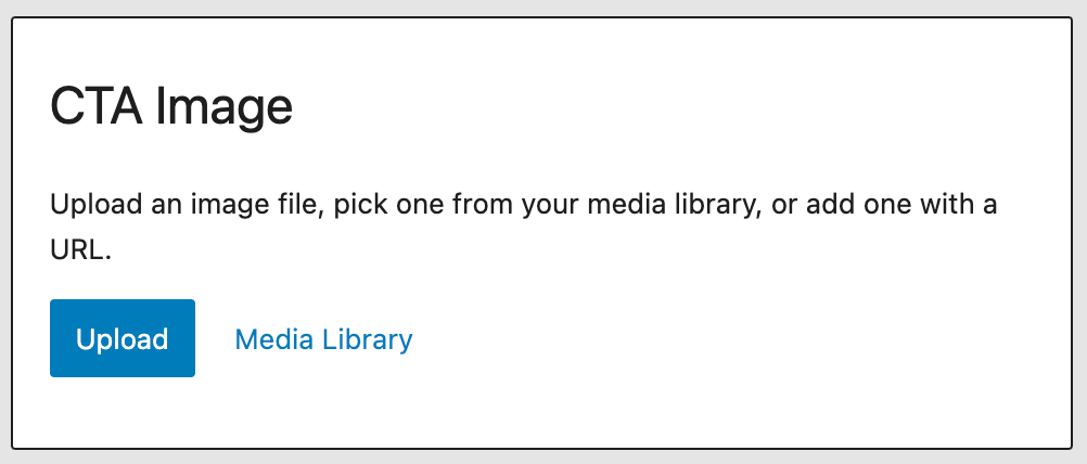
Adding images with the media placeholder component
There are actually a lot of different components you can leverage to hook into the WordPress media library, but the media placeholder element is my personal favorite in terms of UX.
The idea is it will render an interface to upload or select the image if we have not selected an image yet. If an image has been chosen we can instead show the actual image with a button to allow removing it as well.
We’ll use a ternary operator in our edit function in order to accomplish this. Let’s take a look at how we can get this working in our code.
Don’t forget to add the media placeholder element to our imports as well!
import { useBlockProps, RichText, MediaPlaceholder } from '@wordpress/block-editor';<div className='cta-image-container'>
{attributes.image_url && attributes.image_id ? (
<>
<img src={attributes.image_url} />
<button className="button-remove" onClick={() => setAttributes({image_url: "", image_id: null})}>Remove</button>
</>
) : (
<MediaPlaceholder
onSelect = {
( image ) => {
setAttributes( { image_url: image.url, image_id: image.id } );
}
}
allowedTypes = { [ 'image' ] }
multiple = { false }
labels = { { title: 'CTA Image' } }
>
</MediaPlaceholder>
)
}
</div>This component is very poorly documented unfortunately, but the most commonly used options are the “allowedTypes” (which you can set to any mimeType as well), and “multiple”, which can be set to true if you are creating a gallery or slideshow style block.
Basically we are just checking if an image already exists by checking our image ID and url attributes. If they are blank, we render the placeholder component. Otherwise, we render an image with a remove button. Clicking remove will empty out those attributes once again, so we can swap images.
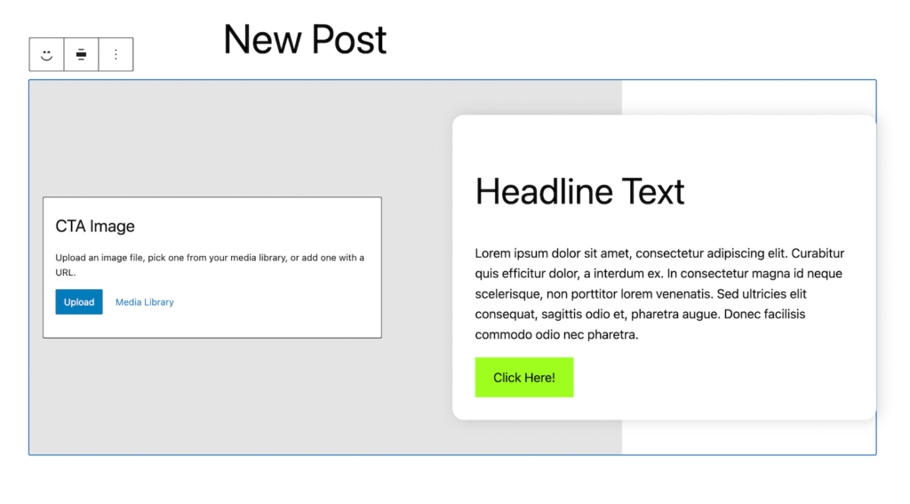
Go ahead and save and refresh the editor, you should see our new placeholder image component!
It’s a little bit wonky how the text box covers it up. This is a great example of when to use the editor.scss file.
Tweaking the editor css
We can add in some styles to position the placeholder component differently that won’t clutter up our production css.
// Adjust media placeholder element in editor

.cta-image-container {
	display: flex;
	align-items: center;
	padding: 20px;

	.block-editor-media-placeholder {
		width: 60% ;
	}
}
While we are in there, I’ll also go ahead and add some styles for our “remove” image button. Again, this only exists in the editor so it is a perfect application of editor.scss.
// add styles for image removal button
.button-remove {
z-index: 2;
position: absolute;
top: 20px;
left: 20px;
background: white;
color: #b93535;
border: 2px solid #b93535;
cursor: pointer;
border-radius: 4px;
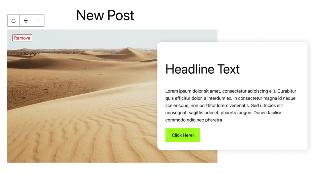
}If we select an image from our media library using our placeholder component now we get a nice little “remove” button as well!
Enjoying the read?
Join 500+ developers and learn modern WordPress, JAMStack, and javascript frameworks with a monthly development newsletter geared towards agencies and freelancers.
Adding a link option to our CTA button
We are going to add one more thing before switching gears to rendering the block on the front end of the site. We need to be able to add a url to our button in the CTA.
Similar to the Image upload interface there are several prebuilt link selection components that WordPress offers. You could just use a standard React controlled text input and let users paste in a url, but if we leverage some one of the WordPress components we get search/autocomplete for pages on the site for free.
I’m going to use the “LinkControl” component. We import this component from the “experimental” package, but don’t worry – this is the WordPress official recommended component for handling page links and URLs.
This component is built to be displayed in the toolbar zone as a “Popover” control. This means we’ll add a button to the toolbar that opens and closes our LinkControl component.
The final result will look like this:
NOTE: Sometimes the WordPress documentation can be a little frustrating when it comes to finding components and how to use them. Certain components only display correctly in certain contexts and it is not always clear from the docs.
In these cases, I will look at some of the core blocks (in this case the core button block) to see how components are implemented in the official Gutenberg package, and then model my own blocks from this.
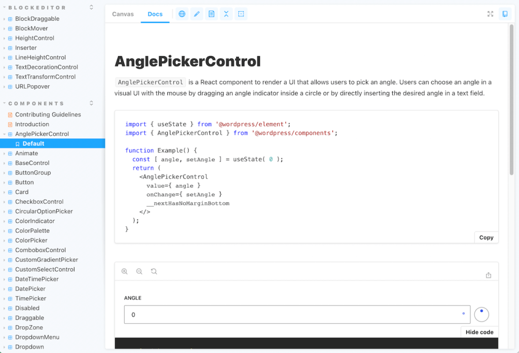
I also highly recommend looking through this storybook of available Gutenberg components as it gives you an idea of what is available for you to snag for your own creations. There are a ton of useful primitive components that will save you time, and make your block look more “WordPress native” than if you reinvent the wheel.
Hooking into the toolbar with the BlockControls component
Let’s take a look at how we add a LinkControl component to our toolbar.
First install the WordPress Icons package, we’ll use this for our toolbar button:
npm i @wordpress/iconsNext, update your edit.js file with the following code:
import { useBlockProps, RichText, MediaPlaceholder, BlockControls, __experimentalLinkControl as LinkControl } from '@wordpress/block-editor';

import { ToolbarGroup, ToolbarButton, Popover } from '@wordpress/components'

import { link } from '@wordpress/icons';

export default function Edit({attributes, setAttributes}) {

	return (
		<>
			{/* Begin Toolbar Zone */}
			<BlockControls>
				<ToolbarGroup>
					<ToolbarButton
						icon={ link }
						label="Link"
					/>
				</ToolbarGroup>
				<Popover>
						<LinkControl
							searchInputPlaceholder="Search here..."
							value={ attributes.link }
							onChange={ ( newLink ) => {
								setAttributes( { link: {...newLink, title: attributes.link.title || ""} } ) }
							}
						>
						</LinkControl>
				</Popover>
			</BlockControls>
			{/* End Toolbar Zone */}

			{/* Begin Main Block Zone */}
			<div { ...useBlockProps({className: `variant-${attributes.layout_variant}`}) }>
				{/* ... Main block content */}
			</div>
			{/* End Main Block Zone */}

		</>
	);
}
There is a LOT going on here, so let’s unpack it:
First off, we need to wrap our whole return statement in a React fragment ( <></> ) since you can only return one top level element in React and the BlockControls element that hooks into the toolbar needs to be at the same level as our main block markup.
Generally we’ll also want to wrap whatever we are adding with a ToolbarGroup element. This provides some base styling and alignment to make sure our button does not break or look funky inside the toolbar.
Inside the group, we can add a ToolbarButton. This is just a nicely styled button we can assign an icon to, from the package we just installed.
Also within our toolbar we have a Popover component. This works similar to the alignment button you are familiar with. You can click the toolbar button and it opens a menu with options.
At long last, within this popover is our actual LinkControl component. This will store the link as an object with url, title, and a couple of other attributes. The onChange will return an object for a new link with url, title, target, etc. We are overriding the title with the existing title attribute, which lets us control it via the RichText Component.
Go ahead and save and make sure there are no errors. You should see the component appear in the editor:
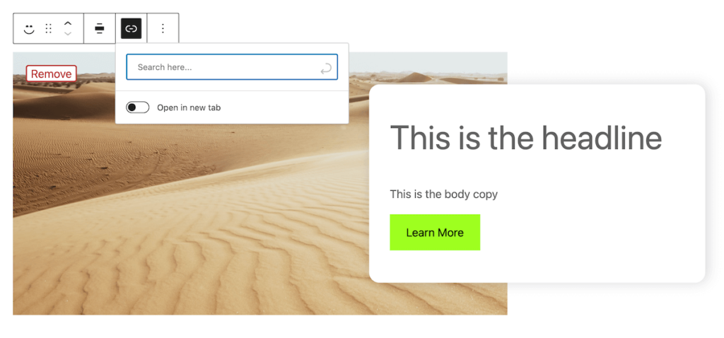
Right now, the popover is open all the time, which is a bit strange. Let’s actually hook it up to the button.
Making the Popover work with our button
To make the Popover appear and disappear when we click the toolbar button we will use traditional React state.
To get access to useState, or any other traditional React hook, we import it from the @wordpress/element package. This is already installed as part of @wordpress/scripts and is a direct wrapper for React.
WordPress wraps it so that it is future proofed in case the WordPress package forks from traditional React at some point down the road.
import { useState } from '@wordpress/element';Now we can update our Edit function to make use of this piece of state:
export default function Edit({attributes, setAttributes}) {

	const [ showLinkPopover, setShowLinkPopover ] = useState( false );
	const toggleLinkPopover = () => {
			setShowLinkPopover( ( state ) => ! state );
	};


	return (
		<>

			{/* Begin Toolbar Zone */}
			<BlockControls>
				<ToolbarGroup>
					<ToolbarButton
						icon={ link }
						label="Link"
						onClick={toggleLinkPopover}
						isPressed={showLinkPopover}
					/>
				</ToolbarGroup>
				{showLinkPopover && (
					<Popover>
						<LinkControl
							searchInputPlaceholder="Search here..."
							value={ attributes.link }
							onChange={ ( newLink ) => {
								console.log(newLink)
								setAttributes( { link: {...newLink, title: attributes.link.title || ""} } ) }
							}
						>
						</LinkControl>
					</Popover>
				)}
			</BlockControls>
			{/* End Toolbar Zone */}

                   {/* ... Rest of block markup */}
                </>
This should look like a very familiar pattern to you if you have used React before. We are simply making the ToolbarButton a controlled component to toggle whether our popover is open or not.
WordPress also provides us an isPressed attribute just to add some styles to the button to make it look active when the Popover is open. Finally, we conditionally render the popover based on this piece of state.
You can use this same pattern for modals, dropdowns, and other interactive controls within the editing interface.
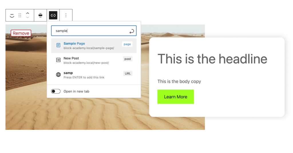
Hooray! Our link control is ready to go. Best of all it includes an autocomplete search of existing posts, and the ability to control whether urls open in a new tab, out of the box:
You can see all the info this component returns when you select a link by adding a console log as well:
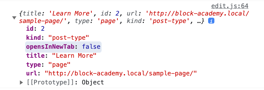
We will really just use the url and the opensInNewTab options since we are controlling the title through RichText.
You may be thinking that is a lot of work to add a url control… and it’s true… this is a relatively involved process. Don’t worry though, in the next few lessons we’ll see a few strategies to streamline our block development process.
Building the render template for our dynamic block
We now have our block looking nice in the editor and we can control and set all our attributes. Let’s switch gears into building out the front end block render template.
If you are a traditional WordPress developer and have used ACF with PHP in the past, you’ll find this refreshingly familiar.
I like to break out all my attributes at the top of the file and stick them into variables just to keep my template markup a little cleaner:
<?php
/**
* Dynamic Block Template.
*	@param   array $attributes - A clean associative array of block attributes.
* @param   array $block - All the block settings and attributes.
* @param   string $content - The block inner HTML (usually empty unless using inner blocks).
*/


$heading = $attributes["heading"];
$body = $attributes["body"];
$image_id = $attributes["image_id"];
$link = $attributes["link"];

?>


<div <?php echo get_block_wrapper_attributes(); ?>>
	<div class="cta-image-container">
		<?php echo wp_get_attachment_image( $image_id, "full" ); ?>
	</div>
	<div class="cta-text-container">
		<h2><?php echo $heading ?></h2>
		<p><?php echo $body ?></p>
		<a target="<?php echo $link["opensInNewTab"] ? '_blank' : '_self' ?>" href="<?php echo $link["url"] ?>" class="wp-element-button">
			<?php echo $link["title"] ?>
		</a>
	</div>
</div>
That’s it! Really the only new concept here is that we have a PHP function that outputs our “blockProps” called get_block_wrapper_attributes() . It functions just the same though – you should almost always use it on the outermost div.
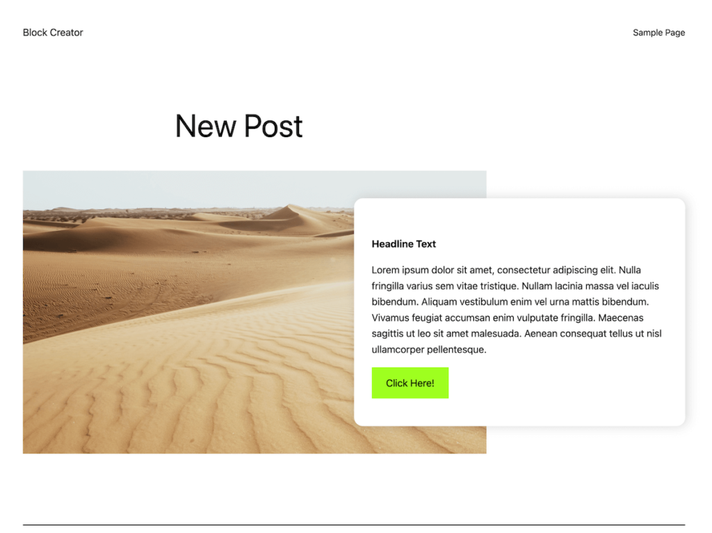
Go ahead and enter some data and save your post with your block and view it on the front end. It should look something like this:
Ready for the best part?
What if we want to change our title to just a bolded paragraph element? Simply change the render template:
<p><strong><?php echo $heading ?></strong></p>Now refresh the front end page, WITHOUT re-saving the post:
Boom. It’s updated. No deprecations, no resaves, no search/replace. This is what makes dynamic blocks such a powerful tool for developing sites for clients.
Quick Aside:
It’s important to note that this does come at a price. Static blocks are more performant since they require no interpretation on the server with PHP. That said, I’ve built lots of sites with exclusively dynamic blocks that score 100 on Lighthouse speed tests across the board.
As long as you follow basic PHP/WordPress best practices and are not running complex queries against a bunch of post metadata, dynamic blocks are still extremely performant.
For me this small tradeoff is 100000% worth it.
Adding layout options to our block
Let’s go one step further with this block. It would be great to be able to decide whether to display the text on the left vs. the right of the image.
We’ll follow similar steps to what we did above:
- Model our data and add attribute(s)
- Modify our edit function to be able to control the attribute(s)
- Update our render template to reflect the selected option of our block
Adding a layout attribute
First let’s add an attribute for selecting a layout:
	"attributes": {
		"layout_variant": {
      "type": "string",
			"enum": ["text-left", "text-right"],
			"default": "text-right"
		},
		"image_id": {
			"type": "number"
		},
		"image_url": {
			"type": "string"
		},
		"heading": {
			"type": "string"
		},
		"body": {
			"type": "string"
		},
		"link": {
			"type": "object"
		}
	},
This is a new way of declaring attributes without “type”. You can use “enum” when you want the attribute to always match a predetermined array of values.
Modify Our Edit Function
Now we can work this attribute into our edit function. I’m going to use the third control zone mentioned above – the inspector/side panel:
First, let’s add a few items to our imports. We’ll grab InspectorControls from the block editor package, and PanelBody and SelectControl from components:
import { __experimentalLinkControl as LinkControl, useBlockProps, RichText, MediaPlaceholder, BlockControls, InspectorControls } from '@wordpress/block-editor';

import { ToolbarGroup, PanelBody, SelectControl, ToolbarButton, Popover } from '@wordpress/components'
We’ll use these to build out our inspector controls zone:
<>
			{/* Toolbar Zone */}

			{/* Begin Sidebar Inspector Zone */}
			<InspectorControls>
				<PanelBody title="Settings">
					<SelectControl
						label="Layout Variant:"
						onChange={(val) => setAttributes({layout_variant: val})}
						value={attributes.layout_variant}
						options={
							[
								{
									label: "Text Right",
									value: "text-right"
								},
								{
									label: "Text Left",
									value: "text-left"
								}
							]
						}
					/>
				</PanelBody>
			</InspectorControls>
			{/* End Sidebar Inspector Zone */}

			{/* Main Block Zone */}

		</>
Much like how we accessed the toolbar, we add a new top level component (within the React fragment) called InspectorControls to hook into the sidebar area.
WordPress gives us some basic components we can leverage to make our controls look good. The PanelBody component provides a collapsible box to nest our controls inside with some default padding.
Then we can just follow typical workflows for creating controlled form elements in React using our attributes and setAttribute function.
This handles the control, now we need to output a class on the actual block markup based on our layout in the editor:
<div { ...useBlockProps({className: `variant-${attributes.layout_variant}`}) }>If you look back at our css file you can see this class just reverses the order of the blocks on desktop.
Great. now if you check out the block in the editor you’ll see we have a nice select control that will update the block layout in real time.
Modify our block render template
The final step is to modify our render template. We’ll do almost the exact same thing as the edit function (just in PHP instead). Using the get_block_wrapper_props() function we can add a class based on our layout selection:
<?php
// ... Rest of block setup
$layout_variant = $attributes["layout_variant"];
?>
<div <?php echo get_block_wrapper_attributes(["class" => 'variant-' . $layout_variant]); ?>>
<div class="cta-image-container">
<?php echo wp_get_attachment_image( $image_id, "full" ); ?>
</div>
<div class="cta-text-container">
<h2><?php echo $heading ?></h2>
<p><?php echo $body ?></p>
<a target="<?php echo $link["opensInNewTab"] ? '_blank' : '_self' ?>" href="<?php echo $link["url"] ?>" class="wp-element-button">
<?php echo $link["title"] ?>
</a>
</div>
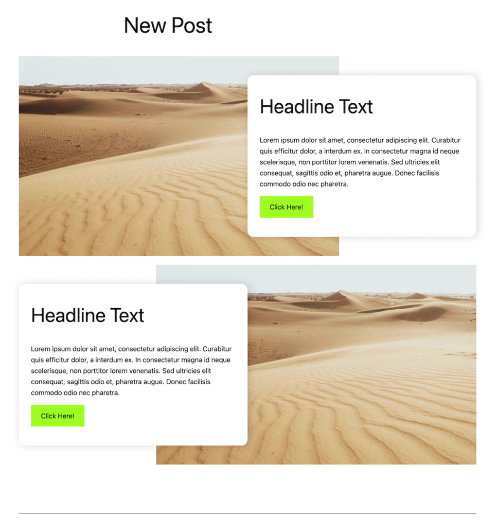
</div>Go ahead and add another instance of the block within the editor and swap its layout. When you save you should now have nice alternating call to action rows:
That’s it!
We’ve finished our dynamic CTA block. Give yourself a pat on the back if you made it through this full lesson. This is a long one, but I hope it gives you the confidence to start crafting some creative block solutions in your projects.
Recapping our process
Congrats again on finishing this lesson, it was a long one!
I want to take a moment and pause and recap the general process we followed, so that you can apply this to building your own blocks:
1. Model Attributes
The first step should always be figuring out what all your editable options are, and what data type will work best for them. I’d also add this is a good time to think about what block supports you want to include as well.
2. Pick components and zones
Once you know your attributes think about the editor experience. Would an attribute be best as RichText or a simple input? a Dropdown or a simple on/off toggle?
As you are considering this I highly recommend referencing this storybook that has tons of the existing Gutenberg components that you can browse and make use of in your own projects.
As you are selecting components to pair with your attributes, be sure to consider where they will be placed. Again, often certain components are specifically meant for the toolbar or sidebar so this may determine placement as well.
3. Build the editor experience
The next couple steps could be done out of order in theory, but I like to start by building out the editor experience in my edit.js file using the components I selected in the previous step.
Remember to start by placing styles in the style.scss file, only using the editor.scss for what specifically applies to the editor.
4. Build the render template
Finally, I usually copy a lot of the markup from my edit.js file into my render.php template and work through transforming any jsx into php logic instead. This helps keep the editor and frontend as similar as possible, rather than just writing the render template from scratch.
What’s next?
Next up, we’ll take this block and explore a method to simplify the code while making our block much more flexible.
What if the user wants to add two buttons? or a paragraph, a list, and then a couple of buttons?
We’ll tackle flexible block creation using inner blocks and block templates. This will be a fun and rewarding lesson as the code is actually less complex than what we just tackled.
Leave a Reply