In this lesson we’ll take a look at how to design more flexible custom blocks using Inner Blocks.
This technique also has an added benefit of speeding up your development workflow by leveraging existing blocks when applicable.
Note: This post is part of the Block Creator series. These lessons build on each other, so it is recommended to complete them in order to get the most out of the course.
You can find links to all the Block Creator lessons on the main course page. You can also download this finished code from the course Github repo in case you get stuck at any point.
Why use Inner Blocks?
Before we start converting our block, I want to go over the high level objectives for this process.
In our previous block we had a button as part of our CTA. If you recall, it was fairly time consuming to set up the button functionality in the editor. We had to add a toolbar component and a popover for our link control. Plus we had to manage a nested “link” attribute that contained the url, target, and link text.
What if our imaginary client decides they want to have the option for two buttons in their CTA for different user actions? This will be a bit of a headache.
We can save a lot of time and end up with a more flexible final product if we think about our custom block from a more atomic approach.
We can make our custom CTA block accept the WordPress buttons block as an “inner block”. This will allow users to add multiple buttons as needed. We also won’t have build out any of the toolbar and popover interface or manage the link attribute, as this will be deferred to the core buttons block instead.
Finally, another advantage is that as Gutenberg matures we are grandfathered into any enhancements to the button block – without needing to do anything on our end!
Setting up your block
In this lesson, rather than bootstrap a new block with @wordpress/create-block, we’ll be working from the dynamic block we created in lesson 4. You can also grab the finished lesson 4 block from the course Github repository.
We’ll be doing some fairly major modifications, so if you want to save a copy of your lesson 4 block, go ahead and duplicate the entire block directory now and move it out of your plugins folder. This way it won’t conflict as we work on this new version of the block with the same name.
Transitioning to Inner Blocks
In order to convert our block to use Inner Blocks instead of relying on our own internal attributes and components we have several steps.
During this process your block may appear broken in the editor, but worry not! Once the conversion is complete things will be working once again!
Let’s walk through how to add a modular area for InnerBlocks now:
1. Update Block.json
Since we are going to use the buttons block to handle our link, we can delete the link attribute from our block.json file – leaving our attributes looking like so:
	"attributes": {
		"layout_variant": {
			"enum": ["text-left", "text-right"],
			"default": "text-right"
		},
		"image_id": {
			"type": "number"
		},
		"image_url": {
			"type": "string"
		},
		"heading": {
			"type": "string"
		},
		"body": {
			"type": "string"
		}
	},
2. Update our Edit Function
Next, let’s update our edit function so that we can get our blocks working on the backend.
We’ll clear out all our old logic for the legacy button – that means deleting the entire Block Controls section as well as our useState logic for the popover and the final RichText that controlled our button text:
export default function Edit({attributes, setAttributes}) {

	// --- Begin Delete ---
	// const [ showLinkPopover, setShowLinkPopover ] = useState( false );
	// const toggleLinkPopover = () => {
	// 		setShowLinkPopover( ( state ) => ! state );
	// };
	// --- End Delete ---

	return (
		<>

			{/* --- Begin Delete --- */}
			{/* Begin Toolbar Zone */}
			{/* <BlockControls>
				<ToolbarGroup>
					<ToolbarButton
						icon={ link }
						label="Link"
						onClick={toggleLinkPopover}
						isPressed={showLinkPopover}
					/>
				</ToolbarGroup>
				{showLinkPopover && (
					<Popover>
						<LinkControl
							searchInputPlaceholder="Search here..."
							value={ attributes.link }
							onChange={ ( newLink ) => {
								console.log(newLink)
								setAttributes( { link: {...newLink, title: attributes.link.title || ""} } ) }
							}
						>
						</LinkControl>
					</Popover>
				)}
			</BlockControls> */}
			{/* End Toolbar Zone */}
			{/* --- End Delete --- */}

                       {/* ... Rest of component... */}
</>
)}
Nice! things are looking a lot simpler now, and we won’t need to add that much back in!
We’ll import the InnerBlocks component from the editor package:
import { useBlockProps, RichText, MediaPlaceholder, InspectorControls, InnerBlocks } from '@wordpress/block-editor';Then, we’ll replace the final RichText component where we stored our button text with the InnerBlocks component we just imported. Our final component will look like this:
export default function Edit({attributes, setAttributes}) {
return (
<>
{/* Begin Sidebar Inspector Zone */}
<InspectorControls>
<PanelBody title="Settings">
<SelectControl
label="Layout Variant:"
onChange={(val) => setAttributes({layout_variant: val})}
value={attributes.layout_variant}
options={
[
{
label: "Text Right",
value: "text-right"
},
{
label: "Text Left",
value: "text-left"
}
]
}
/>
</PanelBody>
</InspectorControls>
{/* End Sidebar Inspector Zone */}
{/* Begin Main Block Zone */}
<div { ...useBlockProps({className: `variant-${attributes.layout_variant}`}) }>
<div className='cta-image-container'>
{attributes.image_url && attributes.image_id ? (
<>
<img src={attributes.image_url} />
<button className="button-remove" onClick={() => setAttributes({image_url: "", image_id: null})}>Remove</button>
</>
) : (
<MediaPlaceholder
onSelect = {
( image ) => {
setAttributes( { image_url: image.url, image_id: image.id } );
}
}
allowedTypes = { [ 'image' ] }
multiple = { false }
labels = { { title: 'CTA Image' } }
>
</MediaPlaceholder>
)
}
</div>
<div className='cta-text-container'>
<RichText
tagName='h2'
allowedFormats={[]}
value={attributes.heading}
onChange={(heading) => setAttributes({heading})}
placeholder='This is the headline'
/>
<RichText
tagName='p'
allowedFormats={[]}
value={attributes.body}
onChange={(body) => setAttributes({body})}
placeholder='This is the body copy'
/>
<InnerBlocks />
</div>
</div>
{/* End Main Block Zone */}
</>
);
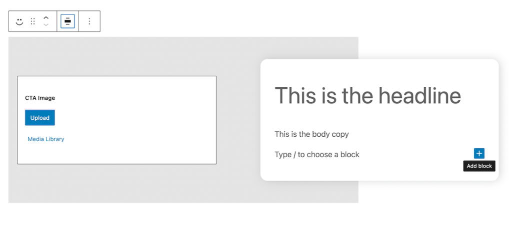
}This will allow us to insert blocks where our button used to be, but right now any inner blocks we add won’t be saved. This makes sense, since they are not associated with an attribute. Let’s fix this.
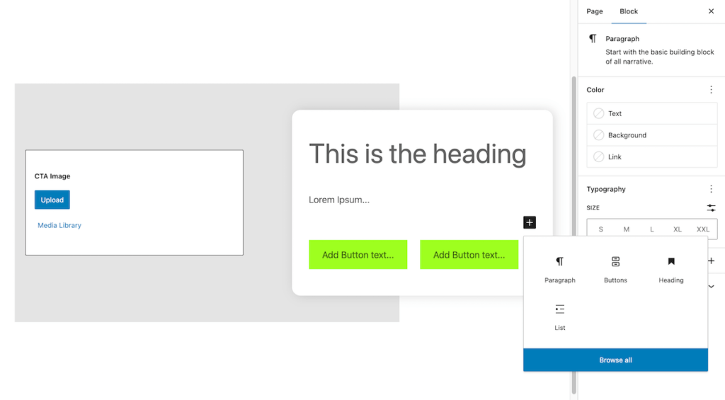
3. Add a save function to store the child blocks
In dynamic blocks, we usually have the “save” function return null since we are not storing block markup in the database – just attribute values. When we use Innerblocks with dynamic blocks we want to save the markup for the child blocks in the database as well as our attributes.
To accomplish this we’ll open up the main index.js file and swap out the return null statement. Instead, we’ll return the InnerBlocks.Content component, which will provide the raw markup of the child blocks to the save function.
import { registerBlockType } from '@wordpress/blocks';

import {  InnerBlocks } from '@wordpress/block-editor'

import './style.scss';

import Edit from './edit';
import metadata from './block.json';


registerBlockType( metadata.name, {
	edit: Edit,
	save: props => {
		return <InnerBlocks.Content />
	}
});
Don’t forget to import InnerBlocks as well!
Now we will be able to add child blocks into our CTA block and saving will persist the changes.
Customizing Inner Block Options
By default, the InnerBlocks component allows the user to insert any block wherever it is placed. This is not very useful for us, since it opens the door to all kinds of broken layouts if the user nests super complex block structures. We want to control this and curate the options available.
There are three arguments we can use to harness the InnerBlocks component:
allowedBlocks– This accepts an array of blocks that will be available to insert.template– Here we can define the default child blocks that are already inserted when our block is created – as well as the attributes for each of those blocks.templateLock– This allows us to lockdown the ability to modify the blocks provided in our starting template. There are a couple options here that we’ll explore more in depth later in this course. You can also find more details in the documentation.
For now, we want to only allow the Buttons block and we’ll go ahead and provide a template with two buttons inserted since this was our imaginary client request. We won’t use templateLock for now, but we’ll cover that option more in depth in future lessons.
You can provide these options directly to the component, but for readability I like to declare them as variables outside of my return statement. Then I just pass those variables into the component.
	const ALLOWED_BLOCKS = [ 'core/buttons' ];

	const MY_TEMPLATE = [
		['core/buttons', {},
			[
				['core/button', {placeholder: "Add Button text..."}],
				['core/button', {placeholder: "Add Button text..."}],
			]
		],
];Note: the way the buttons block works is actually using Innerblocks itself as well! You can see in our template we have a “buttons” block with two child “button” blocks. We’ll use a model like this to create a slideshow block in future lessons.
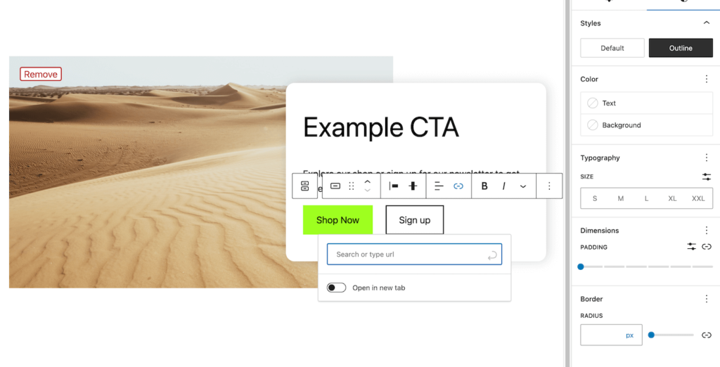
Now if you save, refresh the editor, and insert our CTA block – you should see it appear with two buttons by default:
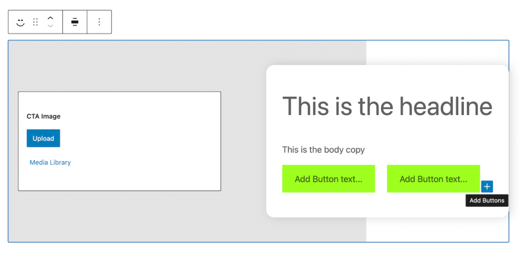
You can delete or add more buttons as needed, but the inserter won’t allow you to add anything else that could break our layout.
We can now add urls individually to each button block using a familiar interface to our old block, but we don’t have to manage any of it! We also can use the built in block styles to differentiate our two buttons – all core functionality.
This once again follows the WordPress principle of differing as much style as possible to the theme. We use the block simply to define the data and structure, so that it is portable between sites and will always look good.
Rendering our block on the front end
Up until now, we’ve just worried about the editor. Now we need to update our render.php file to have our new buttons reflected on the front end as well. Luckily this is super simple. If you followed the last lesson you may remember we added a comment at the top of the file to remind us about the PHP variables WordPress makes available in the render file:
<?php
/**
* Dynamic Block Template.
* @param   array $attributes - A clean associative array of block attributes.
* @param   array $block - All the block settings and attributes.
* @param   string $content - The block inner HTML (usually empty unless using inner blocks).
*/
You’ll notice $content sounds like exactly what we need. You can go ahead and just replace the old link tag and echo out $content instead.
<?php
/**
* Dynamic Block Template.
* @param   array $attributes - A clean associative array of block attributes.
* @param   array $block - All the block settings and attributes.
* @param   string $content - The block inner HTML (usually empty unless using inner blocks).
*/

$heading = $attributes["heading"];
$body = $attributes["body"];
$image_id = $attributes["image_id"];
$layout_variant = $attributes["layout_variant"];

?>

<div <?php echo get_block_wrapper_attributes(["class" => 'variant-' . $layout_variant]); ?>>
	<div class="cta-image-container">
		<?php echo wp_get_attachment_image( $image_id, "full" ); ?>
	</div>
	<div class="cta-text-container">
		<h2><?php echo $heading ?></h2>
		<p><?php echo $body ?></p>
		<?php echo $content; ?>
	</div>
</div>
You should now be able to add your own custom buttons, save, and see them reflected on the front end of the site!
Going even further with Inner Blocks
We now have a much more flexible CTA block, with much less complex code. This may actually be a perfect stopping point, but let’s go even further for the sake of demonstration.
What if we want to open up the flexibility of this block even more. Maybe the client wants to add a bulleted list of benefits for signing up to a newsletter? Or maybe they want to choose what heading level the title is?
To accomplish this we can get rid of our title and heading attributes and controls. Then we can open up our InnerBlocks component to allow headings, paragraphs, and lists as well as buttons.
Let’s breeze through the steps now that we know the basic idea:
Update theme.json to delete our old “heading” and “body” attributes:
	"supports": {
		"html": false,
		"align": ["wide"]
	},
	"attributes": {
		"layout_variant": {
			"enum": ["text-left", "text-right"],
			"default": "text-right"
		},
		"image_id": {
			"type": "number"
		},
		"image_url": {
			"type": "string"
		}
	},
Now update the edit file and get rid of the two old RichText controls:
				<div className='cta-text-container'>
					{/* --- BEGIN DELETE ---
					<RichText
						tagName='h2'
						allowedFormats={[]}
						value={attributes.heading}
						onChange={(heading) => setAttributes({heading})}
						placeholder='This is the headline'
					/>
					<RichText
						tagName='p'
						allowedFormats={[]}
						value={attributes.body}
						onChange={(body) => setAttributes({body})}
						placeholder='This is the body copy'
					/>
					--- END DELETE ---*/}

					<InnerBlocks
						allowedBlocks={ ALLOWED_BLOCKS }
						template={MY_TEMPLATE}
					/>
				</div>
Still in the edit file, we can update our allowed blocks and template to add this functionality:
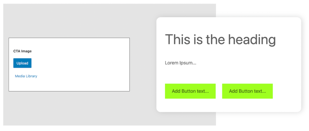
	const ALLOWED_BLOCKS = [ 'core/buttons', 'core/paragraph', 'core/heading', 'core/list' ];

	const MY_TEMPLATE = [
		['core/heading', {placeholder: "This is the heading"}],
		['core/paragraph', {placeholder: "Lorem Ipsum..."}],
		['core/buttons', {},
			[
				['core/button', {placeholder: "Add Button text..."}],
				['core/button', {placeholder: "Add Button text..."}],
			]
		],
	];
Finally, we just need to empty out the old heading and paragraph markup in our render file since everything will now come through the $content variable.
<?php
/**
* Dynamic Block Template.
* @param   array $attributes - A clean associative array of block attributes.
* @param   array $block - All the block settings and attributes.
* @param   string $content - The block inner HTML (usually empty unless using inner blocks).
*/


$image_id = $attributes["image_id"];
$layout_variant = $attributes["layout_variant"];

?>


<div <?php echo get_block_wrapper_attributes(["class" => 'variant-' . $layout_variant]); ?>>
	<div class="cta-image-container">
		<?php echo wp_get_attachment_image( $image_id, "full" ); ?>
	</div>
	<div class="cta-text-container">

		<?php echo $content; ?>

	</div>
</div>
You can also delete the old attribute variables at the top of the file keeping only the $image_id and $layout_variant variables.
Go ahead and save all your files, refresh the editor and insert a new instance of the block:
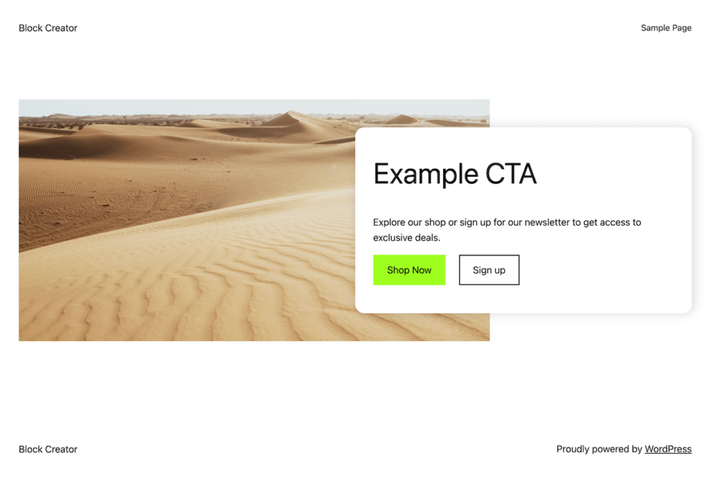
It should look relatively similar to our starting point since we set up our template to mimic the old block. Now however, you can change the heading, add a list component, etc…
Closing Considerations
In this last section, we opened our block up to be extremely flexible. Sometimes this is great, and will save you time, but often it is a balance between flexibility and curation.
After our last modifications a user could do some weird stuff, like have an H6 heading followed by a button, then a paragraph, and finally another H1 heading:
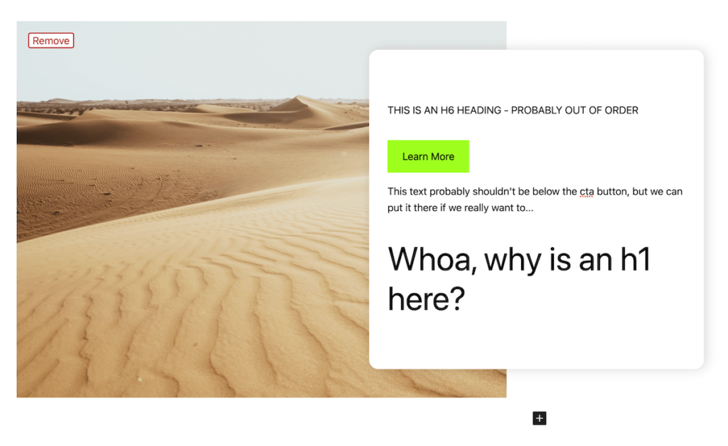
Granted, it’s fairly unlikely someone would choose to do this. The point is that adding flexibility comes at the cost of removing training wheels or safety bumpers – whatever you want to call it.
It is often up to interpretation exactly where the perfect balance lies. In the real world, I probably would keep this block tied down with a heading and paragraph tied to attributes, but allow InnerBlocks for buttons – like we had it in the first section of this lesson.
That’s not to say that this is the more ‘correct’ way to do things though!
Realistically your choices will likely be dependent on the end-user/client and what makes the most sense for them.
That’s it!
I hope you’ve enjoyed this lesson. Getting a grasp on how to leverage Inner Blocks will level up you block creation abilities exponentially.
Next up, we’ll continue using Inner Blocks, but with a new paradigm. We’ll create a specific child/parent block pair in order to create a dynamic slideshow. Through doing this, we’ll also see how to handle custom front end javascript for your blocks.
Leave a Reply