Astro has been the hottest new framework on the block for a little while now, in this post we’ll explore how to hook it up with WordPress to create headless sites, combining a slick modern dev experience with the world’s most ubiquitous CMS.
This will be a couple of installments. In this first post, we’ll set up the classic starter blog project. In future posts, we’ll look at setting up custom post types and custom fields and more advanced/real-world implementations beyond personal sites.
Note: this article assumes some very basic familiarity with both WordPress and Astro. I will try to explain Astro concepts as we go, but if you are completely new to Astro I highly recommend this crash course which will cover all the basics and even some advanced stuff as well.
Let’s jump right in!
Setting up WordPress
For this write up, we’ll be using Astro in the Static Site Generation mode. What this means is that your WordPress instance will not get hit with requests, except when you build your application. For development purposes, this means you can go ahead and just spin up a local WordPress site using your favorite tool (I recommend local if you are looking for a beginner friendly/zero-config option). No need to set up real web hosting unless you want to.
Go ahead and set up your own blank WordPress install, then install the following plugins:
- FakerPress – this will just allow you to generate a handful of sample posts super quickly
- WPGraphQL – You can set up headless WordPress with just the built in REST API, but using WPGraphQL will improve the dev experience on the Astro side significantly.
Generating our starter content in WordPress
Once you install FakerPress you can navigate to the “posts” page within the plugin to generate some dummy content for us to use. Just set the number of posts you want to create and set the date range to sometime in the past:
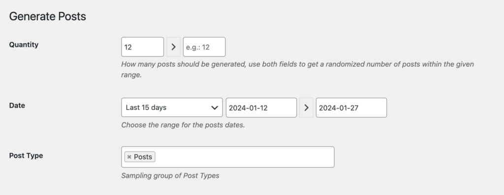
The rest of the settings you can leave at their defaults, but also feel free to look through and modify if you want. This is a super powerful plugin and lets you quickly create all kinds of content for development purposes.
Great, now we are going to set WordPress aside for a moment and set up Astro.
Getting Started with Astro
The Astro documentation is one of the things I love about the framework, so definitely take a look if you haven’t. I commonly reference it for a variety of things.
We’ll start off with the simple init command and follow the prompts:
npm create astro@latest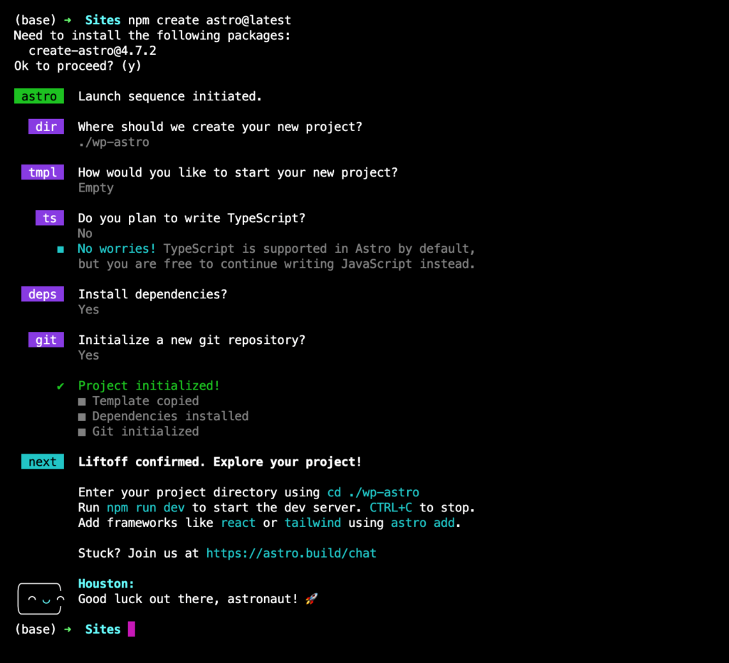
I’m doing a blank site so we don’t have to remove and extra content etc… but if you are new to Astro it might be helpful to use the starter instead to get a sense for how everything works together.
I’m also not using typescript for this project. Normally I would recommend taking advantage of it, but I don’t want to add too much complexity and instead want to focus on the core setup for Astro + WordPress.
Once the install finishes go ahead and open up the project in your code editor. You can run rpm run dev to launch the development process, but there is not much to look at just yet!
Adding Tailwind CSS to our Astro Project
Since styling is not the point of this article I’m not going to spend too much time on it, but adding Tailwind is truly a breeze with the Astro plugin system. All you need to do is run the following command:
npx astro add tailwindIt will ask you to confirm the actions it is about to take as it installs tailwind, creates the needed config files, and sets everything up so you are ready to go!
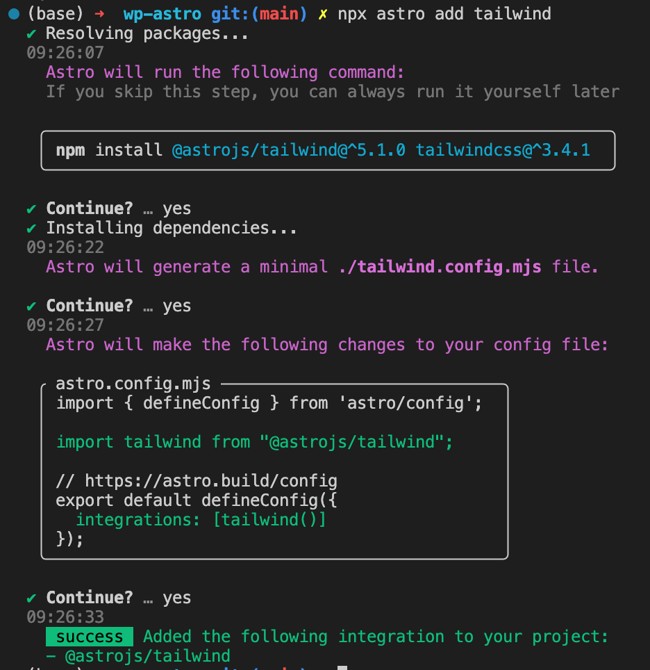
The plugin ecosystem is one of the things I love about Astro. It really doesn’t get much easier than this!
Creating our templates
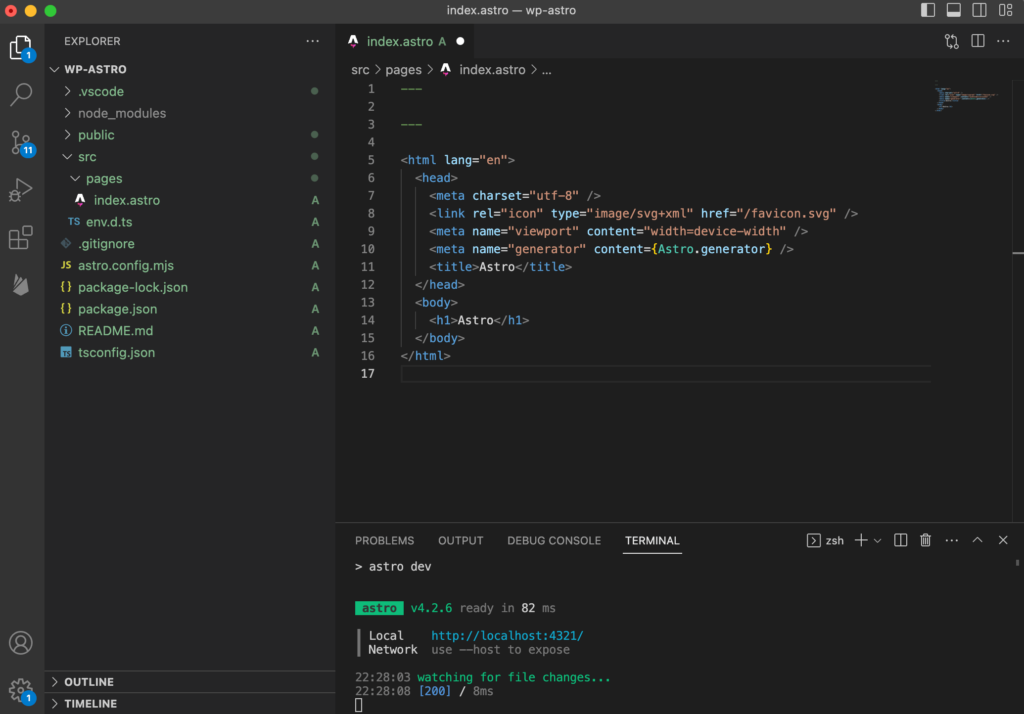
Go ahead and open your Astro project in your code editor. When working with Astro almost all the action will be in the src directory.
Astro uses file based routing, just like many of the other javascript frameworks out there. Any *.astro file in the pages directory will be treated as a page. You can see there is a very basic boilerplate set up in the pages/index.astro file to start us off.
You’ll notice at the top of the .astro file there is the set of “—” dividers. Between these you can run server side javascript and import other .astro components. We’ll get into this a little later, but for now, just know that .astro files always start with this pair of triple dashes.
Go ahead and run npm run dev and you’ll be able to see just an unstyled page that just says “Astro” in the browser. We can confirm tailwind is working properly by adding a class of “text-red-500” to the heading element and making sure the color updates.
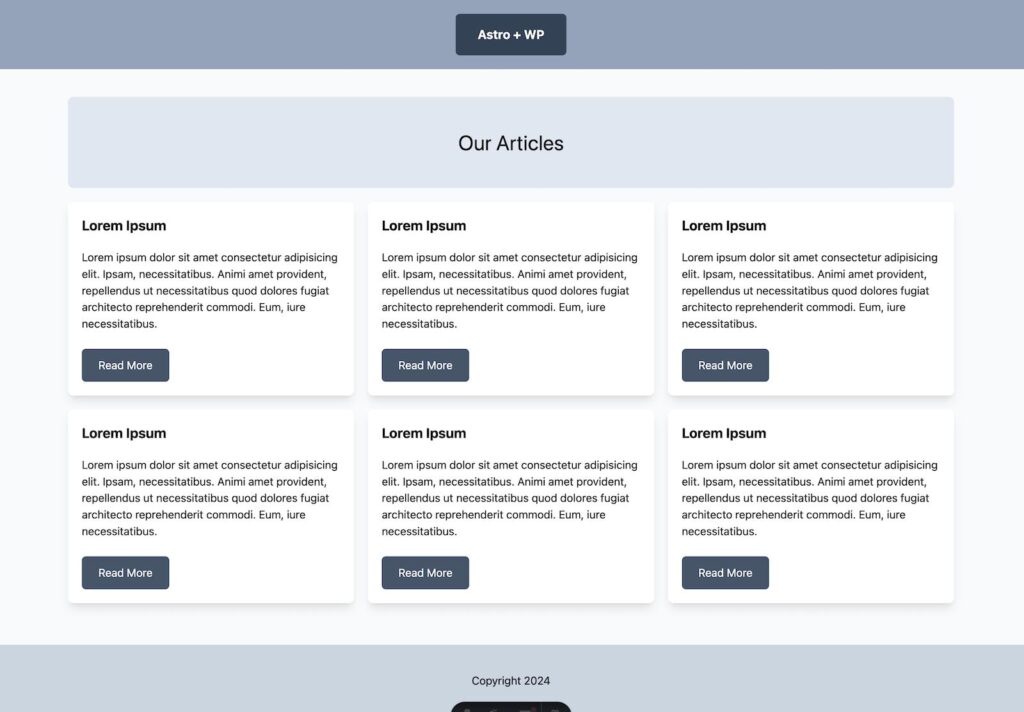
Let’s replace what is currently in the index.astro file with some static markup that we will use as the starting point for our blog:
---
---
<html lang="en">
	<head>
		<meta charset="utf-8" />
		<link rel="icon" type="image/svg+xml" href="/favicon.svg" />
		<meta name="viewport" content="width=device-width" />
		<meta name="generator" content={Astro.generator} />
		<title>Astro + WP</title>
	</head>
	<body>
		<header class="bg-slate-400 py-5 px-10 text-center">
			<a class="text-lg font-bold inline-block bg-slate-700 text-white py-4 px-8 rounded-md" href="/">Astro + WP</a>
		</header>
		<main class="bg-slate-50 py-10 px-4">
			<div class="container mx-auto">

				<div class="bg-slate-200 rounded-lg py-12">
					<h1 class="text-center text-3xl">Our Articles</h1>
				</div>

				<div class="flex flex-wrap pt-5 -mx-2.5">
					<div class="lg:w-1/3 px-2.5 mb-5">
						<article class="rounded-lg bg-white shadow-lg p-5">
							<h2 class="text-xl font-bold mb-5">Lorem Ipsum</h2>
							<p class="mb-6">Lorem ipsum dolor sit amet consectetur adipisicing elit. Ipsam, necessitatibus. Animi amet provident, repellendus ut necessitatibus quod dolores fugiat architecto reprehenderit commodi. Eum, iure necessitatibus.</p>
							<a class="inline-block bg-slate-600 text-white rounded-md px-6 py-3 hover:bg-slate-500" href="#">Read More</a>
						</article>
					</div>
				</div>
			</div>
		</main>
		<footer class="bg-slate-300 py-10 px-4 text-center">
			<div class="container mx-auto">
				Copyright 2024
			</div>
		</footer>
	</body>
</html>
If you check in the browser now you should see the beginnings of a blog index page taking shape. It’s a bit ugly, but design is not the focus of this post, so we can roll with it!
Working with Astro components
The page looks fine for now, but having everything in the index.astro file doesn’t really make sense as we’ll have to copy the header/footer etc. for our single post template as well.
We can do a lot better by creating a layout, and breaking our header and footer into components.
First, let’s create a folder called components in the src directory. Then create a Layout.astro file inside.
Note: There is a common convention to have a “layouts” folder in addition to the “components” folder, but for this project we will only have one layout, so I’m keeping it simple.
Copy everything from index.astro into our new layout. Then delete everything inside the ‘container’ div, since this will be our main content area that will change between pages.
We’ll replace what was in there with a simple <slot /> tag. This will display whatever we wrap in the Layout component in our pages. It is equivalent to the “children” prop if you are used to React/Gutenberg.
---
---

<html lang="en">
	<head>
		<meta charset="utf-8" />
		<link rel="icon" type="image/svg+xml" href="/favicon.svg" />
		<meta name="viewport" content="width=device-width" />
		<meta name="generator" content={Astro.generator} />
		<title>Astro + WP</title>
	</head>
	<body>
		<header class="bg-slate-400 py-5 px-10 text-center">
			<a class="text-lg font-bold inline-block bg-slate-700 text-white py-4 px-8 rounded-md" href="/">Astro + WP</a>
		</header>
		<main class="bg-slate-50 py-10 px-4">
			<div class="container mx-auto">

        <slot />

      </div>
    </main>
    <footer class="bg-slate-300 py-10 px-4 text-center">
      <div class="container mx-auto">
        Copyright 2024
      </div>
    </footer>
  </body>
</html>
Now, we can go back to our index.astro page and update it to use this layout:
---
import Layout from "../components/Layout.astro";
---

<Layout>
	<div class="bg-slate-200 rounded-lg py-12">
		<h1 class="text-center text-3xl">Our Articles</h1>
	</div>

	<div class="flex flex-wrap pt-5 -mx-2.5">
		<div class="lg:w-1/3 px-2.5 mb-5">
			<article class="rounded-lg bg-white shadow-lg p-5">
				<h2 class="text-xl font-bold mb-5">Lorem Ipsum</h2>
				<p class="mb-6">Lorem ipsum dolor sit amet consectetur adipisicing elit. Ipsam, necessitatibus. Animi amet provident, repellendus ut necessitatibus quod dolores fugiat architecto reprehenderit commodi. Eum, iure necessitatibus.</p>
				<a class="inline-block bg-slate-600 text-white rounded-md px-6 py-3 hover:bg-slate-500" href="#">Read More</a>
			</article>
		</div>
	</div>
</Layout>
Great, if you refresh the front end everything should still look the same, but now we have a shared layout we can use.
We can take this one step further by abstracting out our header and footer components too.
Create a Header.astro file and Footer.astro file inside the components directory. Go ahead and cut the header and footer out of the Layout.astro file and add them to their new files respectively.
---
---

<header class="bg-slate-400 py-5 px-10 text-center">
  <a class="text-lg font-bold inline-block bg-slate-700 text-white py-4 px-8 rounded-md" href="/">Astro + WP</a>
</header>
---
---
<footer class="bg-slate-300 py-10 px-4 text-center">
<div class="container mx-auto">
Copyright 2024
</div>
</footer>Finally, import them into the layout file and replace where the markup for each used to be:
---
import Footer from "./Footer.astro";
import Header from "./Header.astro";
---

<html lang="en">
	<head>
		<meta charset="utf-8" />
		<link rel="icon" type="image/svg+xml" href="/favicon.svg" />
		<meta name="viewport" content="width=device-width" />
		<meta name="generator" content={Astro.generator} />
		<title>Astro + WP</title>
	</head>
	<body>
    <Header />
		<main class="bg-slate-50 py-10 px-4">
			<div class="container mx-auto">

        <slot />

      </div>
    </main>
    <Footer />
  </body>
</html>
Nice. Refresh one more time after saving all the files to make sure everything looks good. Now all our templates are nice and clean.
Enjoying the read?
Join 500+ developers and learn modern WordPress, JAMStack, and javascript frameworks with a monthly development newsletter geared towards agencies and freelancers.
Pulling in our WordPress content
Let’s hook this up to WordPress and start seeing the headless implementation in action!
We’ll start with the home page – which will be a typical index page that lists all our blog posts.
Between the triple dash dividers of our astro files we can add javascript code that will be run at build time – again, this code does NOT get executed on the client by default, only at build time.
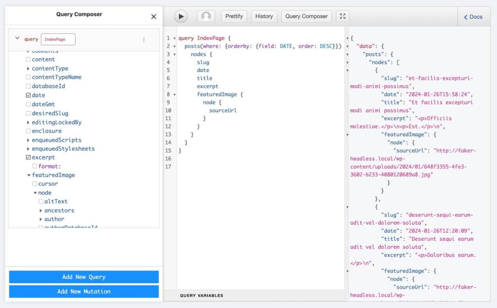
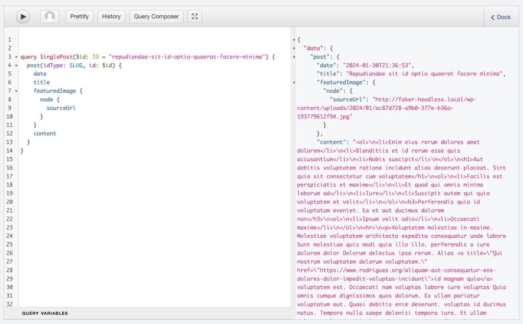
Hop into your WordPress install and go to the GraphQL plugin. Open the query builder and you can select exactly what you want from a request. We’ll name ours “Index Request” and select “posts” with the title and content to start.
The awesome thing with this plugin is you can click the play button right inside the interface and preview the response to your request:
This looks good, so let’s pull this request into our index.astro file.
First create a contants.js file in the src directory. We’ll store our WordPress api endpoint here and import it, so that we can use it across all our files – and update it easily when/if we move to production.
export const API_BASE_URL = "http://your-wordpress-install-url.local/graphql"Now we can copy over our GraphQL request and plug in the API_BASE_URL we just defined:
---
import Layout from "../components/Layout.astro";
import {API_BASE_URL} from "../constants"
const response = await fetch(API_BASE_URL,
{
method: 'POST',
headers: {'Content-Type':'application/json'},
body: JSON.stringify({
query: `
query IndexPage {
posts(where: {orderby: {field: DATE, order: DESC}}) {
nodes {
slug
date
title
excerpt
featuredImage {
node {
sourceUrl
}
}
}
}
}
`
}),
});
// destructure data from our JSON
const { data } = await response.json();
// assign the array of nodes to "posts" variable for usability
const posts = data.posts.nodes
console.log(posts)
---
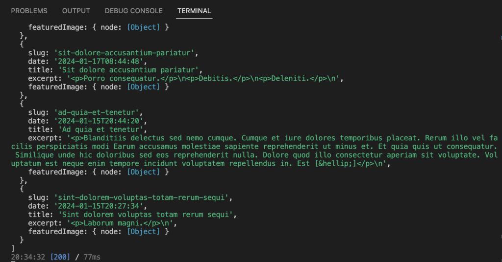
// ... Rest of templateTo start we’ll console.log the response to double check everything looks good. NOTE: the console.log is going to be in your terminal NOT in the browser inspector. Again, this is because this javascript is actually running at build time, not on the client.
You should see a similar response to what we saw inside the WordPress interface (you may need to reload the page):
Now, we can use this data in our page. Replace the hard-coded placeholder contents of the index.astro file with the following:
---
// ... Our fetch function etc...
---

<Layout>
	<div class="bg-slate-200 rounded-lg py-12">
		<h1 class="text-center text-3xl">Our Articles</h1>
	</div>

	<div class="flex flex-wrap pt-5 -mx-2.5">
		{posts.map(post => (
			<div class="lg:w-1/3 px-2.5 mb-5">
				<article class="rounded-lg bg-white shadow-lg p-5 h-full flex flex-col items-start justify-between">
					<div>
						<h2 class="text-xl font-bold mb-5">{post.title}</h2>
						<p class="mb-6">{post.excerpt.replace(/<(.|\n)*?>/g, '')}</p>
					</div>
					<a class="inline-block bg-slate-600 text-white rounded-md px-6 py-3 hover:bg-slate-500" href={`/${post.slug}`}>Read More</a>
				</article>
			</div>
		))}
	</div>
</Layout>
This should look fairly familiar if you’ve used React or done Gutenberg development. We are using “map” to iterate over our posts and outputting html for each to the page.
Our grid should be in place now with our dynamic content!
You may have noticed we aren’t using the featured image yet though… Let’s add that in.
Images in Astro
Astro allows several ways of dealing with images. You can read about all the options in the documentation.
Essentially, you can use standard <img> tags and host your images in your public folder or serve from a 3rd party domain if you want a simple solution, but we’re going to do something a little fancier using Astro’s built in <Image> component. Using this we’ll be able to pull down all our featured images from WordPress at build time and optimize them automatically.
Before we get started we need to make one configuration change. In the astro.config.mjs file we need to add our image domain settings – be sure to replace the domain with your own, and definitely use “https” for the protocol if you have ssl active (I just am using local without it for demo purposes):
export default defineConfig({
  integrations: [tailwind()],
  image: {
    domains: ["astro.build", "your-site.local"],
    remotePatterns: [{ protocol: "http" }],
  }
});
This just gives Astro the green light to pull down and serve images from the domains listed.
Great. Now hop into the index file again, we’ll import the image component and then use it in our template:
---
import { Image } from "astro:assets";
import Layout from "../components/Layout.astro";
import {API_BASE_URL} from "../constants"

const response = await fetch(API_BASE_URL,
  {
    method: 'POST',
    headers: {'Content-Type':'application/json'},
    body: JSON.stringify({
      query: `
				query IndexPage {
					posts(where: {orderby: {field: DATE, order: DESC}}) {
						nodes {
							slug
							date
							title
							excerpt
							featuredImage {
								node {
									sourceUrl
								}
							}
						}
					}
				}
      `
    }),
  });

// destructure data from our JSON
const { data } = await response.json();

//  assign the array of nodes to "posts" variable for usability
const posts = data.posts.nodes
---

<Layout>
	<div class="bg-slate-200 rounded-lg py-12">
		<h1 class="text-center text-3xl">Our Articles</h1>
	</div>

	<div class="flex flex-wrap pt-5 -mx-2.5">
		{posts.map(post => (
			<div class="lg:w-1/3 px-2.5 mb-5">
				<article class="rounded-lg bg-white shadow-lg p-5 h-full flex flex-col items-start justify-between">
					<div>
						<Image class="w-full object-cover aspect-2/3 mb-5" alt="" src={post.featuredImage.node.sourceUrl} width={600} height={400} />
						<h2 class="text-xl font-bold mb-5">{post.title}</h2>
						<p class="mb-6">{post.excerpt.replace(/<(.|\n)*?>/g, '')}</p>
					</div>
					<a class="inline-block bg-slate-600 text-white rounded-md px-6 py-3 hover:bg-slate-500" href={`/${post.slug}`}>Read More</a>
				</article>
			</div>
		))}
	</div>
</Layout>Note: the Image component requires a width and height to avoid CLS and optimize your image for you. It also requires the alt attribute to be present even if it is empty.
If you check the front end of the site you should now see your images getting pulled in!
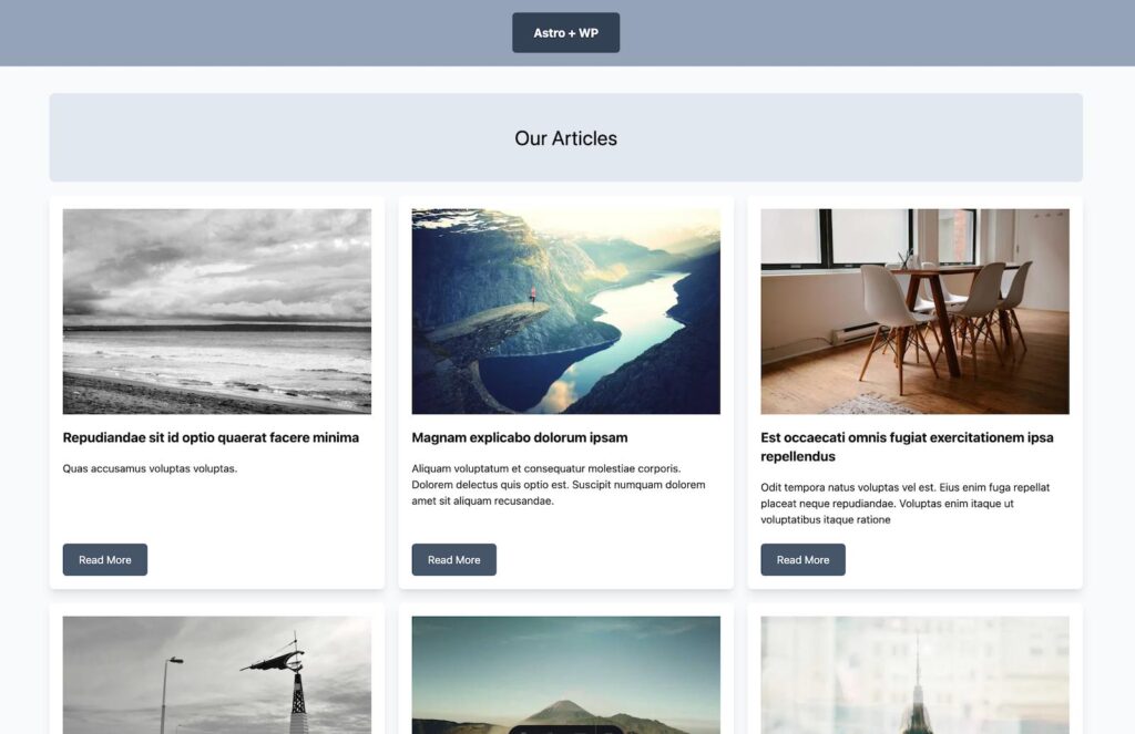
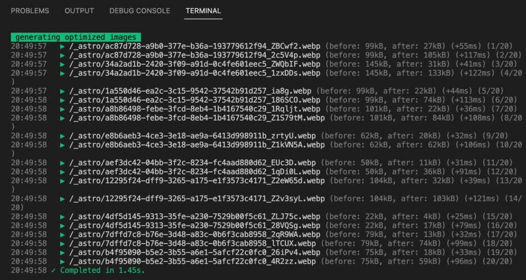
Here’s the super cool part though – they are not getting pulled from your WordPress site’s url. Stop the dev process and go ahead and run npm run build. You’ll see Astro converts to webP, optimizes, and saves all your featured images to disk.
Okay, at this point the index page is looking pretty good. If you click on the “Read More” button though, it will take you to the right URL, but will 404. Let’s shift gears and build the template for these individual pages now.
Using WordPress to generate our single posts
If you’ve used Next.js (with getStaticPaths) this next step will be very familiar to you. Since we are building everything ahead of time, we need to tell Astro all the single posts that we have and what their slug will be to generate static html files for each.
We’ll create a special template file called [slug].astro. Using the brackets lets Astro know this is a “dynamic” template.
Within our triple dash separators we now are going to grab all the slugs of our posts, and let Astro know to generate a page for each. At its most basic the idea is to do something like this:
---
export function getStaticPaths() {
  return [
    {params: {slug: 'post-1'}},
    {params: {slug: 'post-2'}},
    {params: {slug: 'post-3'}},
  ];
}

const { slug } = Astro.params;
---

<div>{slug}</div>
Where we return an array of all possible post slugs from getStaticPaths. The template will be used if the URL matches any of these – otherwise it will 404. Then we can grab the actual slug of the URL from the Astro Params object and use it in our template.
Let’s take a look at how to do this with a dynamic data source like WordPress. We’ll use a simplified version of our index query that just returns the slugs:
---
import {API_BASE_URL} from "../constants"
export async function getStaticPaths() {
  const response = await fetch(API_BASE_URL,
    {
      method: 'POST',
      headers: {'Content-Type':'application/json'},
      body: JSON.stringify({
        query: `
        query AllSlugs {
          posts {
            nodes {
              slug
            }
          }
        }
        `
      }),
    });

  // destructure data from our JSON
  const { data } = await response.json();

  //  assign the array of nodes to "posts" variable for usability
  const posts = data.posts.nodes

  // transform our array of {slug: "post-slug"} objects into an array of {params: {slug: "post-slug"}}
  const paths = posts.map(post => {
    return {params: post}
  })

  return paths
}

const { slug } = Astro.params;
---

<div>{slug}</div>
With this in place Astro knows all the correct URLs for your WordPress posts. If you click on a read more button now, it will not 404, it will show a page and output the current slug you are on.
Now we also just need a function to actually grab the data for our individual post. Let’s build it out in our GraphQL plugin. We’ll grab a post by its slug and then get the title, content, and featured image. You can preview it with the play button and make sure it looks good.
Then, let’s drop this in to our new template as well. We’ll grab the slug from the Astro.params object and pass that as our $id variable to get the right post data.
---
//...our static paths function

// Fetch the single post we landed on
const { slug } = Astro.params;

const singleResponse = await fetch(API_BASE_URL,
    {
      method: 'POST',
      headers: {'Content-Type':'application/json'},
      body: JSON.stringify({
        query: `
        query SinglePost($id: ID = "${slug}") {
          post(idType: SLUG, id: $id) {
            date
            content
            title
            featuredImage {
              node {
                sourceUrl
              }
            }
          }
        }
        `
      }),
    });

// destructure data from our JSON
const { data } = await singleResponse.json();

//  assign the post info to singlePost variable for usability
const singlePost = data.post
---
Finally, drop the following into our single post template below the triple dash section. This should look very straightforward. Don’t forget to import the Layout component and Image tag as well:
---
import { Image } from "astro:assets";
import Layout from "../components/Layout.astro";
// ... rest of our imports & fetch functions
---
<Layout>
<article class="max-w-screen-md mx-auto">
<div class="text-center w-auto mx-auto mb-5">
<p class="rounded-full bg-slate-300 py-2 px-4 inline-block">
{new Date(singlePost.date).toLocaleDateString('en-us', { year:"numeric", month:"long", day:"numeric"})}
</p>
</div>
<h1 class="text-center text-3xl text-bold mb-10">{singlePost.title}</h1>
<Image class="w-full object-cover aspect-2/3 mb-5" alt="" src={singlePost.featuredImage.node.sourceUrl} width={1500} height={1000} />
<!-- We can use the set:html directive with a self closing tag to output raw html -->
<div set:html={singlePost.content} />
</article>
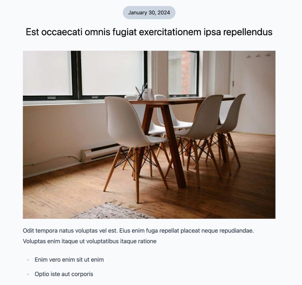
</Layout>We should see our new post template getting rendered!
You might notice that all the text is bunched up and unformatted though. This is because of the tailwind reset which removes all default styles from typography elements.
We can add some nice styling by using the tailwind typography plugin. First, go ahead and install the package with npm install -D @tailwindcss/typography.
Next we just have to add it to our tailwind config file:
/** @type {import('tailwindcss').Config} */
export default {
	content: ['./src/**/*.{astro,html,js,jsx,md,mdx,svelte,ts,tsx,vue}'],
	theme: {
		extend: {},
	},
	plugins: [require('@tailwindcss/typography')],
}
Finally, we can use the “prose” class on a container div to apply nice typography styles to all the text content within the container.
Let’s apply it to our template:
<Layout>

  <article class="max-w-screen-md mx-auto">

      <div class="text-center  w-auto mx-auto mb-5">
        <p class="rounded-full bg-slate-300 py-2 px-4 inline-block">
          {new Date(singlePost.date).toLocaleDateString('en-us', { year:"numeric", month:"long", day:"numeric"})}
        </p>
      </div>
      <h1 class="text-center text-3xl text-bold mb-10">{singlePost.title}</h1>
      <Image class="w-full object-cover aspect-2/3 mb-5" alt="" src={singlePost.featuredImage.node.sourceUrl} width={1500} height={1000} />
      <!-- We can use the set:html directive with a self closing tag to output raw html -->
      <div set:html={singlePost.content} class="prose lg:prose-lg" />

  </article>

</Layout>
Perfect! Now our posts look a lot nicer and we have sensible formatting for all our content.
Wrapping up
Congrats! You now have the beginnings of a modern headless WordPress setup with Astro.
Of course, there is a lot more we could do. In the next write up I’ll add pagination to our blog, and support for tags – with individual archive pages for each. Finally, in the third post in this series, we’ll add a custom post type with ACF custom fields and show how to link that up as well.
Ready to keep going? Continue with adding pagination and tags.
Leave a Reply