One of the most frequently cited limitations of the WordPress block editor is the lack of true responsive design options that are found in full fledged site builders like Elementor.
The WordPress editor opts for a slim approach, leveraging fluid design tools for spacing and typography that ideally reduce the need for having multiple breakpoints on the page.
I actually like this approach for content editors, since editing layout options for a bunch of device sizes can be overwhelming. That said, for some layouts the “collapse on mobile” control for the columns block is simply not enough.
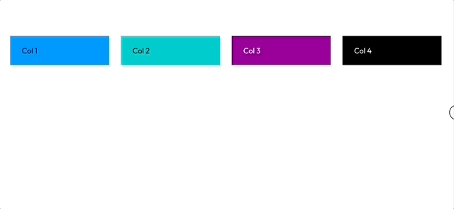
In this tutorial I’ll go over a method of extending the columns block to allow for an additional tablet breakpoint toggle, so that we can make more complex layouts like a 4-2-1 grid.
You could use this same approach to go even farther and add multiple extra breakpoint levels, or ordering controls as well – though I would advise being selective when using this technique to not clutter the interface.
How it works
The basic idea behind this approach is inspired by the “beyond block styles” series from Justin Tadlock.
First, we’ll simply set up a custom class that when applied to the columns block will cause it to collapse to full width at a breakpoint that we specify.
Then we’ll hook into the column block and add a toggle UI control. Behind the scenes, this simply toggles our custom class on/off.
Setting up a plugin to extend core blocks in WordPress
For this demo, we’ll use a plugin to add our additional breakpoint functionality. You could also house this within a theme if you prefer.
In a sandbox WordPress development environment, navigate to the wp-content/plugins/ directory. We’ll add a new folder for our plugin called “multi-breakpoint-columns”.
We’ll follow the WordPress standard setup for our plugin. Create an index.php file with the following boilerplate. Feel free to modify the info to your own name, website, etc:
<?php
/**
 * @wordpress-plugin
 * Plugin Name:       Multi Breakpoint Columns
 * Plugin URI:        https://fullstackdigital.io
 * Description:       Adds additional breakpoints to the core columns block
 * Version:           0.1.0
 * Author:            Anton Plauche
 * Author URI:        https://fullstackdigital.io
 * License:           GPL-2.0+
 * License URI:       http://www.gnu.org/licenses/gpl-2.0.txt
 * Text Domain:       mbpc
 * Domain Path:       /languages
 */

// If this file is called directly, abort.
if (!defined('WPINC')) {
	die;
}

/**
 * Current plugin version.
 */
define('MBPC_VERSION', '0.1.0');
Essentially, all our php is going to do is enqueue a javascript file for the block editor to add our custom control, and a css file for the frontend to handle the styles for collapsing on tablets.
Go ahead and add a “src” folder to contain our assets. I’ll make a separate css and js directory within this “src” folder as well to stay organized.
Styles for responsive columns
You can use your browser tools to inspect the core columns block and observe how the existing “collapse on mobile” toggle works.
Essentially all child elements are toggled to flex-basis: 100%; and the columns block itself has flex-wrap: wrap; added to it. This causes elements to default to full width and naturally stack on top of one another in an elegant way.
We’ll borrow this css for our tablet breakpoint as well. Go ahead and create a style.scss file within our css folder and add the following:
// Enable extra breakpoint for columns
.wp-block-columns.mbpc-collapse-tablet {
  @media(max-width: 1000px){
    flex-wrap: wrap !important;
    & > .wp-block-column {
      flex-basis: 100% !important;
    }
  }
}
You could modify this code depending on your needs, but for this demo we will have the columns collapse below 1000px and call this our “tablet” breakpoint. (personally, I don’t actually like naming breakpoints by device, but in this case it makes sense to follow WordPress’ mobile collapse point verbiage).
In a production project, it would make sense to create a setting to be able to customize your breakpoint size (or sizes), but that is beyond the scope of this write up, so we are just going to hard code it in the css so we can focus on extending block controls.
Go ahead and create an editor.js file within the “js” folder as well. For now let’s just log out a message to make sure it runs within the right context:
console.log("hello from mbpc plugin in the editor");Since we are going to use React and JSX in our javascript as well as SCSS, we need to setup a build process to compile these assets.
Setting up a build process
We’ll use my favorite @wordpress/scripts package to compile everything, but we’ll modify the setup just a little bit.
From within the main multi-breakpoint-columns directory initialize npm with:
npm init -yThen install the following packages:
npm i --save-dev @wordpress/scripts webpack-remove-empty-scripts pathNext, create a webpack.config.js. We can use this file to customize WP scripts to our liking:
//WordPress config
const defaultConfig = require("@wordpress/scripts/config/webpack.config.js");

const RemoveEmptyScriptsPlugin = require( 'webpack-remove-empty-scripts' );

const path = require( 'path' );

module.exports = {
  ...defaultConfig,
  entry: {
    "js/editor": path.resolve( process.cwd(), "/src/js",  "editor.js"),
    "css/style": path.resolve( process.cwd(), "/src/css",  "style.scss")
  },
  plugins: [
    // Include WP's plugin config.
    ...defaultConfig.plugins,

    // Removes the empty `.js` files generated by webpack but
    // sets it after WP has generated its `*.asset.php` file.
    new RemoveEmptyScriptsPlugin( {
      stage: RemoveEmptyScriptsPlugin.STAGE_AFTER_PROCESS_PLUGINS
    } )
  ]
};
You can see that we can use destructuring to inherit all the default configuration and then just selectively override what we need to.
In this case, we are setting up our entry points to grab the two files we just created. The keys assigned to each entry specify the output folder and filenames. I’m setting it to essentially mirror our src folder.
Finally, we’ll just add a couple scripts to our package.json file that npm generated, so that we can run the wp-scripts compiler with an easy command:
{
  "name": "multi-breakpoint-columns",
  "version": "1.0.0",
  "description": "",
  "main": "index.js",
  "scripts": {
    "build": "wp-scripts build",
    "start": "wp-scripts start"
  },
  "keywords": [],
  "author": "",
  "license": "ISC",
  "devDependencies": {
    "@wordpress/scripts": "^26.11.0",
    "path": "^0.12.7",
    "webpack-remove-empty-scripts": "^1.0.4"
  }
}
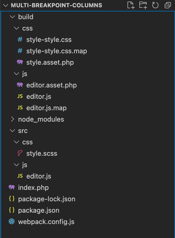
Go ahead and run npm run start to begin compiling our assets in the background. You should see a build folder created with our compiled versions:
Setting up our block enqueues
Now that our build files have been generated, we need to tell WordPress to enqueue our assets with the appropriate hooks. We’ll do this in our plugin’s main index.php file.
I prefer to write my plugins as classes to stay organized and avoid namespace conflicts, but you could also approach this with typical functional WordPress hooks and callback functions as well.
I’ve annotated the code below with explanations:
class MultiBreakpointColumns
{
	public function __construct()
	{
		// Base path is used to include PHP server-side
		$this->basePath = plugin_dir_path( __FILE__ );
		// Base url is used for the client side asset urls
		$this->baseUrl = plugins_url( '/', __FILE__ );

		// Get our asset.php files that include version and dependency info
		$this->jsAssetInfo = include($this->basePath . 'build/js/editor.asset.php');
		$this->cssAssetInfo = include($this->basePath . 'build/css/style.asset.php');

		// Hooks for the editor and front end - uses array callable syntax: [class instance, method name to call]
		add_action('enqueue_block_editor_assets', [$this, 'addEditorAssets']);
		add_action('wp_enqueue_scripts', [$this, 'addFrontEndAssets']);
	}

	public function addEditorAssets()
	{
    wp_enqueue_style('mbpc-editor-css', $this->baseUrl . 'build/css/style-style.css', $this->cssAssetInfo['dependencies'], $this->cssAssetInfo['version']);

		wp_enqueue_script('mbpc-editor-js', $this->baseUrl . 'build/js/editor.js', $this->jsAssetInfo['dependencies'], $this->jsAssetInfo['version']);
	}

	public function addFrontEndAssets()
	{
		wp_enqueue_style('mbpc-frontend-css', $this->baseUrl . 'build/css/style-style.css', $this->cssAssetInfo['dependencies'], $this->cssAssetInfo['version']);
	}
}

new MultiBreakpointColumns();
Testing our plugin so far…
At this point we now have the functionality for collapsing columns on an additional breakpoint.
Go ahead and activate your plugin in the WordPress admin of your development site if you haven’t already.
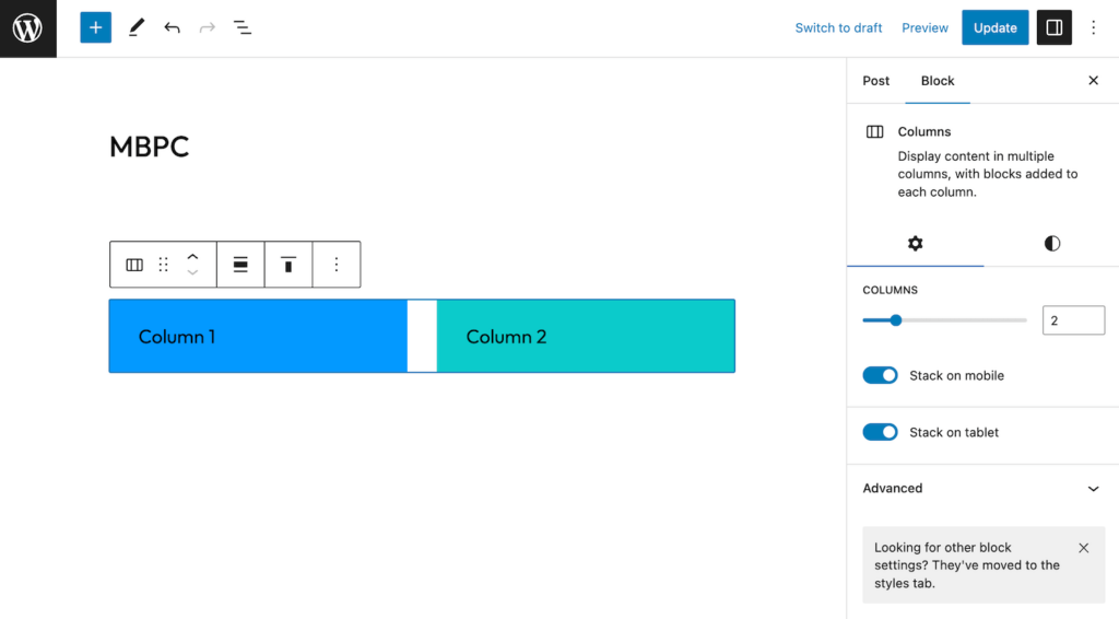
Create a new columns block in the editor and use the custom classes panel to add the “mbpc-collapse-tablet” class to it. When you view the frontend you’ll see the columns will collapse at your new predefined breakpoint.
We could stop here, or you could easily make this a block style as well, but there’s a couple reasons I prefer to add a custom control instead:
- With custom classes alone, it is unintuitive to tell what breakpoint a columns block is using. You may click on a block and see the “collapse on mobile toggle” turned off, but not realize it actually has the class applied and therefore collapses on tablet and by extension mobile as well (since our breakpoint is a max-width breakpoint).
- With block styles you are only allowed to select one at a time. Personally, I feel block styles are better reserved for visual recipes, like adding rounded corners and a slight shadow for a card style effect, rather than individual utility classes like our collapse class.
Understanding block filters and higher-order components
To build our custom control we will need to hook into the block editor and use a higher order component to add the control. This is a pretty advanced approach, so if you are new to React if may be a little confusing – but bear with me.
Essentially we’ll write a function that filters blocks in the editor and receives block props. Then we’ll check those props to see if the current block is the block we want to add our control to. If so, we’ll add the control, otherwise we’ll just let it render the default block editor content.
This is very similar to how traditional PHP WordPress filters work in concept. In practice, it looks like this:
const withMultiBreakpoint = ( BlockEdit ) => ( props ) => {

  // Render control on core columns block
	return 'core/columns' === props.name ? (
		<>
			<BlockEdit { ...props } />
      <InspectorControls>
          {/* Our custom controls here */}
      </InspectorControls>
		</>
	) : (
		<BlockEdit { ...props } />
	);
};

addFilter('editor.BlockEdit', 'mbpc/multiBreakpoint', withMultiBreakpoint);
The first argument of addFilter takes the filter name – you can find a reference of the filters available in the documentation. The “editor.BlockEdit” filter receives the block’s edit function and allows you to modify it. You then also pass a namespaced name for your modifier and a callback function.
It is customary to name these higher order functions prefixed “with” to indicate they are adding something to an existing function/component.
Within our callback we have access to the BlockEdit component to return the edit function unchanged, but we can also add to it.
Often you may only be modifying a subset or one particular block. You can do this simply by checking the props for block name, category, etc, and then conditionally adding whatever you need.
Building our custom control
Now let’s apply this filter logic to our particular use case.
// WordPress dependencies.
import { InspectorControls } from '@wordpress/block-editor';
import { ToggleControl, PanelBody } from '@wordpress/components';

import { addFilter } from '@wordpress/hooks';
import TokenList from '@wordpress/token-list';

const withMultiBreakpoint = ( BlockEdit ) => ( props ) => {

  // Destructure Attributes / ClassName
  const { attributes, setAttributes } = props;
  const {className} = attributes

  // Handle toggling classNames and settings
  const toggleTabletCollapse = (enable) => {
    const list = new TokenList( className );

    if(enable){
      list.add( `mbpc-collapse-tablet` );
      return setAttributes({className: list.value })
    } else {
      list.remove( `mbpc-collapse-tablet` );
      return setAttributes({className: list.value});
    }
  }

  // Check if tablet collapse is enabled
  const isTabletCollapseEnabled = () => {
    return className?.includes('mbpc-collapse-tablet')
  }

  // Render control on core columns block
	return 'core/columns' === props.name ? (
		<>
			<BlockEdit { ...props } />
      <InspectorControls>
        <PanelBody>
          <ToggleControl
              label="Stack on tablet"
              checked={ isTabletCollapseEnabled() }
              onChange={ (val) => {
                toggleTabletCollapse(val);
              } }
          />
        </PanelBody>
      </InspectorControls>
		</>
	) : (
		<BlockEdit { ...props } />
	);
};

addFilter('editor.BlockEdit', 'mbpc/tablet-collapse', withMultiBreakpoint);
Let’s look at this a little closer.
The return statement should look pretty familiar from the generic example. We are just using the PanelBody component to make sure to add appropriate padding around our new toggle control on the columns block.
At the top of our function we destructure out attributes and setAttributes so that we can modify block state, then we also pull out className from our attributes.
We are using custom classes because this is a really safe and non-destructive way to modify blocks. Technically you could filter the block save output and add data attributes or even modify the markup, but this risks block validation errors when users deactivate your plugin.
Classes are natively supported so even if your plugin is disabled nothing will break on the site, the control will just no longer be visible – and the class won’t have styles associated with it.
Because of this, rather than directly using attributes and setAttributes with our control we have our own custom handlers for the onChange event and value of the toggle:
  // Handle toggling classNames and settings
  const toggleTabletCollapse = (enable) => {
    const list = new TokenList( className );

    if(enable){
      list.add( `mbpc-collapse-tablet` );
      return setAttributes({className: list.value, isStackedOnMobile: true})
    } else {
      list.remove( `mbpc-collapse-tablet` );
      return setAttributes({className: list.value});
    }
  }

  // Check if tablet collapse is enabled
  const isTabletCollapseEnabled = () => {
    return className?.includes('mbpc-collapse-tablet')
  }
WordPress has a nifty utility for dealing with classNames called TokenList. ClassName is a string and we could use splits and joins to be able to add and remove classes, but TokenList makes it much easier with methods like add, remove, and list.
At this point if you make sure the build process is running and add a columns block to the editor you should be able to use our new custom control!
Polishing our custom block control
While our control is now functional, there are a few UX quirks that we can address to make it nicer.
First, when we turn our tablet breakpoint on it would be nice if the mobile breakpoint toggled on as well to indicate that the collapse affect will be on ALL screens below our tablet size, not just tablet.
This is actually pretty easy, we just need to modify our toggle handler function to affect the existing attribute called “isStackedOnMobile” that the columns block uses for that control:
  // Handle toggling classNames and settings
  const toggleTabletCollapse = (enable) => {
    const list = new TokenList( className );

    if(enable){
      list.add( `mbpc-collapse-tablet` );
      return setAttributes({className: list.value, isStackedOnMobile: true})
    } else {
      list.remove( `mbpc-collapse-tablet` );
      return setAttributes({className: list.value});
    }
  }
If you are wondering how I knew the name of that attribute – I simply added a console.log(props) within our function and then toggled the control to see how it functioned under the hood.
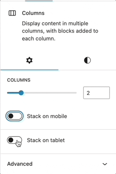
Excellent, now when you turn “collapse on tablet” on, the mobile toggle turns on too.
We can do even better though…
Based on how we set up our media queries, if you turn the mobile collapse off, the tablet should turn off as well. Again, we are not supporting a tablet only breakpoint. Our breakpoints affect everything below a certain screen size. So, if we set mobile to NOT collapse, tablet cannot be set to collapse.
We can use useEffect to listen to changes on the isStackedOnMobile attribute, and then trigger our className toggler when we are switching the attribute off:
import {useEffect} from '@wordpress/element'

const withMultiBreakpoint = ( BlockEdit ) => ( props ) => {

  // Listen to changes on mobile collapse setting and disable tablet if mobile is turned off - shouldn't allow collapsed tablet, but not mobile
  useEffect(() => {
    if(attributes.isStackedOnMobile === false) {
      toggleTabletCollapse(false)
    }
  }, [attributes.isStackedOnMobile])

// Rest of component...
};

addFilter('editor.BlockEdit', 'mbpc/tablet-collapse', withMultiBreakpoint);
Awesome, now we have two fully linked controls that work intuitively together.
One final detail…
There is one final detail I want to address that you may have already noticed. When you initially add a columns block, the native “collapse on mobile” toggle is not visible until you select an initial number of columns from the default insert state. Our tablet control, however, is always visible.
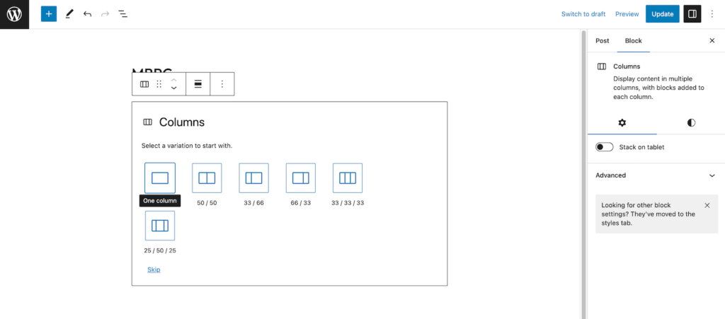
This is extremely minor, but to me it would be better if our custom control followed the example of the core-provided control.
To figure out how to do this, I went to the Gutenberg repository and simple looked at how the core columns block hid the control.
It turns out, it is just checking whether the block contains any innerBlocks and rendering based on that.
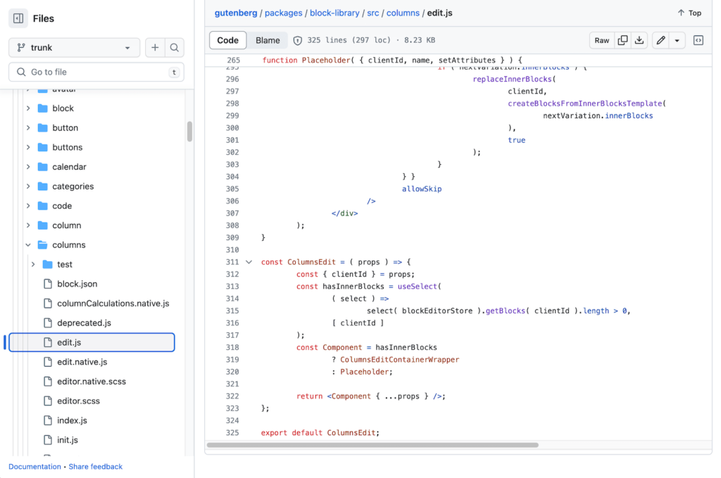
I copied this setup to get the same behavior for our control:
import { InspectorControls, store as blockEditorStore } from '@wordpress/block-editor';
import { useSelect } from '@wordpress/data';

const withMultiBreakpoint = ( BlockEdit ) => ( props ) => {

  // This is taken from the core columns block. When initially inserted the controls are disabled until a column layout has been selected
  const { clientId } = props;
	const hasInnerBlocks = useSelect(
		( select ) =>
			select( blockEditorStore ).getBlocks( clientId ).length > 0,
		[ clientId ]
	);

// Rest of block logic....

  // Render control on core columns block
	return 'core/columns' === props.name && hasInnerBlocks ? (
		<>
			<BlockEdit { ...props } />
      <InspectorControls>
        // Rest of component...
      </InspectorControls>
		</>
	) : (
		<BlockEdit { ...props } />
	);
};

addFilter('editor.BlockEdit', 'mbpc/tablet-collapse', withMultiBreakpoint);
Unfortunately, we cannot access whether a block has innerBlocks directly from props. Instead we can use the “useSelect” hook from WordPress which can pull data out of the global editor context.
This is a pretty advanced hook that works with the WordPress data layer which is beyond the scope of this write up, but you can read more about it in the WordPress documentation if you are curious. You can also learn more about useSelect and the data layer in general in this post about creating a modern data layer plugin.
In this case, we just need this snippet to create the hasInnerBlocks variable which we can use as a condition in our return statement.
With this code in place, if you insert a columns block our new tablet control will not become visible until the core mobile collapse control does as well!
Wrap up
At this point our custom columns block modification is complete!
If you ran into any errors feel free to check out the finished code in github.
Even with just this slight change we can do some pretty cool responsive layouts that were not possible before by nesting columns with different breakpoints like this 4-2-1 grid layout:
This is pretty basic implementation of how you could extend the columns block to accomplish more complex responsive layouts. If you are feeling adventurous, try adding another control to reverse column order when collapsed.
A word of caution: it may be tempting to add a full suite of controls and try to emulate a grid system like bootstrap or a page builder like Elementor. I would advise against this. The columns block is simple for a reason. If you want a full-fledged page builder, it would be best to create a custom block system of your own, or use an existing tool. This extension approach is best for adding incremental levels of functionality, not overhauling a block entirely.
If you want more practice with extending blocks I highly recommend this tutorial by Justin Tadlock on the WordPress developer blog. His write up inspired this post and tackles some additional use cases and approaches for customizing the editor experience and extending blocks.

Leave a Reply