In this lesson we’ll take a short break from directly developing blocks. Instead, we’ll look at how to package our blocks together in a plugin file and customize the editor experience for our blocks.
We’ve looked at a lot of great general block creation techniques. Up until now though, most of our blocks have been experimental in nature and not exactly “production-ready”. This lesson will fill the gaps to give your blocks a professional polish.
This will include namespacing, tooling, custom icons, block previews, block categories and more! By the end of this lesson, you’ll have a good idea of how to create a plugin for a block starter kit optimized for a great editor experience.
Let’s dive in!
Note: This post is part of the Block Creator series. These lessons build on each other, so it is recommended to complete them in order to get the most out of the course.
You can find links to all the Block Creator lessons on the main course page. You can also download this finished code from the course Github repo in case you get stuck at any point.
Revisiting Block.json
Before we get started, I want to revisit the block.json file. Let’s address some of the items that we have glossed over up until now.
Below is an annotated example file with comments:
{
	// Schema allows for autocomplete and hints to work within block.json
	"$schema": "https://schemas.wp.org/trunk/block.json",
	// API version is important for what properties are supported - do not edit
	"apiVersion": 3,
	// Name is divided in {namespace}/{block-slug} this helps prevent conflicts
	"name": "create-block/example-block",
	// Version is needed if distributing plugin - less important for bespoke one off client blocks
	"version": "0.1.0",
	// Title displayed in editor
	"title": "Example Block",
	// Category determines where the block appears in the inserter which is divided into categories
	"category": "widgets",
	// Icon is from dashicons library to help provide context for the block in the inserter
	"icon": "smiley",
	// description is shown in the inserter to help editors understand what the block does
	"description": "Example block scaffolded with Create Block tool.",
	"supports": {
		"html": false
	},
	"textdomain": "example-block",
	"editorScript": "file:./index.js",
	"editorStyle": "file:./index.css",
	"style": "file:./style-index.css",
	"render": "file:./render.php",
}
Most of these are self-explanatory. We’ll cover categories and icons below, but one important property to note is the block name.
The name is divided into “namespace/block-slug”. This helps avoid conflicts if two developers register a block called “slideshow” for instance.
By default, when you use the create block script it adds the namespace as “create-block”. This is not ideal, since anyone else who does not customize the namespace could then create conflicts with our block.
Usually a good practice is to namespace blocks with the client name if they are for a specific client’s site. You can use your own custom namespace (like initials or agency name) if they are a more general plugin.
If I were building this block for myself I would use fsd/example-block for instance.
NOTE:
You can edit the namespace after creating a block manually in block.json. Be aware though that changing this property after using a block on a live site is equivalent to changing the name of the block! Block instances that already exist will show the error message that “no block is registered under XX name” in the editor.
Blocks also have top level class attributes generated through useBlockProps with the namespace in them:
/* Top level class automatically applied to block through useBlockProps */
.wp-block-create-block-example-block {
	border: 1px dotted #f00;
}
/* Format of class is .wp-block-{namespace}-{block-slug} */
if you change the namespace manually, you will need to update the css to make sure it is still targeting the block correctly.
The best approach approach to namespacing is to make sure you specify a namespace when you initially run @wordpress/create-block. You can do so with the --namespace argument:
// Don't run this - just informational
npx @wordpress/create-block --namespace fsd --variant dynamic example-block
This block creation command is getting a bit long. Don’t worry, in the next section we will set up our plugin so that we don’t have to remember to type out all of this for every block we add.
Developing Multiple Blocks
In the last lesson, we set up our plugin to develop our single slide and slideshow block with one build command. We are going to expand on that setup to create a nice block building developer experience for ourselves.
First we navigate to our plugins folder and run the create block script.
For the block slug, I’m going to enter what I want the overall plugin’s slug to be (in this case “block-starter-kit”) – not what I want for any specific block:
npx @wordpress/create-block block-starter-kitThis will spin up a plugin directory ready to go for block development. It will also contain a “src” folder that contains a bunch of block files. We don’t want these block files because we will generate our blocks separately within their own folders. Delete all the files in the src folder and delete the auto-generated build folder as well.
This leaves us with a skeleton setup for developing custom blocks. Now we can add as many blocks as we want, each within their own folder inside of the src directory.
We could generate our blocks by navigating into src and running our familiar command:
// DON'T RUN THIS - just for illustration
cd src
npx @wordpress/create-block --no-plugin --variant dynamic our-block
The key argument is --no-plugin, which specifies to create a folder with all the required block files, but none of the extra plugin files we already have.
We can make this process way easier though. Let’s add a custom script to our package.json file in the root directory:
	"scripts": {
		"build": "wp-scripts build",
		"format": "wp-scripts format",
		"lint:css": "wp-scripts lint-style",
		"lint:js": "wp-scripts lint-js",
		"packages-update": "wp-scripts packages-update",
		"plugin-zip": "wp-scripts plugin-zip",
		"start": "wp-scripts start",
// New scripts:
		"add": "npx @wordpress/create-block --namespace fsd --variant dynamic --no-plugin",
		"add-static": "npx @wordpress/create-block --namespace fsd --no-plugin"
	},
I’ve actually added two scripts, one for dynamic and one for static blocks. Honestly, usually I am exclusively building dynamic blocks, so you can just add one if that’s all you need.
Also note, I added the --namespace argument in addition to --no-plugin. Feel free to use your own namespace instead of “fsd” as you follow along.
Now we can just type npm run add {block-slug} to create a new block. We don’t have to remember to add the extra options every single time.
NOTE: One annoying caveat here is that currently there is not a flag that allows us to specify to output the folder within our src directory. So you will you need to run the command and then just drag the newly created folder into src manually or change the command to something like so: cd src && npx @wordpress/create-block --namespace fsd --no-plugin.
When you run npm run start, each block folder within src will be auto-detected and a build folder will be generated that mirrors the structure of your src folder.
Let’s give this a try and create two demo example blocks we will use throughout this lesson. I’ll call them “demo-basic-text” and “demo-slideshow”:
npm run add demo-basic-text
npm run add demo-slideshow
We will for the most part be leaving these blocks with the default boilerplate. We’ll use them to experiment with some of the presentational features we can leverage to create a better block editing experience.
Don’t forget to drag the two generated folders into your src folder. Your plugin directory should look like this:
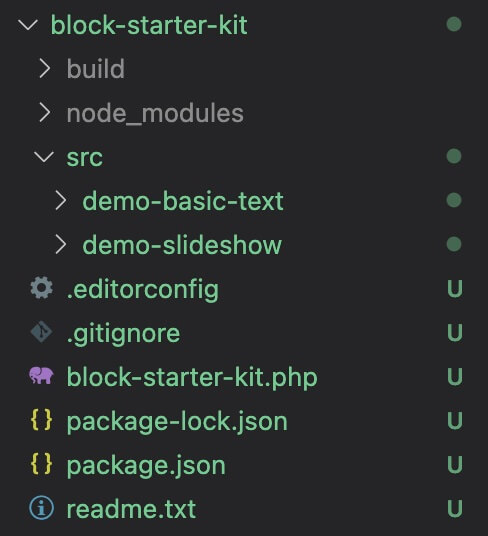
Registering your blocks with php
The @wordpress/scripts process will automatically pick up the individual blocks inside the src folder and compile them into matching folders within build. We still have to make sure each gets registered in PHP however.
Open the main plugin block-starter-kit.php file.
One option is to add an additional line for each block we add, as shown below:
function create_block_block_starter_kit_block_init() {
// Point to each folder that corresponds to each block within build
register_block_type( __DIR__ . '/build/demo-basic-text' );
register_block_type( __DIR__ . '/build/demo-slideshow' );
}
add_action( 'init', 'create_block_block_starter_kit_block_init' );
This has the benefit of being able to quickly disable a block by commenting out the registration line, while leaving all files in place.
If you are creating a bunch of blocks though, adding these lines may get tiresome. You can use this snippet instead to automatically register each block included in the src directory:
function create_block_block_starter_kit_block_init() {
// Generates an array of directory paths based on the build folder
	$block_directories = glob(__DIR__ . "/build/*", GLOB_ONLYDIR);

	foreach ($block_directories as $block) {
		register_block_type( $block );
	}
}
add_action( 'init', 'create_block_block_starter_kit_block_init' );
Usually when I am developing a set of blocks, this is the approach I use.
A quick note: Anytime you add or delete a block, it is best to stop and re-run npm run start. This will clear out the build folder and make sure it is synced with your src directory. If you ever are seeing strange errors with your blocks, this should be your first step.
Now we have our multi-block development setup working. Let’s jump into how we can better organize and present our blocks for clients and site editors.
Block Categories
The next option we’ll look at from the block.json file is the block category. This affects the section the block will appear in when you open the block inserter within the editor.
There are a couple approaches to handling this, and one is not necessarily better than the other.
First, you can leverage the existing block categories and assign your blocks based on what makes sense. For instance, a slideshow might go in the media category, whereas a CTA might go in text or design.
The basic default categories are text, media, design, widgets, theme, and embed.
Personally, I prefer to create a custom category that I assign to all of my blocks. For client sites, I will usually call it “{client name} Custom Blocks”. For this demo, I’ll call it “FSD Custom Blocks”.
You can do this by adding the following function in the main block-starter-kit.php file:
// ADD BLOCK CATEGORIES TO TOP OF INSERTER
function custom_block_category( $categories, $post ) {
    return array_merge(
        array(
            array(
                'slug' => 'fsd-custom-blocks',
                'title' => 'FSD Custom Blocks',
            ),
        ),
        $categories
    );
}
add_filter( 'block_categories_all', 'custom_block_category', 10, 2);
By using array_merge, we can position this custom category at the very top of the inserter for easy access. This may not always make sense, but for clients it is often nice to have all the bespoke blocks front and center.
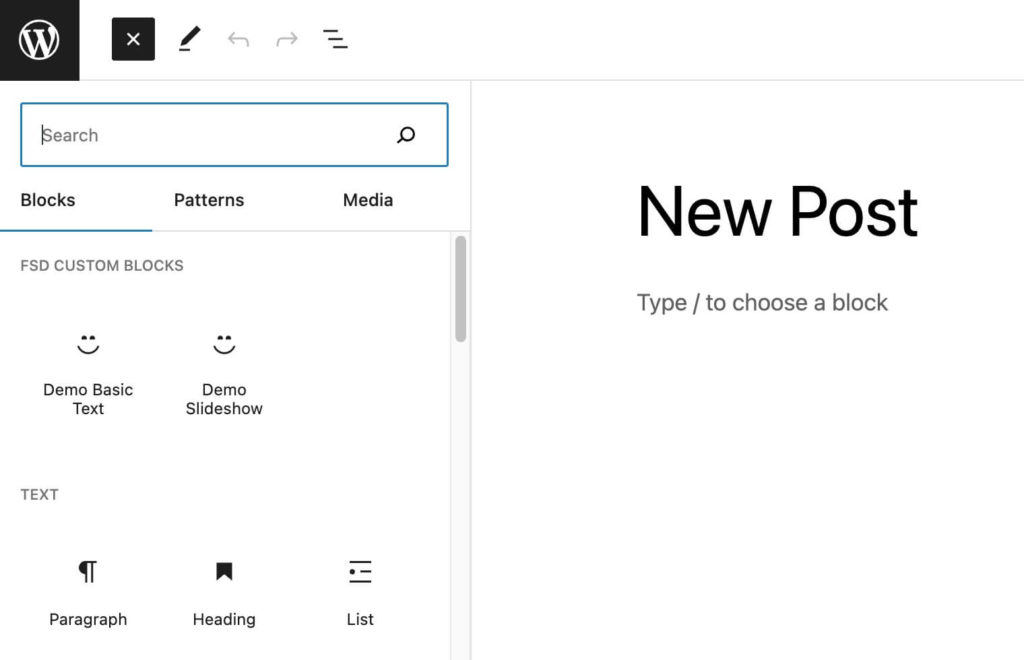
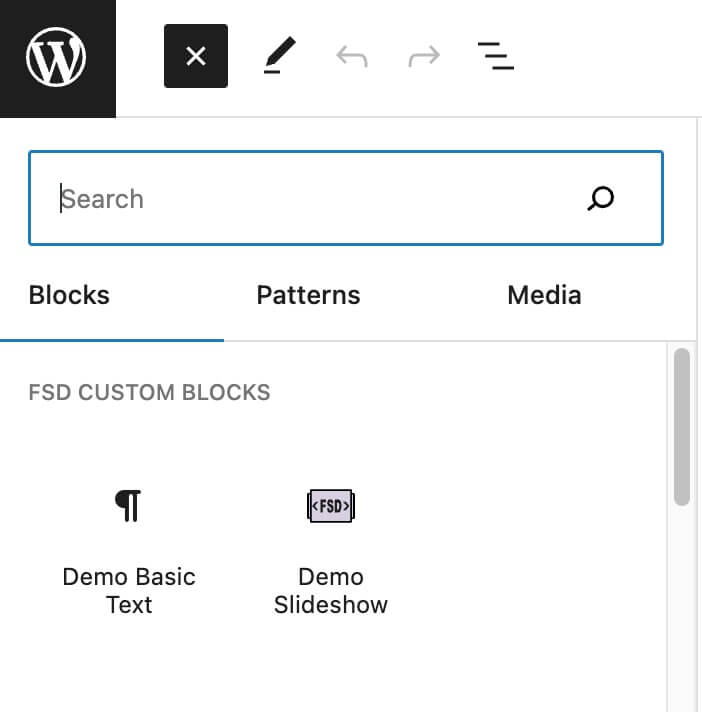
Now we can edit our block.json file for both our blocks and assign them to this category:
{
	"category": "fsd-custom-blocks",
}
After you’ve updated the blocks, if you open the editor you should see the following:
If you want, you can even add --category fsd-custom-blocks (or whatever your own category slug is) to your npm script in the package.json to auto-assign newly created blocks to this custom category.
		"add": "npx @wordpress/create-block --namespace fsd --category fsd-custom-blocks --variant dynamic --no-plugin",
		"add-static": "npx @wordpress/create-block --namespace fsd --category fsd-custom-blocks --no-plugin"
Unlike the namespace, you can change the category of a block at any time on a production site and it will update with no issues.
If you have a larger site and are adding 15+ custom blocks, this single bespoke category may not be the best solution. In this case, one option is to further subdivide and have FSD Custom Media / FSD Custom Layout / FSD Custom Text, etc. This gives the benefit of semantic categories, while keeping your blocks isolated from other core blocks.
Block Descriptions
Okay this one is really self explanatory. You can just drop in a short text description of what your block does.
It’s simple, but it’s also easy to forget! Go ahead and add some descriptions to both our demo blocks now just to get in the habit!
Block Icons
When browsing blocks, the icon and the name are the two primary hints for what a block does. Up until now, we’ve just been using the default smiley for blocks.
It’s very easy to supply a better and more informative icon. We can jump into the block.json and change our “icon” property to any acceptable dashicon. You can find the full list of options in this explorable library.
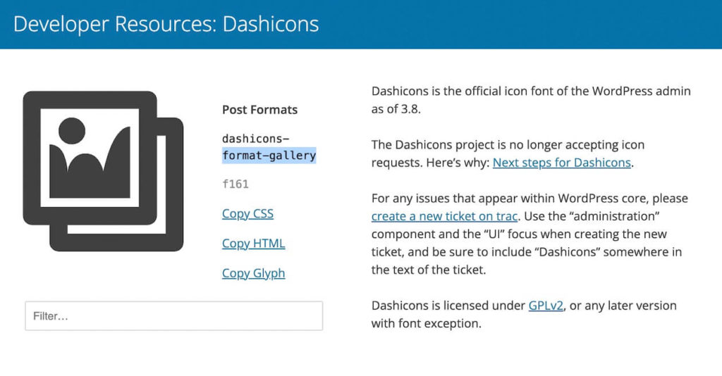
Make sure to exclude the “dashicon-” part of the icon slug (as shown above) when using this library. WordPress already knows to include this.
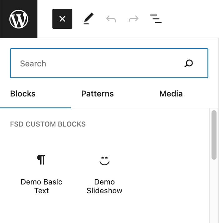
Go ahead and update your demo-basic-text block with the following in the block.json file:
"icon": "editor-paragraph",Perfect, if you refresh and take a look in the editor you’ll see this new icon.
I’ve found that most of the time I can find an icon that adequately communicates the purpose of my block by browsing through this library.
That said, sometimes you need something custom or want your blocks to use a differentiating style of icon. This way users can also tell the difference between your bespoke blocks and the WordPress core blocks at a glance.
Create a custom SVG icon for your block
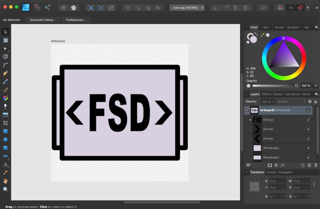
In order to create a totally custom icon, you’ll need image editing software capable of outputting an SVG. This process is a bit finicky, but it can be worth it to give your block set a polished feel.
I’m using Affinity Designer, but you could also use Figma or Sketch.
Set your artboard or canvas to 512 x 512px. Create an SVG that will help users tell what your block does. I like to choose a specific color palette for my icons. This way the whole set looks cohesive and you can easily recognize blocks that belong to it.
As an example I’ll export this icon (I know, it’s rough….). I mocked this up as an icon for our fictional demo-slideshow block:
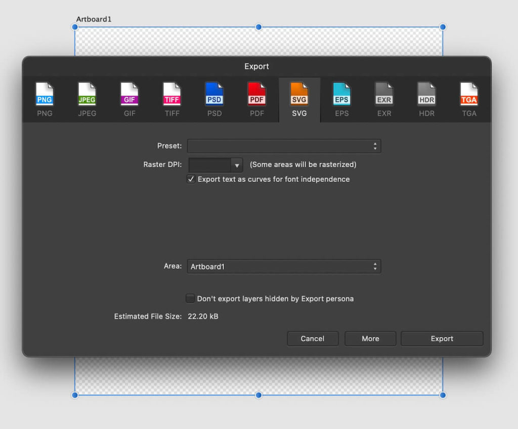
Note – when you create an icon, you should use purely vector tools, don’t drop in a jpeg image for instance. You will also need to make sure to convert any text to curves on export:
If you don’t want to bother creating your own right now, feel free to download this SVG file to follow along with the rest of the process:
Unfortunately, we can’t just point our icon property to this file. It’s a bit trickier – we need to pass the raw SVG code to React.
The first step is to run your icon through a SVG to JSX converter:
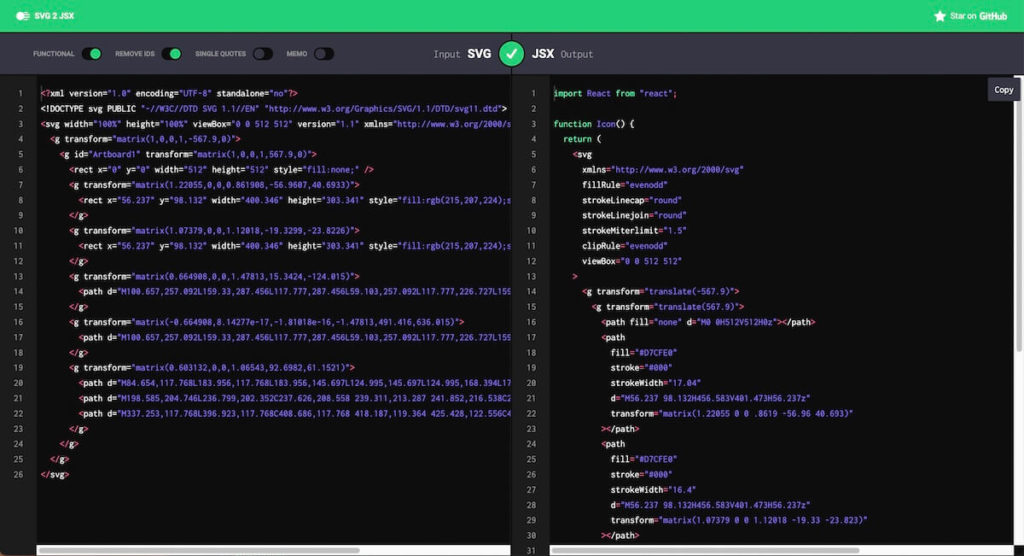
This will make sure all the SVG attributes are valid. Next, we’ll grab just the SVG code from here, not the whole React functional component that gets output.
WordPress is finicky and wants us to pass an object or a string to the icon. Create an icon.js file within your demo-slideshow block directory.
We will export an object with an “svg” key set to our converted JSX-compatible SVG:
export default {
  svg: <svg
  xmlns="http://www.w3.org/2000/svg"
  fillRule="evenodd"
  strokeLinecap="round"
  strokeLinejoin="round"
  strokeMiterlimit="1.5"
  clipRule="evenodd"
  viewBox="0 0 512 512"
>
  <g transform="translate(-567.9)">
    <g transform="translate(567.9)">
      <path fill="none" d="M0 0H512V512H0z"></path>
      <path
        fill="#D7CFE0"
        stroke="#000"
        strokeWidth="17.04"
        d="M56.237 98.132H456.583V401.473H56.237z"
        transform="matrix(1.22055 0 0 .8619 -56.96 40.693)"
      ></path>
      <path
        fill="#D7CFE0"
        stroke="#000"
        strokeWidth="16.4"
        d="M56.237 98.132H456.583V401.473H56.237z"
        transform="matrix(1.07379 0 0 1.12018 -19.33 -23.823)"
      ></path>
      <path
        d="M100.657 257.092l58.673 30.364h-41.553l-58.674-30.364 58.674-30.365h41.553l-58.673 30.365h58.673-58.673z"
        transform="matrix(.6649 0 0 1.47813 15.342 -124.015)"
      ></path>
      <path
        d="M100.657 257.092l58.673 30.364h-41.553l-58.674-30.364 58.674-30.365h41.553l-58.673 30.365h58.673-58.673z"
        transform="matrix(-.6649 0 0 -1.47813 491.416 636.015)"
      ></path>
      <g fillRule="nonzero">
        <path
          d="M84.654 117.768h99.302v27.929h-58.961v22.697h50.361v26.244h-50.361v53.109H84.654V117.768zM198.585 204.746l38.214-2.394c.827 6.206 2.512 10.935 5.053 14.186 4.138 5.261 10.049 7.891 17.733 7.891 5.733 0 10.152-1.345 13.255-4.034 3.103-2.69 4.655-5.807 4.655-9.354 0-3.369-1.478-6.384-4.433-9.044-2.956-2.659-9.812-5.172-20.57-7.536-17.614-3.96-30.175-9.221-37.682-15.782-7.566-6.561-11.348-14.925-11.348-25.091 0-6.679 1.935-12.989 5.807-18.93 3.872-5.94 9.694-10.61 17.466-14.008 7.773-3.399 18.427-5.098 31.963-5.098 16.61 0 29.274 3.088 37.992 9.265 8.719 6.177 13.905 16.003 15.56 29.48l-37.859 2.217c-1.004-5.852-3.117-10.108-6.339-12.768-3.221-2.66-7.669-3.99-13.344-3.99-4.669 0-8.186.99-10.55 2.971-2.365 1.98-3.547 4.388-3.547 7.226 0 2.068.975 3.93 2.926 5.585 1.891 1.714 6.384 3.31 13.477 4.788 17.555 3.783 30.13 7.61 37.726 11.482 7.595 3.871 13.122 8.674 16.579 14.408 3.458 5.733 5.187 12.146 5.187 19.239 0 8.335-2.305 16.019-6.916 23.053-4.61 7.033-11.053 12.368-19.328 16.003-8.275 3.635-18.708 5.453-31.298 5.453-22.106 0-37.415-4.256-45.927-12.768-8.512-8.511-13.329-19.328-14.452-32.45zM337.253 117.768h59.67c11.763 0 21.264 1.596 28.505 4.788s13.225 7.773 17.954 13.743c4.729 5.97 8.157 12.915 10.285 20.835 2.128 7.921 3.192 16.314 3.192 25.18 0 13.891-1.581 24.663-4.744 32.318-3.162 7.654-7.551 14.068-13.166 19.24-5.615 5.172-11.644 8.615-18.087 10.329-8.807 2.364-16.787 3.546-23.939 3.546h-59.67V117.768zm40.164 29.436v71.019h9.842c8.393 0 14.363-.931 17.91-2.793 3.546-1.862 6.324-5.113 8.334-9.753s3.014-12.162 3.014-22.565c0-13.772-2.246-23.2-6.738-28.283-4.492-5.083-11.94-7.625-22.343-7.625h-10.019z"
          transform="matrix(.60313 0 0 1.06543 92.698 61.152)"
        ></path>
      </g>
    </g>
  </g>
</svg>
}
You might be thinking: this does not look like valid javascript… Normally you’d be right.
Since @wordpress/scripts is configured to accept JSX though, the SVG will be treated as JSX and converted into an object, so it works!
Now jump into your index.js file for you block. We’ll import the icon object, and set it when we register our block:
import icon from './icon'

registerBlockType( metadata.name, {
	icon: icon.svg,
	edit: Edit,
	save,
} );
Any properties from the block.json file can instead be specified as part of an object when you register the block in javascript.
Normally, we only put the edit/save functions here, since for most properties it is more readable to use block.json.
For the icon though, setting it in this javascript file gives us the ability to assign it to an object, instead of being limited to a string designator.
Finally, delete the “icon” property from your block.json file since now we handle it in our index.js file instead.
Great, if you open the editor you’ll see your block now has the updated completely custom icon!
I know this is a bit of a process. Hopefully this workflow gets easier as WordPress rolls out more tooling.
That said, I think in many scenarios it is worth the extra effort to be able to handoff a set of blocks with a slick and cohesive custom icon set. It will set you apart from a lot of the competition out there that leave their icons as the default.
Setting up Block Previews
An icon is nice, but there is only so much you can get across with a name and a small SVG icon. Block previews give a better picture of what an actual block looks like once inserted.
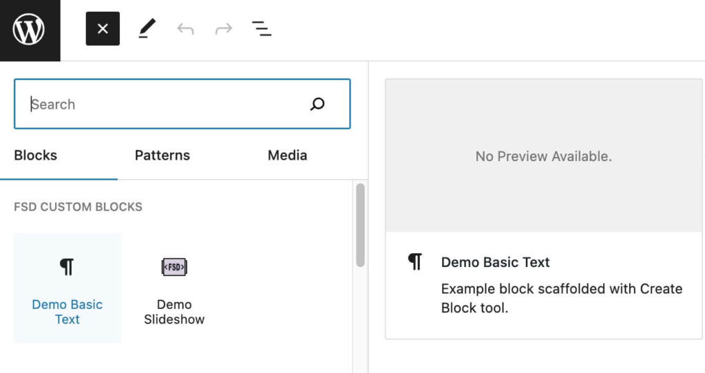
Out of the box, previews are disabled. If you hover over our blocks you’ll see the “no preview available” message.
You can set up your blocks to generate a preview by using the “example” key in the block.json file.
Let’s walk through this in our “demo-simple-text” block.
First we need an actual attribute. By now you should be a master at adding attributes, just hop into the block.json file for our simple block and add the following:
	"attributes": {
		"title": {
			"type": "string",
			"default": "Enter some text here..."
		}
	},
Then, let’s update our edit function to use this attribute instead of the hard coded value (we won’t worry about the render template for this demo):
export default function Edit({attributes, setAttributes}) {
	return (
		<p { ...useBlockProps() }>
			{attributes.title}
		</p>
	);
}
Now, we can add the “example” object to our block.json:
	"attributes": {
		"title": {
			"type": "string",
			"default": "Enter some text here..."
		}
	},
	"example": {},
If we set it to an empty object, an example will be generated using the default values you provided in your attributes object.
Sometimes you may want different values for your example though. In this case let’s use “lorem ipsum” text in the preview to show what a longer paragraph would look like:
	"attributes": {
		"title": {
			"type": "string",
			"default": "Enter some text here..."
		}
	},
	"example": {
		"attributes": {
			"title": "Lorem ipsum dolor sit amet, consectetur adipiscing elit. Sed nec tellus eget ipsum condimentum viverra. In convallis neque metus, vel rhoncus justo pellentesque eu. Donec varius suscipit lacus, vitae tincidunt magna ultricies a. Duis vel nisi ex. Sed semper vehicula viverra. Etiam id vehicula neque."
		}
	},
Now our block will use our edit function passing in this example attribute value to generate a preview. Of course in this case it looks a bit rough since we are using the default boilerplate styles from @wordpress/create-block:
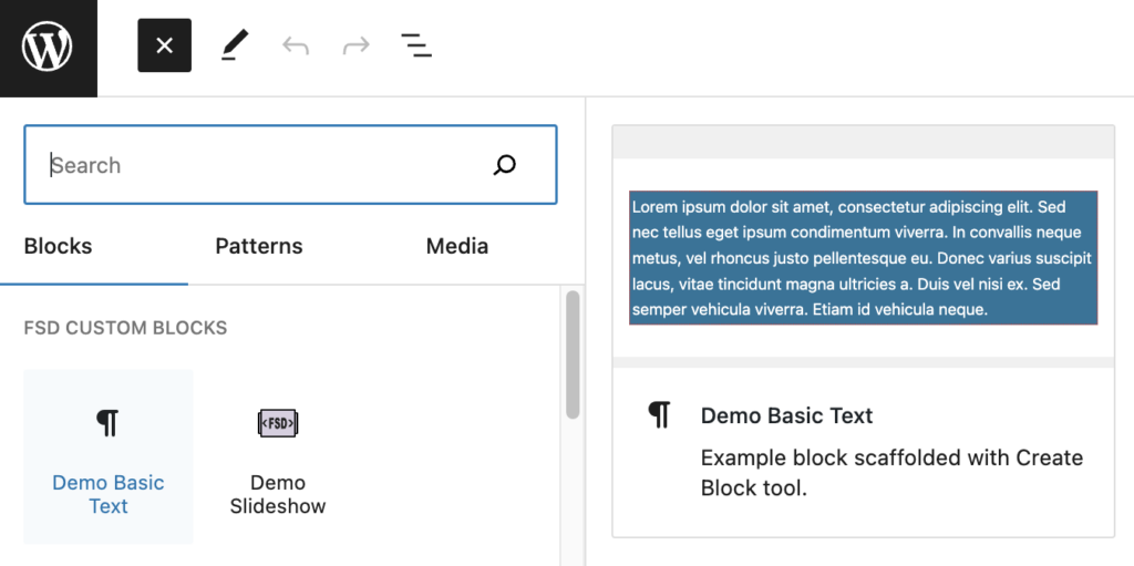
This is super quick and easy, so for simple blocks this is a great way to go.
For interactive blocks like a slideshow, it would be really difficult to replicate the front end in the preview. Often the edit function may not actually return the same layout as how the block looks on the front end in these more complex cases.
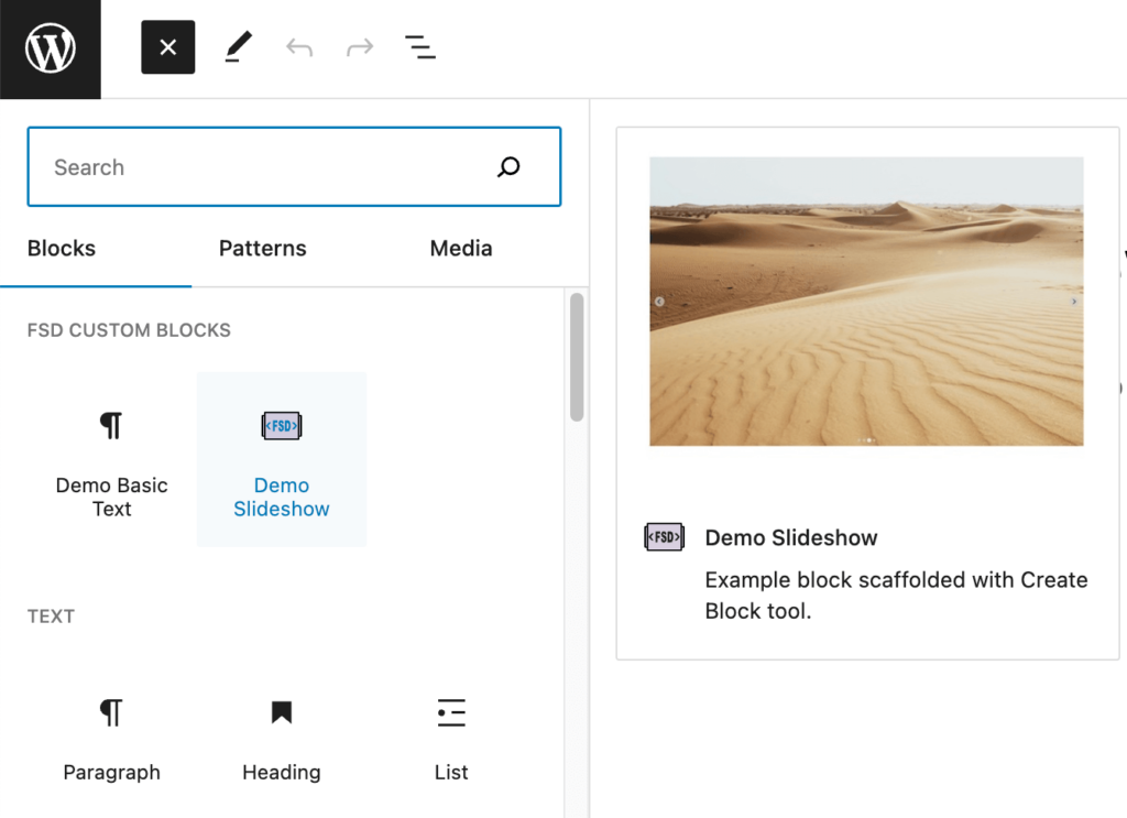
In this case, a better option is to assign a jpeg screenshot that shows what the block looks like on the front end.
Using a custom screenshot or image for block previews
Let’s check out how to do this using our “demo-slideshow” block this time. I’ll be using the screenshot linked below. Feel free to download and use this or create your own:
We’ll drop this image in our “demo-slideshow” block directory and call it “preview.jpg”.
Now we need to tell WordPress to render this image when showing a block preview for our block.
This is a bit tricky to do. First, we are going to create an attribute that tracks whether we are in block preview mode.
We can do this by registering an attribute in block.json like so:
	"attributes": {
		"_previewMode": {
			"type": "boolean",
			"default": false
		}
	},
I like to follow the convention of prefixing this with an underscore to indicate it is meant as a system attribute, not one for block editing.
Then under “example” we set this attribute to “true”:
	"attributes": {
		"_previewMode": {
			"type": "boolean",
			"default": false
		}
	},
	"example": {
		"attributes": {
			"_previewMode": true
		}
	},
WordPress only applies the example attributes when generating block previews, so this essentially gives us a piece of state for whether or not we are viewing a preview.
We’ll use this in our edit.js file for the block. We’ll add a conditional above our main return that checks if the preview mode is enabled. If so, we return just an image element with some basic styling to make sure it fits in its container:
// Import our preview image
import previewImage from './preview.jpg'

export default function Edit({attributes}) {

// Check if we are in preview mode and render the image
	if(attributes._previewMode){
		return <img style={{width: "100%", height: "auto"}} src={previewImage} alt="" />
	}

	return (
		<p { ...useBlockProps() }>
			{ __( 'Demo Slideshow – hello from the editor!', 'demo-slideshow' ) }
		</p>
	);
}
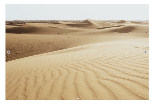
Voila! If you refresh the editor, you can now hover over the block and see a nice preview using our custom image.
Often this method can be useful if you are working from a design file. You can create a collection of screenshots of each of the various sections in the design file, then add those to each block as you build them.
Clients will appreciate this if they have been reviewing designs throughout the process, since the block previews will already be familiar to them.
Make sure your jpegs are small in dimensions and also compressed. The preview images are lazy-loaded when hovering over the blocks. If you use a huge image, it will lag and be frustrating to users.
Wrap up
This was a different format than our usual lessons, but its super important!
I’ve been on the receiving end of sites from agencies that get handed off with a suite of 20+ custom blocks – all with smiley logos, no descriptions, no previews, and confusing titles like “CTA-1”, “CTA-2”, etc. Don’t be this agency!
It makes a huge difference to editors to have blocks that have been thoughtfully set up, and ultimately can be the make or break of someone’s first WordPress CMS experience.
We touched a little bit on workflow in this lesson too. I’ve received a couple requests to do a lesson covering workflow for building a suite of blocks within a theme, and hope to do a write up on that as well in future lessons.
I’d encourage you to look at the blocks we created in earlier lessons and apply these techniques for practice.
Next up, we’ll get back to block building and look at block context. This is an advanced technique that opens up some pretty cool possibilities when working with nested blocks.

Leave a Reply