In the past few lessons, we’ve explored how to create nested blocks. This is a super powerful design pattern.
In this lesson, we’ll take this a step further by exploring how we can pass data from our parent block into our child blocks. This allows us to effectively have an attribute we can change in one location that affects all blocks under the scope.
Note: This post is part of the Block Creator series. These lessons build on each other, so it is recommended to complete them in order to get the most out of the course.
You can find links to all the Block Creator lessons on the main course page. You can also download this finished code from the course Github repo in case you get stuck at any point.
Before we dive in, let’s look at an example of when this can be really useful.
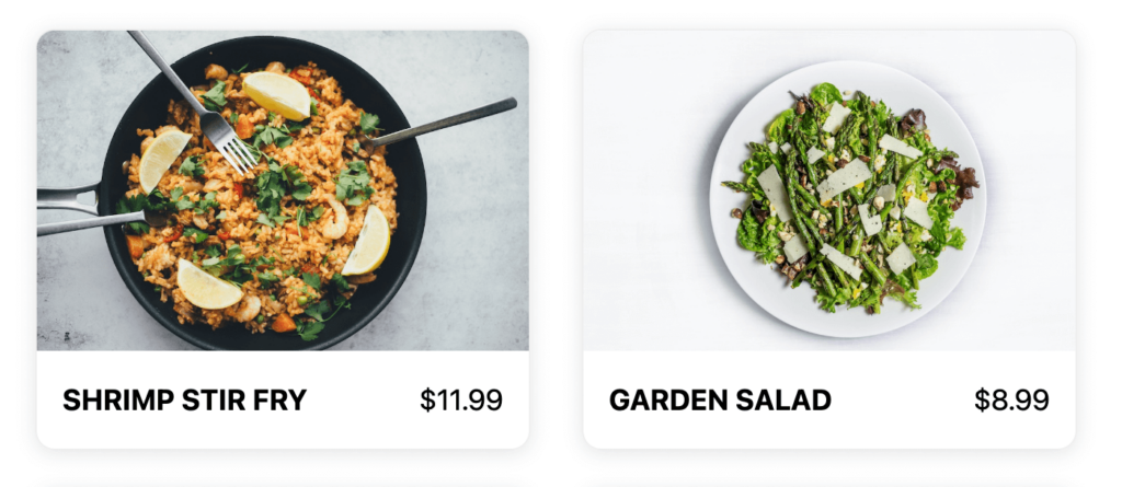
For our demo, we’ll be building a custom block for a fictional restaurant site. We’ll have a parent “menu” block that will support “dish” child blocks and display them in a grid.
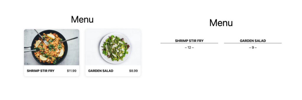
Different types of restaurants style menus very differently, for demo purposes let’s say we want to support two menu styles: An elegant minimal one (for all the “neue-american” restaurants popping up these days), and a card style one that supports images (for your typical take-out spots).
Here’s an example of how they should look:
Without using block context we could approach this in one of two ways:
- We could have two different types of inner blocks (card/minimal) or have a control on our menu-item block that switches the style.
What if a restaurant decides to rebrand though? They will have to go through each menu item and switch the style one by one. Worse yet, with different types of child blocks they would have to delete all the menu-item blocks of one style, and replace them with the other style.
2. We could have a style switcher on the menu block that changes a class, and then use CSS to restyle the children blocks.
This solves the problem of having to update each and every item, but even pretty clever CSS has limitations and this approach makes it messy to organize your styles, since CSS overlaps between the two blocks.
Enter block context
Using block context, we can add a menu style attribute to our parent block, but then consume this attribute in our dish blocks and conditionally render different markup based on the value.
This lets us do more than typical CSS changes. For instance, our minimal menu option will round the price to the nearest integer and not display cents – no need to reformat the price for every item manually or wrap the cents in a special span tag to hide with CSS.
Setting up our plugin
We are going to zip through the creation process since we covered this in the last couple of lessons – feel free to go back and review if at any point you feel lost:
We are going to setup a multi-block development environment. First run:
npx @wordpress/create-block block-context-menu-pluginThen delete everything inside the src folder and the build folder as well for good measure.
Next, navigate inside the src folder and run the following commands. Please use the ‘fsd’ namespace, as this will let you copy my css without making any changes:
npx @wordpress/create-block --namespace fsd --variant dynamic --no-plugin menu
npx @wordpress/create-block --namespace fsd --variant dynamic --no-plugin dish
This will create the necessary files for our ‘menu’ and ‘dish’ block.
Now we just need to make sure both our registered in our plugin’s main php file. We can use our snippet from the last lesson about block management that will auto-register all our blocks:
function create_block_block_starter_kit_block_init() {
	// Generates an array of directory paths based on the build folder
		$block_directories = glob(__DIR__ . "/build/*", GLOB_ONLYDIR);

		foreach ($block_directories as $block) {
			register_block_type( $block );
		}
	}
	add_action( 'init', 'create_block_block_starter_kit_block_init' );
Finally, this lesson has some custom CSS that will help style our blocks, but I want to focus on the block logic, not CSS, so go ahead and copy the following into your respective block CSS files so that you can follow along without worrying about styles for the rest of the lesson.
Everything in here is very straightforward CSS, no fancy style trickery.
.wp-block-fsd-menu {
	display: grid;
	grid-template-columns:  1fr 1fr;
	gap: 32px;

	@media (max-width: 768px){
		grid-template-columns: 1fr;
	}
}
.wp-block-fsd-menu {
	border: 1px dotted black;
	padding: 8px;
}

.wp-block-fsd-menu {
	display: block;

	.block-editor-block-list__layout {
		display: grid;
		grid-template-columns:  1fr 1fr;
		gap: 20px;
	}
}
// Styles for 'Card' Style

.menu-item--card
	border: 1px solid #eee;
	box-shadow: 0px 2px 12px rgba(0,0,0,0.1);
	border-radius: 12px;
	overflow: hidden;

	.menu-item__image-container {
		width: 100%;
		height: 200px;
		position: relative;

		img {
			position: absolute;
			top: 0;
			left: 0;
			width: 100%;
			height: 100%;
			object-fit: cover;
		}
	}

	.menu-item__text-container {
		padding: 16px;
		display: flex;
		gap: 16px;
		align-items: center;
		justify-content: space-between;

		h5, p {
			margin: 0;
		}
	}
}

//  Styles for 'Minimal' Style

 .menu-item--minimal {
	text-align: center;
	margin-bottom: 20px;

	h5 {
		margin-bottom: 8px;
		border-bottom: 1px solid black;
	}

	p {
		margin: 0;
	}
}
.wp-block-fsd-dish {
	border: 1px solid #eee;
	box-shadow: 0px 2px 12px rgba(0,0,0,0.1);
	border-radius: 6px;
	overflow: hidden;
	padding: 8px;
 }
At this point if you start your dev process with npm run start, activate the plugin, and open up a page or post in the editor you should see our two blocks in the inserter.
Let’s start building out the functionality.
Setting up the menu block
The first thing we’ll do for our menu block is set up the InnerBlocks component so that we can add dish blocks inside of it.
We’ll use the same design pattern from the slideshow block we created, using the Allowed Blocks and Block Template options.
I’m defaulting the menu block to containing two dishes so it does not appear blank when added:
import { useBlockProps, InnerBlocks } from '@wordpress/block-editor';

export default function Edit({attributes, setAttributes}) {
	const ALLOWED_BLOCKS = [ 'fsd/dish' ];

	const TEMPLATE = [
    [ 'fsd/dish', {} ],
    [ 'fsd/dish', {} ]
	];


	return (
		<>
		<div { ...useBlockProps() }>
			<InnerBlocks allowedBlocks={ALLOWED_BLOCKS} template={TEMPLATE} orientation="horizontal" />
		</div>
		</>
	)
}
Next, a super important thing to remember is any time you use inner blocks you must return the inner blocks content in the block save function, even in dynamic blocks!
If you miss this step, the block will appear to function, but nothing will get saved.
import { InnerBlocks } from '@wordpress/block-editor';

registerBlockType( metadata.name, {
	edit: Edit,
	save: () => <InnerBlocks.Content />
} );
Finally, we’ll modify the render template just to output our inner dish blocks within the menu block:
<div <?php echo get_block_wrapper_attributes(); ?>>
	<?php echo $content; ?>
</div>
Great, we’ll come back to this block to add our style switcher shortly, but for now let’s build the dish block that will go inside this container block.
Building our Single Dish Block
For our dish block we’ll have four attributes: Name, Price, Image URL and Image ID. You can expand on this if you’d like as well.
We can go ahead and add them in the block.json file. While we are there, go ahead and also add the “parent” attribute and list our menu block. This way our dishes can only be inserted inside a menu block:
	"attributes": {
		"price": {
			"type": "string"
		},
		"name": {
			"type": "string"
		},
		"image_id": {
			"type": "number"
		},
		"image_url": {
			"type": "string"
		}
	},
	"parent": ["fsd/menu"],
Now let’s build out the editor experience for the dish block. Most of this you’ve seen before so I am going to paste the final code below rather than walk through each thing again:
import { useBlockProps, MediaPlaceholder } from '@wordpress/block-editor';
import {  TextControl } from '@wordpress/components'

export default function Edit({attributes, setAttributes}) {
	return (
		<>
			<div { ...useBlockProps() }>
					<div className='dish-image-container'>
						{attributes.image_url && attributes.image_id ? (
								<>
									<img src={attributes.image_url} />
									<button className="button-remove" onClick={() => setAttributes({image_url: "", image_id: null})}>Remove</button>
								</>
							) : (
									<MediaPlaceholder
											onSelect = {
												( image ) => {
													setAttributes( { image_url: image.url, image_id: image.id } );
												}
											}
											allowedTypes = { [ 'image' ] }
											multiple = { false }
											labels = { { title: 'Dish Image' } }
										>
									</MediaPlaceholder>
							)
						}
					</div>
					<div className='dish-text-container'>
							<TextControl
								label="Name"
								value={ attributes.name }
								onChange={ ( value ) => setAttributes({name: value}) }
						/>
							<TextControl
								label="Price"
								type='number'
								value={ attributes.price }
								onChange={ ( value ) => setAttributes({price: value}) }
						/>
					</div>
			</div>
		</>

	);
}
You’ll recognize we once again are using the Media Placeholder component. This is my favorite option for handling images in a block.
Below this, we have two TextControl components for our name and price. Notice on the price control we set the type to “number”. It may seem a bit odd to have a “Text” control set to “number” type, but essentially you can think of the TextControl as a vanilla html input element, just with WordPress styles. The “Text” in the component name a bit of a misnomer.
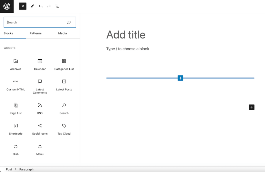
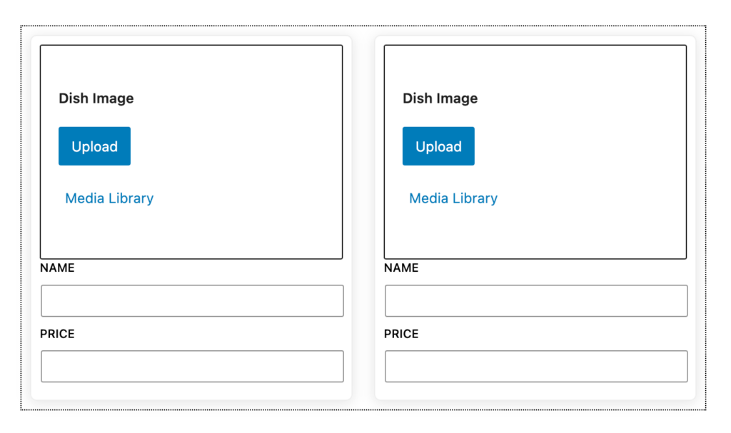
Make sure your dev process is running and go ahead and test your block. If you have any errors, double check you have imported everything – there are quite a few components going on here.
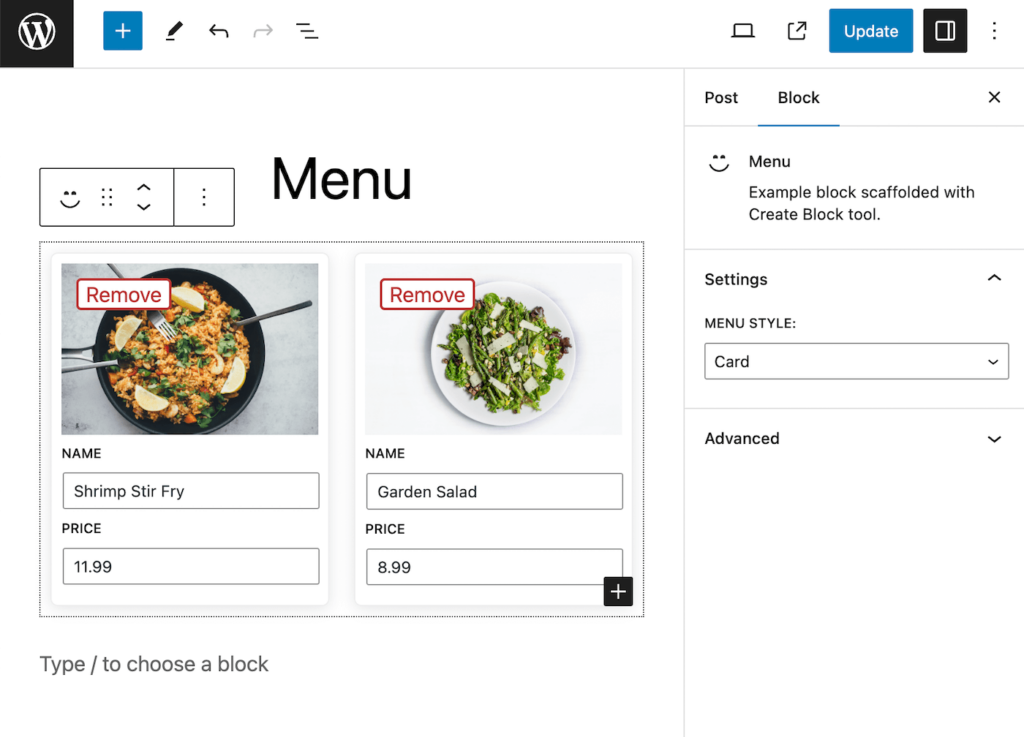
You should see something like this when you add the menu block to a page:
Great! now let’s just build out our render function.
We’ll just build the render for the card style block for now, and then go back and add our minimal menu style later.
<div <?php echo get_block_wrapper_attributes(["class" => "menu-item--card"]); ?>>
<div class="menu-item__image-container">
<img src="<?php echo $attributes["image_url"] ?>" alt="">
</div>
<div class="menu-item__text-container">
<h5><?php echo $attributes['name'] ?></h5>
<p>$<?php echo $attributes['price'] ?></p>
</div>
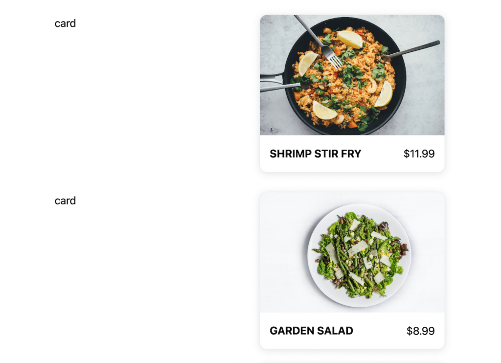
</div>Go ahead and add your block to a page and enter some data for your dishes. When you check the front end of your site, you should see something like this:
At this point we have a fully functioning menu and dish block. In many cases, this may be exactly what you need and you can stop there!
For this lesson though, let’s explore how we can use block context to allow our users to quickly switch menu styles in the menu block, and have our dish blocks react accordingly.
Enjoying the read?
Join 500+ developers and learn modern WordPress, JAMStack, and javascript frameworks with a monthly development newsletter geared towards agencies and freelancers.
Adding a Style Switcher to our Menu Block
In order to get the style variation switcher functionality, we want we’ll need to add an attribute to our menu block to control the menu style. We’ll use an ‘enum’ for this:
	"attributes": {
		"menu_style": {
			"enum": ["card" ,"minimal"],
			"default": "card"
		}
	},
Next, we’ll move into the edit.js function. We’ll use inspector controls to add a select control to our sidebar connected to this attribute:
import { useBlockProps, InnerBlocks, InspectorControls } from '@wordpress/block-editor';
import { PanelBody, SelectControl } from '@wordpress/components'

export default function Edit({attributes, setAttributes}) {
	const ALLOWED_BLOCKS = [ 'fsd/dish' ];

	const TEMPLATE = [
    [ 'fsd/dish', {} ],
    [ 'fsd/dish', {} ]
	];


	return (
		<>
		<div { ...useBlockProps() }>
			<InnerBlocks allowedBlocks={ALLOWED_BLOCKS} template={TEMPLATE} orientation="horizontal" />
		</div>

			{/* Begin Sidebar Inspector Zone */}
			<InspectorControls>
			<PanelBody title="Settings">
				<SelectControl
					label="Menu Style:"
					onChange={(val) => setAttributes({menu_style: val})}
					value={attributes.menu_style}
					options={
						[
							{
								label: "Card",
								value: "card"
							},
							{
								label: "Minimal",
								value: "minimal"
							}
						]
					}
				/>
			</PanelBody>
		</InspectorControls>
		{/* End Sidebar Inspector Zone */}

		</>
	)
}
This should all look pretty familiar so far. Feel free to review chapter 4 if you are rusty on the InspectorControls component.
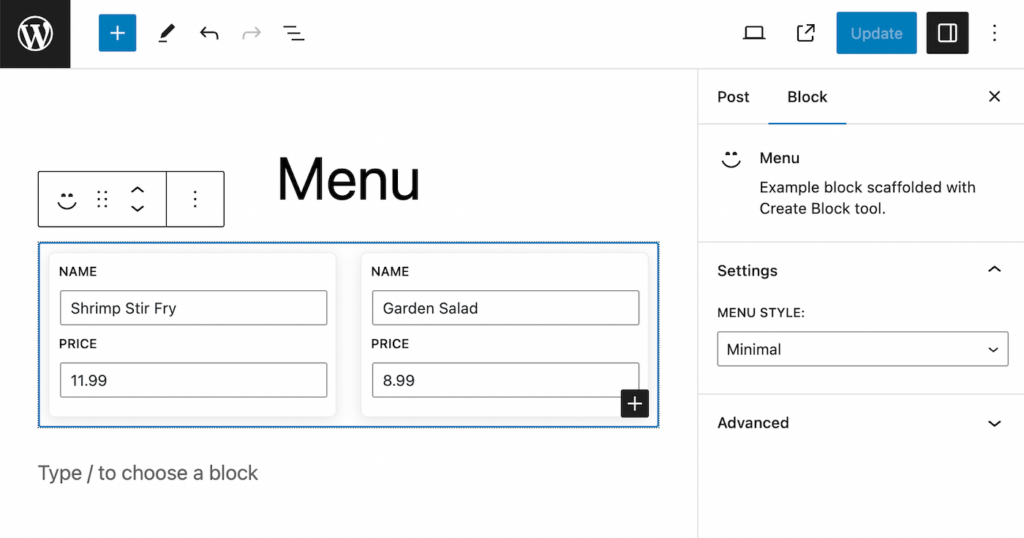
If you check in the editor, you should now be able to toggle menu styles within the inspector, but currently switching has no effect:
Now comes the fun part. We need to pass this attribute down to our dish blocks. We can do this by adding an item to each block.json file.
Adding Block Context
First, in our menu block we can add the following after our attributes:
	"providesContext": {
		"menu/menu_style": "menu_style"
	},
ProvidesContext accepts an array of key/value pairs. The key should be a namespaced string – this will be what you reference from your child blocks. It’s important to use namespacing to avoid conflicts with other values that could be within global context.
The value assigned to this namespaced string should be the name of the attribute that you want to add to the context provider.
Next, open up your dish block’s block.json file and add the following:
"usesContext": ["menu/menu_style"],UsesContext just takes an array of context key names that we want to be available to our block.
At this point our dish blocks have access to the “menu_style” attribute!
Jump into your dish block’s render.php file and add the following line above everything else:
<?php echo $block->context['menu/menu_style'] ?>
// ... Rest of template
This is how we can access context attributes from PHP templates. If you save and check the front end of your site you should see the name of the menu style output next to our cards in the grid.
You can go ahead and try switching the style in the menu block and you should see that change reflected in all our child blocks.
Conditionally rendering based on block context
At this point, we have a ton of options for how we can use this data!
One of the common approaches is to use a switch statement to conditionally render different markup based on the value.
I’ll replace the render.php template for the dish block with the following:
<?php switch ($block->context['menu/menu_style']) {
	case 'minimal': ?>

		<div <?php echo get_block_wrapper_attributes(["class" => "menu-item--minimal"]); ?>>
			<h5><?php echo $attributes['name'] ?></h5>
			<p>- <?php echo round($attributes['price']) ?> - </p>
		</div>

	<?php break;

	default: ?>

		<div <?php echo get_block_wrapper_attributes(["class" => "menu-item--card"]); ?>>
			<div class="menu-item__image-container">
				<img src="<?php echo $attributes["image_url"] ?>" alt="">
			</div>
			<div class="menu-item__text-container">
				<h5><?php echo $attributes['name'] ?></h5>
				<p>$<?php echo $attributes['price'] ?></p>
			</div>
		</div>

	<?php break;
}
?>
In this case we can default to our card style, but if the block context menu_style variable is set to ‘minimal’ we render our more minimal template instead.
Go ahead and try switching between our two templates. You should be able to easily swap all the menu items at once between our minimal or card style display.
Awesome! We can still go one step further to enhance the editor experience as well.
Conditional rendering in the Editor
Just as we can access our context variables in our render template, we can also access them in the edit.js file.
Since our ‘minimal’ menu style does not display the image, I think it would make sense to hide the image picker when we swap the style on the parent menu block.
We can accomplish this by wrapping it in an additional if-statement:
export default function Edit({attributes, setAttributes, context}) {
	return (
		<>
			<div { ...useBlockProps() }>
					{context['menu/menu_style'] === 'card' && (
						<div className='dish-image-container'>
							{attributes.image_url && attributes.image_id ? (
									<>
										<img src={attributes.image_url} />
										<button className="button-remove" onClick={() => setAttributes({image_url: "", image_id: null})}>Remove</button>
									</>
								) : (
										<MediaPlaceholder
												onSelect = {
													( image ) => {
														setAttributes( { image_url: image.url, image_id: image.id } );
													}
												}
												allowedTypes = { [ 'image' ] }
												multiple = { false }
												labels = { { title: 'Dish Image' } }
											>
										</MediaPlaceholder>
								)
							}
						</div>
					)}
					<div className='dish-text-container'>
							<TextControl
								label="Name"
								value={ attributes.name }
								onChange={ ( value ) => setAttributes({name: value}) }
						/>
							<TextControl
								label="Price"
								type='number'
								value={ attributes.price }
								onChange={ ( value ) => setAttributes({price: value}) }
						/>
					</div>
			</div>
		</>

	);
}
Great! now try swapping back and forth between menu styles. When you do, all the child elements will hide the image picker in the editor
Side note: You may disagree with this approach. Some people may find it confusing that the image picker disappears and think that they lost all their images – even though they are all saved still in attributes. Honestly, this is a valid opinion/concern, and it may just come down to your users and use case whether you would want to implement this.
Wrap up
Congratulations!
Block context is an advanced topic for custom block creation. You likely won’t need this super often, but for specific use-cases it really levels up the editor experience.
Another great example would be a team grid block with team member child blocks. You could have a similar style swap control on the main team grid block to give some options for how the information gets displayed without having to manually edit each team member’s individual block.
In the next lesson we’ll transition to using Advanced Custom Fields Pro to create custom blocks. This will feel very similar to dynamic blocks, but takes away some of the javascript complexity. ACF blocks are a great way to quickly create custom one-off blocks for client sites.

Leave a Reply