Gutenberg’s core/button block has been one of the more frustrating aspects of block editor for theme developers because of all the options it gives users, particularly if you are developing something bespoke for a client in a freelance/agency setting.
With recent additions to the power of the Theme.json file however, we can tame the options panel and make the buttons block an asset, rather than working around it or building a new buttons block from scratch.
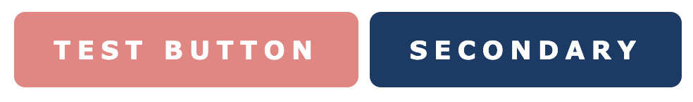
Lets set a goal to make a buttons block that allows us to choose between these two styles of buttons:
Disabling default options
Let’s jump into theme.json and start getting rid of some of this craziness. If you aren’t familiar with the theme.json file I have a basic write up here.
We’ll start in settings:{} and specifically disable options related to this block.
Note: if you are globally disabling things like custom colors, you may not need all these lines, but I’ve found the button block can override some global disabled options so its safest to explicitly disable everything you don’t want.
First border radius:
{
  "version": 2,
  "settings": {
    "blocks": {
      "core/button": {
        "border": {
          "color": false,
          "radius": false,
          "style": false,
          "width": false
        },
      }
    }
  }
}
Next all custom color options:
{
  "version": 2,
  "settings": {
    "blocks": {
      "core/button": {
        "border": {
          "color": false,
          "radius": false,
          "style": false,
          "width": false
        },
        "color":{
          "text": false,
          "background": false,
          "customDuotone": false,
          "customGradient": false,
          "defaultDuotone": false,
          "defaultGradients": false,
          "duotone": [],
          "gradients": [],
          "palette": []
        }
      }
    }
  }
}
Finally typography options:
{
"version": 2,
"settings": {
"blocks": {
"core/button": {
"border": {
"color": false,
"radius": false,
"style": false,
"width": false
},
"color":{
"text": false,
"background": false,
"customDuotone": false,
"customGradient": false,
"defaultDuotone": false,
"defaultGradients": false,
"duotone": [],
"gradients": [],
"palette": []
},
"typography": {
"fontSizes": [],
"fontFamilies": []
}
}
}
}
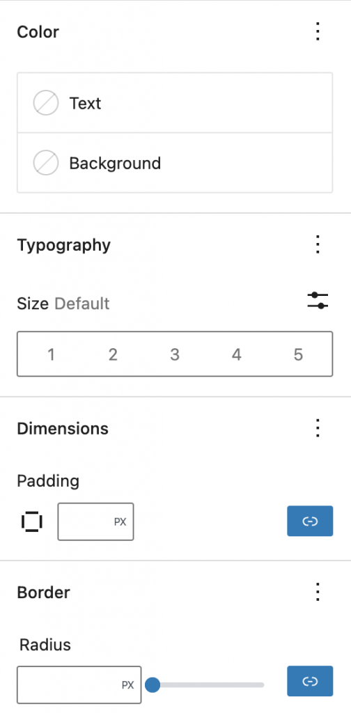
}At this point you are left with an almost empty settings pane:
Just for fun lets put our CSS for the first button style we want into our style.css file and see how it looks:
.wp-block-button__link {
  background-color: lightcoral;
  color: white;
  text-transform: uppercase;
  font-family: Verdana, Geneva, Tahoma, sans-serif;
  font-weight: 700;
  letter-spacing: 0.25em;
  border-radius: 8px;
  border: 2px solid lightcoral;
  transition: all 0.3s ease;

  &:hover {
    background-color: white;
    color: lightcoral;
  }
}
Note: we have to enqueue this style in the editor assets in order for it to show up on the backend.
function example_gutenberg_styles() {
	wp_enqueue_style( 'ff-editor-style', get_stylesheet_directory_uri() . '/build/theme/style-index.css',array(), microtime() );
}
add_action( 'enqueue_block_editor_assets', 'example_gutenberg_styles' );
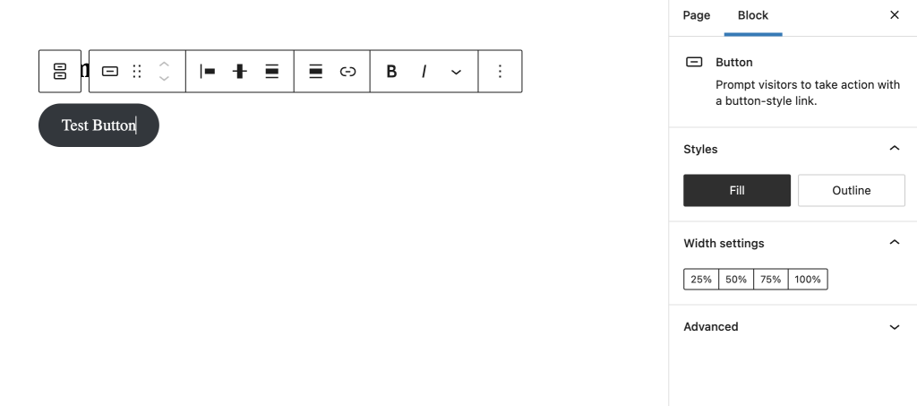
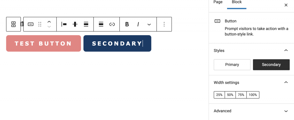
Great! You may notice though we still have these “block style” options for “Fill” and “Outline” which does not align with what we want. Let’s get rid of those and replace them with a primary and secondary option that align with the brand.
Custom button block styles
For this we want to use javascript to manage our block styles, so the first step is to enqueue a script the same way we enqueued our editor styles.
function example_gutenberg_styles() {
	wp_enqueue_style( 'ff-editor-style', get_stylesheet_directory_uri() . '/build/theme/style-index.css',array(), microtime() );
	wp_enqueue_script( 'ff-editor-script', get_template_directory_uri() . '/build/theme/editor.js', array(), microtime(), true );
}
add_action( 'enqueue_block_editor_assets', 'example_gutenberg_styles' );
Now, moving into our new editor script file we’ll first disable what is already there:
wp.domReady( () => {
  wp.blocks.unregisterBlockStyle('core/button', 'outline');
  wp.blocks.unregisterBlockStyle('core/button', 'fill');
})
Side note: if you know you want to just get rid of all the default styles across the board you can use a function like this instead of manually picking which ones to remove:
  _.forEach(wp.blocks.getBlockTypes(), function(blockType){
    let blockStyles = wp.data.select('core/blocks').getBlockStyles(blockType.name);
    if(!_.isEmpty(blockStyles)){
        _.forEach(_.pluck(blockStyles, 'name'), function(blockStyle){
                wp.blocks.unregisterBlockStyle(blockType.name, blockStyle);
        });
    }
  });
Now we can add back in our own styles:
wp.domReady( () => {
wp.blocks.unregisterBlockStyle('core/button', 'outline');
wp.blocks.unregisterBlockStyle('core/button', 'fill');
wp.blocks.registerBlockStyle('core/button', {
name: 'primary-button',
label: 'Primary',
isDefault: true
});
wp.blocks.registerBlockStyle('core/button', {
name: 'secondary-button',
label: 'Secondary'
});
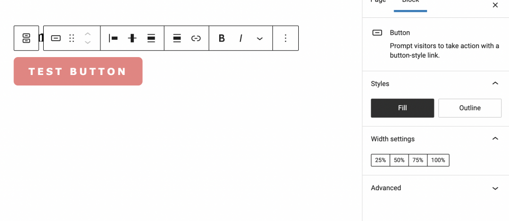
});Now, you’ll see our two custom styles show up in the editor, but under the hood all this does is add a class to the button that follows the format is-style-{name}.
In order for this to do what we want, we just need to add some CSS that targets our style class.
.wp-block-button__link {
  background-color: lightcoral;
  color: white;
  text-transform: uppercase;
  font-family: Verdana, Geneva, Tahoma, sans-serif;
  font-weight: 700;
  letter-spacing: 0.25em;
  border-radius: 8px;
  border: 2px solid lightcoral;
  transition: all 0.3s ease;

  &:hover {
    background-color: white;
    color: lightcoral
  }
}

.is-style-secondary-button {
  .wp-block-button__link {
    background-color: #0d3b66;
    border-color: #0d3b66 ;
    color: white;
    &:hover {
      background-color: white;
      color: #0d3b66;
    }
  }
}
And there we have it! With only a handful of json declarations and a few lines of code we have a super functional buttons block that gives editors a perfect balance of control without crazy options.
You might be wondering about the width settings. At the time of writing there is not an elegant way to disable these. That said, I find that this is the one setting that might actually still be useful every now and then just to create a full width block in certain scenarios, so for me I’m fine with it being there.
Going Further
Obviously these button styles are nothing inspirational, but this technique allows you to really make the core/buttons block work for you. You can add as many styles as you want and get crazy with gradients, hover states, drop shadows (if you roll that way), you name it!

Leave a Reply