In this lesson, I’ll pick up where we left off with our basic static block from Lesson 01. If you haven’t completed that lesson go ahead and take a look now, or download the course repo if you want to skip ahead to this one.
Right now our block allows us to edit and add text, but what if we want the ability to change the color of the block or amount of padding around it to make a slimmer banner alert for instance?
We could add attributes for background color, text color, etc… but there is an easier and better way that makes use of built in Gutenberg functionality.
Note: This post is part of the Block Creator series. These lessons build on each other, so it is recommended to complete them in order to get the most out of the course.
You can find links to all the Block Creator lessons on the main course page. You can also download this finished code from the course Github repo in case you get stuck at any point.
Introducing Block Supports
Gutenberg offers a variety of built in supports we can leverage. Let’s add a few to the basic banner block to see how they work.
You can enable block supports through the block.json file. In fact, you’ll see we already have the “supports” key in our theme.json file and right now html is turned off:
{
	"$schema": "https://schemas.wp.org/trunk/block.json",
	"apiVersion": 2,
	"name": "create-block/basic-static",
	"version": "0.1.0",
	"title": "Basic Static",
	"category": "widgets",
	"icon": "smiley",
	"description": "Example block scaffolded with Create Block tool.",
	"supports": {
		"html": false
	},
	"attributes": {
		"content": {
			"type": "string"
		}
	},
	"textdomain": "basic-static",
	"editorScript": "file:./index.js",
	"editorStyle": "file:./index.css",
	"style": "file:./style-index.css"
}
The html support allows editor to actually manually edit the block code, so we’ll leave that set to false, but lets add a few extra supports now:
	"supports": {
		"html": false,
		"color": {
			"text": true,
			"background": true
		},
		"spacing": {
			"padding": true,
			"margin": ["top", "bottom"]
		}
	}
You can reference the documentation to see all the available settings, but these are a few of the most common ones to use. We can now change background and text color, padding, and margins. We also can limit spacing to specific options – for this block I’m allowing custom top/bottom margin, but not allowing side margins.
Make sure your npm run start process is running for you block then go ahead and take a look in the editor now:
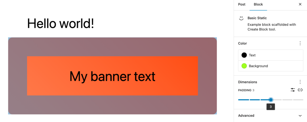
You’ll see you can add colors and padding or margin controls under the dimensions panel.
You might notice a bug though, while you can control the text color and padding, the background color does not update. This is because of how our css is written.
Block supports and CSS styles
We currently assign a gradient to the block’s background property. When you change the background setting in the editor it adds a declaration for background-color, but this gets overwritten by our background rule.
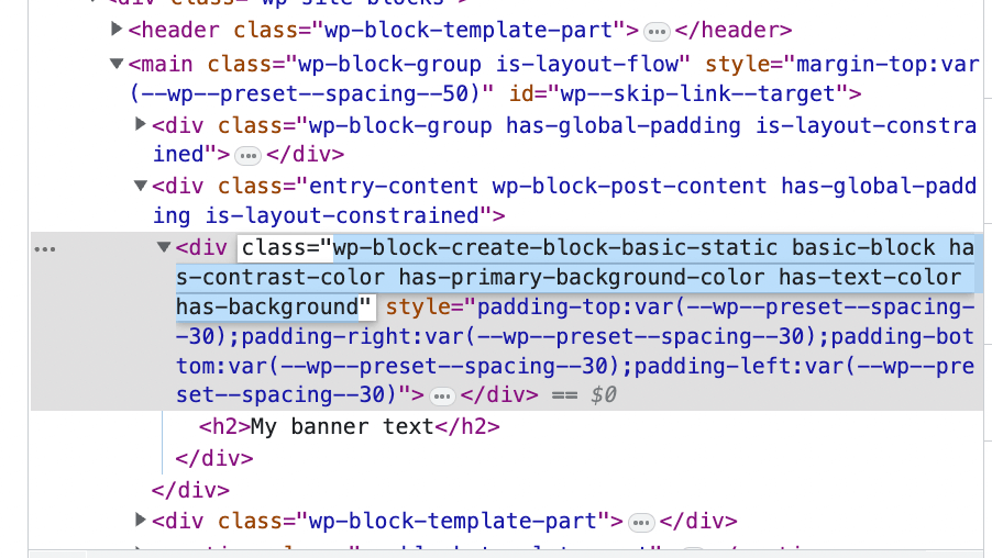
Luckily there is an easy fix. When you apply a background color (or any other support option) Gutenberg behind the scenes is applying classes to your block through the useBlockProps hook in our edit.js function. This is why it is so important to include that in your blocks.
If we take a look at the block markup on the front end with our options applied, we’ll see a bunch of classes:
All we have to do is modify our style.css file slightly. We’ll only apply the default gradient background when the block does not have a background color applied:
 .basic-block {
	border-radius: 16px;
	color: white;
	padding: 32px 20px;
	text-align: center;

	&:not(.has-background){
		background-image: linear-gradient(45deg, coral, orangered);
	}
}
Great! now you can apply custom backgrounds.
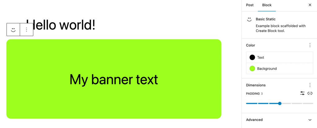
If you click the triple dot menu next to colors and click “reset all” in the editor, it will fallback to our original gradient.
Understanding Theme.json and Block Supports
If you are new to block themes, you may be wondering where the colors and spacing sizes are coming from?
These are declared in the WordPress theme.json file. If you’ve never used this file, I do have a write up going over the basics I recommend checking out.
When we are developing blocks we want to make sure we follow the WordPress standard of functionality in plugins vs. presentation in themes.
Therefore, when we leverage block supports we do not provide a bunch of color options or spacing options in our block, we let the theme declare these and just provide the functionality.
This way our block can work with a wide variety of themes and look on brand no matter what.
If you want, you can jump into the 2023 default WordPress theme and play with customizing the theme.json file. After you save you should see any changes reflected in the editor for our block.
	"settings": {
		"appearanceTools": true,
		"color": {
			"palette": [
				{
					"color": "#f2fa00",
					"name": "Custom Bright Yellow",
					"slug": "custom-yellow"
				},
				{
					"color": "#ffffff",
					"name": "Base",
					"slug": "base"
				},
				{
					"color": "#000000",
					"name": "Contrast",
					"slug": "contrast"
				},
				{
					"color": "#9DFF20",
					"name": "Primary",
					"slug": "primary"
				},
				{
					"color": "#345C00",
					"name": "Secondary",
					"slug": "secondary"
				},
				{
					"color": "#F6F6F6",
					"name": "Tertiary",
					"slug": "tertiary"
				}
			]
		},
}
Essentially how most block supports work is by applying classes or inline styles to blocks that are generated based on the theme.json file.
Adding a few more block supports
Let’s add a couple more supports that you might consider using when developing blocks.
"supports": {
"html": false,
"color": {
"text": true,
"background": true
},
"spacing": {
"padding": true,
"margin": ["top", "bottom"]
},
"anchor": true,
"align": ["wide", "full"]
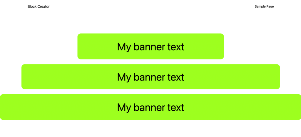
}First, we are adding the anchor support. This just adds the ability to provide an ID html attribute to the block from the editor. That way content editors could then link to this particular section with a hash (#) link. The input is located under the advanced settings in the editor.
Second, is alignment. I almost always add at least one of the wide or full alignment options for custom blocks. Again, the exact size of “wide” vs “normal” is determined by the theme within the theme.json file.
Alignment, just like color and spacing, uses classes that are applied by the useBlockProps hook under the hood.
Great! our block is now much more versatile and will fit in stylistically with any theme you may be running.
Part 2: Optimizing our block
Before I close out this lesson I want to talk about block optimization. I’m going to create a new post, add our block, and enter some text in the content field.
To understand optimizing blocks I’m going to take a look under the hood in the WordPress database to see how WordPress actually stores blocks that we add to the page.
If you want to follow along and are using Local for your development environment, navigate to the Database tab in your Local dashboard and click “Open Adminer”.
In the sidebar click on the “posts” table and then click “select data”.
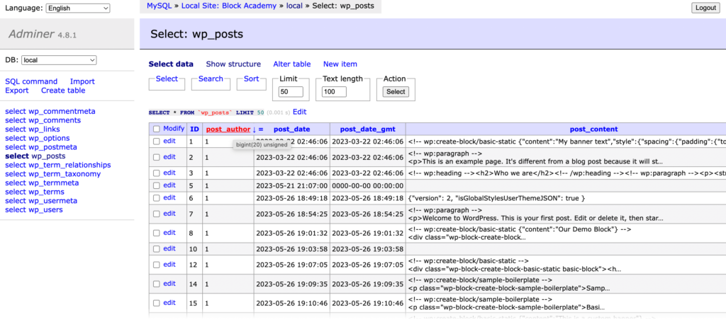
Look in your posts table and go to the very end – you should see your last created post. If you click “edit” and look in the post_content field it should look something like this:
<!-- wp:create-block/basic-static {"content":"This is a banner"} -->
<div class="wp-block-create-block-basic-static basic-block"><h2>This is a banner</h2></div>
<!-- /wp:create-block/basic-static -->
Gutenberg stores static blocks as an html comment. An object contains all the attributes, and the actual html markup is inside the comment tags. When Gutenberg loads the block in the editor it loads in the attributes from the object and renders the markup to the page.
You’ll notice that WordPress stores the content “This is a banner” twice. Once in the object and once in the markup.
For a simple block this is no big deal, but imagine the block has several attributes that may contain full paragraphs worth of text. Then imagine the block is repeated multiple times across dozens of pages. This starts to add up to a lot of wasted space in the database.
Introducing Source/Selector
We can be smarter with our attributes in static blocks by connecting them to elements in the actual markup. We can do this in block.json with two keys called “source” and “selector” that we add to our attributes definition:
	"attributes": {
		"content": {
			"type": "string",
			"source": "text",
			"selector": "h2"
		}
	}
Selector accepts a valid css selector and looks for this element in the block’s saved markup. Source tells Gutenberg what to extract from the selected DOM node. In this case text is equivalent to “innerText” in javascript.
Now if you look in the database, WordPress no longer needs the data object and the post_content will look like this:
<!-- wp:create-block/basic-static -->
<div class="wp-block-create-block-basic-static basic-block"><h2>This is a banner!</h2></div>
<!-- /wp:create-block/basic-static -->
When Gutenberg loads the block in the editor it uses the source/selector to pull the attribute out of the saved markup.
You can see a ton of different examples of using source/selector in the WordPress Block Editor Handbook. You are not limited to using it for text, you can also point it to html attributes. In this case you provide an extra “attribute” key to tell it which to pull from. For instance, if your block contained an image, you could extract the url and alt text like so:
"imageUrl": {
  "type": "string",
  "source": "attribute",
  "selector": "img",
  "attribute": "src",
 },
"imageAlt": {
  "type": "string",
  "source": "attribute",
  "selector": "img",
  "attribute": "alt",
}
Whenever you make static blocks you should try to use source/selector to optimize your block as a best practice.
Wrap up
Congratulations! You’ve extended the block to support a lot more configuration options and to generally be much more useful. In addition, you now know some advanced performance tips for optimizing static blocks.
In the next lesson, we’ll talk about the pesky “block contains invalid markup” error and how to avoid it. Then we’ll move onto building dynamic blocks!
Leave a Reply