Welcome to the Block Creator series! If you haven’t looked at the course introduction feel free to take a moment and check it out before jumping into this first build.
In this post, we’ll setup and build our very first block from start to finish. This block will be quite simple to demonstrate the basic boilerplate setup, but in the coming weeks we’ll dive into increasingly complex and exciting custom blocks for WordPress.
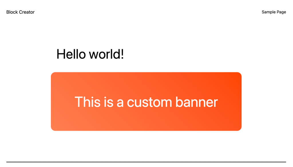
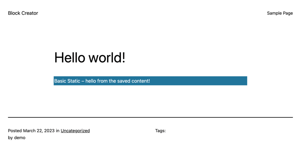
Our goal is a simple banner block with custom editable text that looks like this:
Let’s jump into it!
What is a static block?
In WordPress there are two types of custom blocks you can create: Static and Dynamic.
Static blocks save all their markup in the actual WordPress database, while dynamic blocks just store data called “attributes” in an object, and then render markup on the server using this data. This allows you to write your dynamic block templates using familiar PHP syntax much like you would for a short code or custom include from classic WordPress.
For most of this course I’ll focus on dynamic blocks, as they have several important advantages we’ll discuss later. For this intro though, I’ll begin with a static block as these are the foundation of the Gutenberg editor and how the core blocks of Gutenberg are built.
Important Note:
As we begin our journey with static blocks, you may encounter the following error in the editor with your custom block:
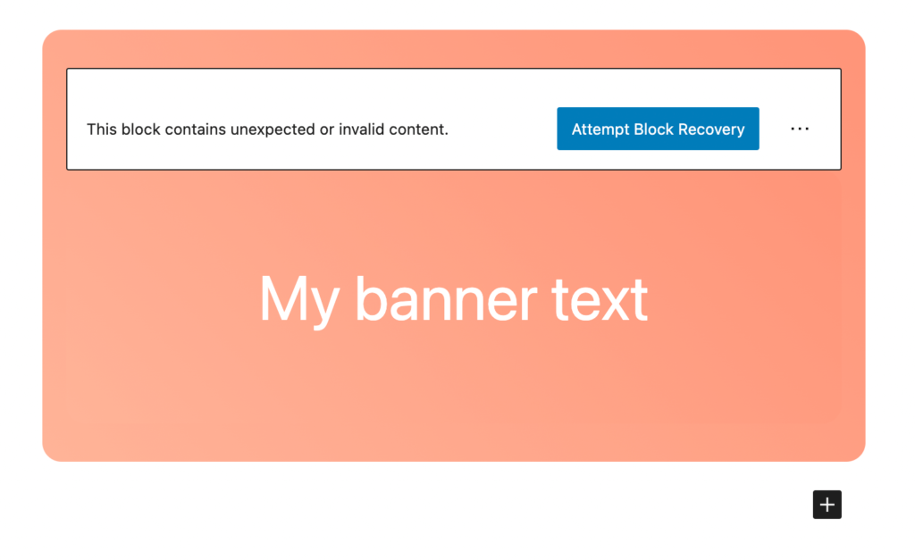
This happens when you insert a block and then change the save function that outputs the final block markup. In the third lesson of this course, we’ll explore why this happens and a couple of methods to avoid it, but for now if you encounter this issue feel free to just delete the block with the error and re-insert it.
Setting up our block plugin
To build our first block make sure you have a blank WordPress install on your local machine that you can work from. If you don’t have one already feel free to follow the setup guide in my introduction post to the course. I’ll be using the 2023 WordPress Theme.
WordPress provides us with a great tool to get up and running with block development called @wordpress/create-block. If you have worked with React before, its equivalent to the (now defunct) “create-react-app” command.
From the command line navigate to your WordPress install and go into the plugins directory. Run the following command to install the scaffolding for your first block, I’ll call mine “basic-static”, but you can name it whatever you want:
npx @wordpress/create-block basic-staticThis may take a minute to install everything, but once it finishes go ahead and navigate inside the new “basic-static” directory and open it in your code editor to check it out.
Exploring the Gutenberg Block File Structure
The create block command will install a handful of files at the root of your project, as well as a src and node_modules folder.
First off there is the basic-static-block.php file at the root of the plugin. This is where our block is registered and the plugin options are set up. In future lessons, we’ll use this file to do other plugin level logic like adding block categories, styles, etc.
<?php
/**
 * Plugin Name:       Basic Static
 * Description:       Example block scaffolded with Create Block tool.
 * Requires at least: 6.1
 * Requires PHP:      7.0
 * Version:           0.1.0
 * Author:            The WordPress Contributors
 * License:           GPL-2.0-or-later
 * License URI:       https://www.gnu.org/licenses/gpl-2.0.html
 * Text Domain:       basic-static
 *
 * @package           create-block
 */

/**
 * Registers the block using the metadata loaded from the `block.json` file.
 * Behind the scenes, it registers also all assets so they can be enqueued
 * through the block editor in the corresponding context.
 *
 * @see https://developer.wordpress.org/reference/functions/register_block_type/
 */
function create_block_basic_static_block_init() {
	register_block_type( __DIR__ . '/build' );
}
add_action( 'init', 'create_block_basic_static_block_init' );
Now go ahead and look at your package.json file. You’ll notice we only have to manage one dependency, which comes from the WordPress scripts package:
{
	"name": "basic-static",
	"version": "0.1.0",
	"description": "Example block scaffolded with Create Block tool.",
	"author": "The WordPress Contributors",
	"license": "GPL-2.0-or-later",
	"main": "build/index.js",
	"scripts": {
		"build": "wp-scripts build",
		"format": "wp-scripts format",
		"lint:css": "wp-scripts lint-style",
		"lint:js": "wp-scripts lint-js",
		"packages-update": "wp-scripts packages-update",
		"plugin-zip": "wp-scripts plugin-zip",
		"start": "wp-scripts start"
	},
	"devDependencies": {
		"@wordpress/scripts": "^26.0.0"
	}
}
We have a handful of scripts, but for now the most important is npm run start. This will compile our block in dev mode and listen for changes. Go ahead and run it now.
You should see a build folder created, which will contain all our compiled files.
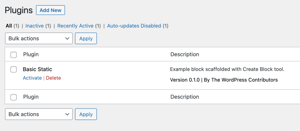
At this point you can go ahead and login to the WordPress dashboard and you should see the basic static block plugin listed. Go ahead and activate it so that you can start playing with the new block in the editor.
Exploring the “src” directory
In the src directory we have the meat of our custom block. Let’s go through each file one by one:
- block.json – sets up all the options of our block and points to the other js and css files used.
- index.js – the main entry point to our block (imports editor.js and save.js)
- editor.js – javascript function that displays the block within the editor and handles all editing logic
- save.js – function that generates the saved markup for our static block that will be displayed on the front end.
- editor.scss – styles only present in the editor
- style.scss – styles present BOTH in the editor and on the frontend
Take a look at the boilerplate in these files and then go ahead and try using the demo block on a page.
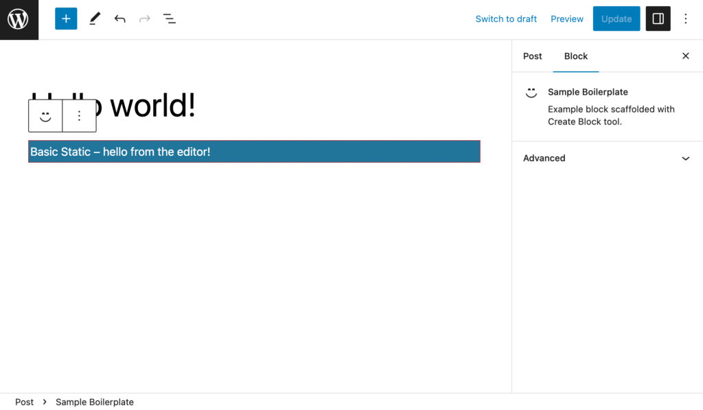
You should notice that the block is styled slightly differently in the editor vs the frontend of the site because of the edit.scss stylesheet. It’s subtle, but there is a dotted red border applied only in the editor:
Rather than go too in depth into each of these files, let’s learn by modifying them and building our own block now.
Setting up our block.json file
When you are building a custom block, one of the first things to consider is “what will the editable parts of this block be?” Anything that the user should be able to control in the editor will need to mapped to an “attribute” on the block. (Not to be confused with html attributes – block attributes are equivalent to pieces of React state).
For this first block we’ll just have one attribute to control the text within our banner. We can add this by adding an “attributes” key within our block.json file:
{
	"$schema": "https://schemas.wp.org/trunk/block.json",
	"apiVersion": 2,
	"name": "create-block/basic-static",
	"version": "0.1.0",
	"title": "Basic Static",
	"category": "widgets",
	"icon": "smiley",
	"description": "Example block scaffolded with Create Block tool.",
	"supports": {
		"html": false
	},
	"attributes": {
		"content": {
			"type": "string"
		}
	},
	"textdomain": "basic-static",
	"editorScript": "file:./index.js",
	"editorStyle": "file:./index.css",
	"style": "file:./style-index.css"
}
You can name your attribute whatever you like, but it needs to have a type associated with it. You can read all about the different attribute types here – I’ll use a variety in future lessons as well. For this block I’ll just set it to a string.
Setting up the block in the editor
After we model our block data and create attributes in block.json, we can start working on how it will appear in the editor and wire up fields to control our attributes. This follows the model of managing controlled forms with state in React.
I’ll replace the default Edit function with the following boilerplate:
export default function Edit({attributes, setAttributes}) {

	const blockProps = useBlockProps({className: "basic-block"})

	return (
		<div { ...blockProps }>
			// Input to set our content goes here
		</div>
	);
}
Whoa… There’s a handful of new concepts going on here.
First you can see our attributes get passed in as props and we are immediately de-structuring “attributes” and “setAttributes”. Again, this functions pretty much the same as state/setState in React.
Next, I’m using a hook unique to WordPress called useBlockProps. This gives us access to any classes, ID attributes, style attributes, etc that come from the block editor as an object that can be applied to our markup. As you can see, you can also directly pass in our own HTML attributes to block props.
You should always use this hook and apply the de-structured blockProps object to the outermost div of your block to ensure the best compatibility with Gutenberg’s built in options. It allows WordPress to essentially hook into this div to add extra data to the block.
Setting up the text input
Now we just need an input to control the text for our block.
We could use a native html input here and follow React’s model of hooking the value and onChange to our block’s state, or in this case the “content” attribute.
For the sake of demonstration, here is what that would look like:
(don’t copy this, we’ll be doing something different in a moment)
export default function Edit({attributes, setAttributes}) {

	const blockProps = useBlockProps({className: "basic-block"})

	return (
		<div { ...blockProps }>
			<input
				type="text"
				value={attributes.content}
				onChange={e => setAttributes({content: e.target.value})}
			/>
		</div>
	);
}
While this works, it doesn’t look very good in the editor and we would have no formatting controls for our text, so we’d have to manually add options to handle even simple things like the ability to make the text bold.
This is what our finished block would like in the editor if we used a simple input:
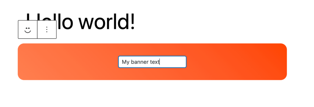
In some case this may be exactly what you need, but for this block we can do better…
Introducing the RichText Component
WordPress provides a lot of really useful components from color pickers to modal elements, that we can import and use, which make use of existing Gutenberg functionality, so we don’t have to reinvent the wheel.
For this block, we will use RichText – which actually comes from the @wordpress/editor package because it is such a core part of Gutenberg.
It renders the interface you are already familiar with from the paragraph and headings block. This includes controls for bold, italic, etc. all straight out of the box. You can even configure exactly what options you want available within your block editing context.
For demo purposes I’ll limit it to bold and italic:
import { useBlockProps,RichText } from '@wordpress/block-editor';
// ... other imports
export default function Edit({attributes, setAttributes}) {
const blockProps = useBlockProps({className: "basic-block"})
return (
<div { ...blockProps }>
<RichText
tagName="h2" // The tag here is the element output and editable in the admin
value={ attributes.content } // Any existing content, either from the database or an attribute default
allowedFormats={ [ 'core/bold', 'core/italic' ] } // Allow the content to be made bold or italic, but do not allow other formatting options
onChange={ ( content ) => setAttributes( { content } ) } // Store updated content as a block attribute
placeholder={ __( 'Enter your banner text...' ) } // Display this text before any content has been added by the user
/>
</div>
);
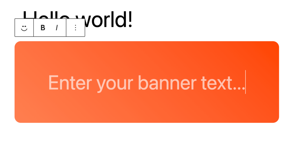
}Our block will look much cleaner in the editor using this component and we get formatting options basically for free.
Handling CSS styling for the custom block
Let’s empty out our editor.scss file and delete the default css that came in there.
In general you should only use the editor.scss file when absolutely necessary. The idea is to match the front end and editor visually, so styling one separately generally violates this goal.
When developing blocks it’s best to start by writing styles in the style.scss file, then only add css to the editor.scss file if you need to fix any issues that arise from differences in markup structure within the editor context.
I’ll go ahead and drop some basic styling for our block in style.scss now:
 .basic-block {
	border-radius: 16px;
	background: linear-gradient(45deg, coral, orangered);
	color: white;
	padding: 32px 20px;
	text-align: center;
}
As a reminder, this will be applied to both the editor and the front end.
Finally, before we test our block let’s create the save function as well.
Enjoying the read?
Join 500+ developers and learn modern WordPress, JAMStack, and javascript frameworks with a monthly development newsletter geared towards agencies and freelancers.
Building the block save function
Our save function will closely mirror our edit function to ensure continuity between the front end and editor:
import { useBlockProps,RichText } from '@wordpress/block-editor';

export default function save({attributes}) {
	const blockProps = useBlockProps.save({
		className: "basic-block"
	})
	return (
		<div { ...blockProps }>
			<RichText.Content
				tagName="h2"
				value={attributes.content}
			/>
		</div>
	);
}
This should look very familiar. Our useBlockProps hook has a save method specifically for outputting markup on the front end.
Similarly, the RichText element can be called as RichText.Content to simply output the saved html on the frontend without all the extra form options from the editor.
Note: This is unique to RichText. We often will simply be outputting the value of an attribute just like you would in traditional jsx: <div>{attributes.exampleValue}</div>.
Using our new block
Make sure you development process is still running in your terminal, then go ahead and open a fresh post or page and add our block.
Check out how much cleaner the block looks with the RichText component compared to the basic input:
You should be able to add some text, save, and then view on the frontend and see your block rendered to the page.
Wrap Up
Congratulations! You’ve built your first basic block. Obviously, there is a lot more ground to cover to create more complex advanced blocks, but this is the foundation that we will work from.
Next up, we’ll add the ability to change the background color and modify the padding of our block using core block supports and optimize our block with some advanced settings.
In case you got stuck at any point, you can reference the Block Creator course repo here. I’ll be adding all the blocks we build to this repo for easy reference.

Leave a Reply